The Obama Bull Market Rally on Its Fifth Anniversary

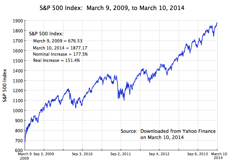
S&P 500 Index, March 9, 2009, to March 10, 2014

Bull Markets, 1940-2014, updated to March 10, 2014

 
   Bull Market Rallies Since 1940
  Ranked by overall growth in real terms
Start Date End   Date Calendar Days Nominal % Change Real % Change Real Rate of Growth
Dec 4, 1987 Mar 24, 2000 4,494 582% 361% 13%
Jun 13, 1949 Aug 2, 1956 2,607 267% 222% 18%
Aug 12, 1982 Aug 25, 1987 1,839 229% 181% 23%
Mar 9, 2009 Mar 10, 2014 1,827 177% 151% 20%
Apr 28, 1942 May 29, 1946 1,492 158% 124% 22%
Oct 22, 1957 Dec 12, 1961 1,512 86% 76% 15%
Oct 9, 2002 Oct 9, 2007 1,826 101% 75% 12%
Jun 26, 1962 Feb 9, 1966 1,324 80% 69% 16%
May 26, 1970 Jan 11, 1973 961 74% 57% 19%
Oct 6, 1966 Nov 29, 1968 785 48% 37% 16%
Oct 3, 1974 Nov 28, 1980 2,248 126% 34% 5%

Today marks the fifth anniversary of the Obama bull market rally.  The rally began on March 9, 2009, just six weeks after Obama was inaugurated.  A reader of this blog suggested that on this anniversary, an update of previous posts on the strong performance of the stock market during Obama’s tenure (see here and here) might therefore be timely and of interest.

Stock market prices have indeed continued to rise, and as the table above shows, stocks during Obama’s term in office have now posted the fourth highest gains of any stock market rally since 1940.  Market rallies are defined as at least a 25% rise in the S&P 500 Index (in real terms), without a 20% fall.  Equity prices (as measured by the S&P 500) have risen by 177% in nominal terms since March 9, 2009, as of the close today.  The increase in real terms (using the CPI inflation index) has been 151%.  And since this rally is on-going, it could move further up in rank.  In addition, in just twelve more days (assuming the rally does not suddenly collapse) this rally will be the third longest in terms of calendar days of all market rallies since 1940.

It is also interesting to see how steady the upward progression has been, especially since September 2011.  This is shown in the graph at the top of this post.  I do not believe anyone had predicted this.

The rally could also end tomorrow.  All rallies eventually come to an end, and this one will as well.  But the rise in prices already achieved, the fourth largest since 1940, needs to be recognized.

Should Obama be given credit for this historic market rally?  Not fully.  I doubt that equity prices in themselves are a primary objective of what Obama has been trying to achieve.   Rather, the objective has been a stronger economy.  Regulatory as well as policy measures have been taken with the aim of strengthening the system, and this ultimately benefits business (as well as the population) as a whole.  This then helps equity prices.  Unfortunately, and as this blog has discussed in earlier posts, fiscal drag from cuts in government spending has held back the pace of the recovery, and this fiscal drag is continuing.  The economy could be doing better.  Nevertheless, there has been a partial recovery.  But it is not yet complete, nor as rapid as one would have had without the fiscal drag.

But what this strong growth in the stock market does clearly indicate is that the charges by Republican politicians that Obama has been bad for business (indeed a disaster for business many of them have said), has no basis.  If there were any truth to the charge, stock market prices would not be up by 177% in nominal terms (and by 151% in real terms) over the last five years, leading to the fourth biggest rally in stock prices in three-quarters of a century.

The Continued Fall in Government Spending Under Obama

Govt Spending on Goods & Services by Presidential Term, Quarterly

A.  Introduction

Government spending continues to fall under Obama.  As this blog has noted in earlier posts, the fiscal drag from this reduction in demand for the goods and services that unemployed workers could have been producing can fully explain why the recovery from the 2008 has been so slow.  As another blog post noted, if government spending had merely been allowed to grow under Obama at the same pace as it had historically, the economy would by now be back at full employment.  The public debt to GDP ratio would also be lower, as GDP would be higher.  And if government spending had been allowed to grow as it had under Reagan, we would likely have returned to full employment by 2011.

Fiscal drag is therefore important.  Yet it is still not yet commonly recognized that government spending has been falling in real absolute terms for the last several years (and even more so when measured as a share of GDP).  Earlier blog posts have reviewed this.  The trends have unfortunately continued and indeed strengthened over the last year.  Whether this will now change with government spending finally leveling off, and perhaps even start to recover, remains to be seen.  The budget compromise for fiscal years 2014 and 2015 reached by Senator Patty Murray and Congressman Paul Ryan in December, and passed by Congress in January, will reverse part of the impact of the budget sequester.  According to calculations by the Committee for a Responsible Federal Budget (fiscal hawks in favor of budget cuts), the agreement for FY2014 will lead to a small (1.8%) rise in nominal terms in budget authority compared to the FY2013 post-sequester levels.  This would still be flat to negative in real terms, based on inflation of about 2%.  And the FY2014 sum would still represent a 3.7% fall compared to what the FY2013 pre-sequester levels would have been.

Possibly more important would be government spending at the state and local level.  This was cut back as a result of the 2008 collapse and slow recovery, due to lower revenues and the requirement in many states and localities of a balanced budget.  While expenditures were still falling in 2013, revenues have started to grow (due to the positive, though still slow, recovery of GDP) and state and local budgets as a result can now start to recover as well.  But it also remains to be seen if that will happen.

This blog post will update the government spending figures during the Obama term through the fifth year of his administration.  And it will present the figures from a different perspective than before, by tracing the paths during the course of each presidential term (going back to Carter’s) relative to what the spending was at the start of their respective presidencies.

[Note that all the government spending figures used in this post will be in real, inflation-adjusted, terms.]

B.  Government Spending on Consumption and Investment

The graph at the top of this post shows the tracks of real government spending on consumption and investment during each presidential term going back to Carter, as a ratio to what it was at the start of their terms.  The base period is always taken as the last quarter before their inauguration (i.e. in the fourth quarter of the calendar year preceding their January 20 inauguration).  The data is computed from the figures in the standard National Income and Product Accounts (NIPA accounts, also commonly referred to as the GDP accounts) of the Bureau of Economic Analysis (BEA) of the US Department of Commerce, and are seasonally adjusted.  Note that all levels of government are included here – federal, state, and local.  We will examine below spending at the federal level only, as well as spending including transfer payments.

This government spending has fallen by 5 1/2% in real terms by the end of the fifth year (the 20th quarter) of Obama’s term in office.  It rose by 2 1/2% during Obama’s first year, which one might note is similar to the increases seen by that point under Carter, Reagan, and Bush I, and with a significantly greater increase by that point under Bush II.  Spending during Obama’s term has since been falling steadily, leading to the fiscal drag referred to above, to a point where it is now 8% lower in real terms than it was in his first year, or a net 5 1/2% fall from when he took office.

There has been no such fall in government spending under any other presidential term since Carter.  The closest was spending during the Clinton period, but there was still a 3% rise by the end of his fifth year in office.  The increases by the end of the fourth year under Carter and Bush I (single term presidencies) were 8% and 6 1/2% respectively.  And the increases by the end of the fifth year in office were 13% during the term of Bush II, and by a full 21% in real terms under Reagan.  Government spending also continued to grow under Bush II and Reagan, reaching increases of 21% and 33% respectively by the end of their eight years in office.

Yet Reagan and Bush II are seen as small government conservatives, while Obama is deemed by conservatives to be a big spending liberal.  The facts simply do not support this.

C.  Government Spending Including Transfers

Government spending for the direct purchase of goods and services (used for consumption or investment), reviewed above, is a direct component of GDP demand.  When there are substantial unemployed resources (as now), such government spending will have a significant positive impact in spurring economic expansion.  As was discussed in an Econ 101 post on this blog, under such circumstances the fiscal multiplier will be positive and high.  Hence the fiscal drag from the cut-back in government spending during Obama’s term in office has kept the recovery below what it would have been.

But there is also government spending on transfers to households (such as for Social Security, food stamps, or unemployment insurance).  Such transfers are ultimately spent by households for their consumption of goods and services (or will in part be saved, including through the pay-down of debt such as mortgage debt).  It will enter into GDP demand by way of the spending of households for consumption, and the impact on GDP will depend on the behavior of households in deciding what share of those transfers they will spend or save.

Such spending rose more sharply during Obama’s first year in office, as he faced an economy in free fall as he was taking his inaugural oath:

Govt Spending, Total incl Transfers, by Presidential Term, Quarterly

The economy was losing 800,000 jobs per month at that time, pushing the unemployment roles up rapidly and plunging the incomes of many in the population to levels where they qualified for food stamps.  Government spending including transfers therefore rose by almost 9% by the third quarter of 2009, and reached a peak of 9.8% in the third quarter of 2010.  Since then, however, total government spending including transfers has been modestly falling, and is now 7 1/2% above where it was when Obama took office.

[Note all figures are in real terms.  The personal consumption expenditures deflator in the NIPA accounts was used to adjust transfer payments for inflation.]

Only during the Clinton period did one see a modestly smaller increase, of about 6 1/2%.  But there was a 16 1/2% increase in such spending at the same point in the term of Bush II, and an increase of over 22% under Reagan.  It was also higher by the end of their fourth years in office for both Carter and Bush I.

The differences are not small.

D.  Federal Government Spending on Consumption and Investment

What matters to the economy when demand is inadequate and unemployment is high is spending at all levels of government.  Yet while we commonly blame the president in office for the performance of the economy, they at best can only influence the federal budget (and influence it only partially, as Congress decides on the budget).  Hence it may be of interest also to examine the paths of only federal government spending.

Such federal spending on direct consumption and investment at first rose during the Obama term, reaching a peak 8% increase in the third quarter of his second year in office.  It then fell sharply, to a point where it is now 5 1/2% below where it was when Obama took office:

Federal Govt Spending on Goods & Services by Presidential Term, Quarterly

The initial increase in federal spending was in part due to the stimulus package that served to restart the economy (GDP was falling from 2008 through the first half of 2009; it then began to recover).  Note that while federal spending rose by 8% by the third quarter of 2010, overall government spending (including state and local) rose only by 2 1/2% at that point.  State and local government was cutting back, as they were forced to do by the balanced budget requirements of many of them, so federal spending and the stimulus it could provide was partially being offset by their cut-backs.

But after this initial increase in the first two years of the Obama presidency, federal spending has been cut substantially, to the point where it is now 5 1/2% below in real absolute terms where it was when Obama took office.  Federal spending also fell during the Clinton term, by 11% at the same point in his term.  In contrast, federal spending rose sharply under Bush II (by 27% at the same point) and especially under Reagan (by over 31%).

E.  Federal Government Spending Including Transfers

Finally, federal government spending including transfers:

Fed Govt Spending, Total incl Transfers, Quarterly

[Technical Note:  Federal government transfers in the NIPA accounts include transfers to individuals as well as transfers to the states or localities for all purposes, including road construction, for example.  Such intra-government transfers are netted out in the accounts when government as a whole – federal, state, and local – is examined, so that remaining government transfers are then solely transfers to individuals, such as for Social Security.]

Such spending is now lower under Obama than under any of the presidencies examined, including Clinton.  Federal spending including transfers rose to a peak in 2010 of 10% above where it was when Obama took office, but has since declined to just 1% above that level.  It was 4% higher at that point in Clinton’s term, 23% higher at the point in the term of Bush II, and 25 1/2% higher at that point in the term of Reagan.

F.  Conclusion

Republicans in Congress and conservatives generally continue to criticize Obama as being responsible for runaway government spending.  But after an initial modest increase in the first two years of his term, as he sought to stop the economic free fall he inherited on taking office (and succeeded), government spending has come down under any measure one takes.  The resulting fiscal drag has held back the economy, leading to an only slow recovery.  And the fiscal drag during Obama’s term in office is in sharp contrast to the large increases in government spending observed during the terms of George W. Bush and especially Ronald Reagan. Yet they have been viewed as small government conservatives.

Rising Income Inequality: Full Employment Would Have Kept the Bottom 20% From Falling Behind

Real Income Growth of Bottom 20% vs Unemployment Rate, 1968-2012

A.  Introduction

President Obama highlighted in this year’s State of the Union address, as well as in other recent speeches and events, the importance of and concerns about the worsening distribution of income in the US.  As this blog noted in a post two years ago, income distribution has worsened markedly in the US since about 1980, when Reagan was elected.  This deterioration since 1980 is in sharp contrast to the period from the end of World War II until 1980, when incomes of all groups in the US moved upward together.  The paths then diverged sharply after 1980, with large increases in the incomes of the rich (and in particular the extremely rich:  the top 1%, top 0.1%, and especially the top 0.01%), while the real incomes of the bottom 90% were flat or even falling.

An important question, of course, is what to do to achieve more equitable growth, and in particular more rapid growth in the real incomes of those in the lower strata of the population.  Much of the discussion has focussed on measures such as improving our educational and training systems, to prepare workers for better paying jobs.  There is no doubt that such measures are important, and need to be done.  Their impact will, however, only be over the long term – in a generation for measures such as improvements in the educational system.

This blog post will focus on a more immediate action that can be taken:  returning the economy to full employment and keeping it there.  We will find that based on historic patterns, slack in the labor market due to less than full employment has been negatively associated with growth in the real incomes of the bottom 20% of households.  Furthermore, based on statistical regression parameters estimated from the historical data, the greater degree of slack in the US labor market since 1980 compared to that in the thirty years before 1980, largely suffices in itself to account for the relative deterioration of real incomes since 1980 of the bottom 20% of households compared to the top 20%.

This is an important result.  Note that the claim is not that greater slack in the labor market (on average) in the decades since 1980 was the sole cause of the deterioration of relative incomes of the poorest 20% vs. the richest 20%.  There were undoubtedly numerous reasons for this.  But what the finding does indicate is that had the unemployment rate after 1980 matched what it had been in the three decades before 1980, this would have largely sufficed in itself to offset the other factors, and would have led to a rate of growth in the real incomes of the bottom 20% close to what it was for the top 20%.

B.  The Relationship Between Real Income Growth of the Bottom 20% and the Unemployment Rate

The scatter diagram at the top of this post shows the relationship between the annual real income growth of the bottom 20% of households since 1968, and the average rate of unemployment in the same year.  The income data for the bottom 20% comes from the series produced by the US Census Bureau, and measures household cash income before tax and from all cash sources (so it will include Social Security, for example, but not payments under Medicare).  The series starts in 1967 (so 1968 is the first year for which one can compute the growth), and goes to 2012.  The unemployment rate comes from the standard series produced by the US Bureau of Labor Statistics, where the annual rate is the simple average of the monthly rates over the year.

The scatter diagram suggests there is a relationship between slack in the labor market (a higher unemployment rate) and the annual change in the real incomes of the bottom 20% of households, but that it is by no means a tight one.  Other factors matter as well.  But a simple ordinary least squares regression of the annual change in the real incomes of the bottom 20% against the average unemployment rate in that year, does suggest that the unemployment rate is an important and statistically significant factor.

The regression fitted line slopes downward with a coefficient of -0.8228, indicating that on average, a 1% point increase in the unemployment rate in the year will be associated with a 0.8228% point fall in the growth rate that year of the real incomes of the bottom 20%.  The t-statistic on the 0.8228 slope coefficient is 3.3, where any t-statistic greater than about 2.0 is generally seen as statistically significant (with a greater than 95% degree of confidence).  That is, with a greater than 95% degree of confidence, the results suggest that the coefficient is significantly different from zero (where zero would indicate no relationship).

The R-squared of the regression (an indication of correlation) is relatively modest at just 0.1982.  It can vary from zero to one.  This indicates that there is more than just the unemployment rate that accounts for the annual change in the real incomes of the bottom 20%.  But this does not mean that the unemployment rate does not matter.  The t-statistic for it is highly significant.  Rather, the modest R-squared indicates there are other factors as well which have not been identified here.

Similar regressions were run for the changes in the real incomes of the other quintiles of the household income groups.  The estimated coefficients became progressively closer to zero, from -0.82 for the bottom 20%, to -0.62 for the second 20%, to -0.52 for the middle 20%, to -0.47 for the fourth 20%, and then dropping sharply to -0.25 for the top 20%.  This suggests that the link to unemployment as a factor explaining the growth in the real incomes of the group became progressively less important for the richer groups.  And the t-statistic for the coefficient for the top 20% was only 1.0, indicating the estimated coefficient (of -0.25) was statistically not significantly different from zero (and hence that one cannot reject the hypothesis that no relationship is there).  The R-squareds for the regressions similarly fell steadily, from 0.1982 for the bottom 20%, to 0.19 for the second 20%, to 0.16 for the middle 20%, to 0.14 for the fourth 20%, and then dropping sharply to an extremely low 0.02 for the top 20%.

The results suggest that slackness in the labor market, as measured by the unemployment rate, was a significant factor in explaining the annual growth in the real incomes of the bottom 20% (with more unemployment leading to lower or indeed negative growth).  The results also suggest that higher unemployment did not have a statistically significant impact on the growth in real incomes of the top 20%.

C.  The Impact of Less Slack in the Labor Market

From 1950 to 1979, when growth was similar for all income groups (see this earlier blog post), the monthly unemployment rate averaged 5.17% in the US.  But from 1980 to 2012, the monthly rate averaged 6.44%, or 1.27% points higher.  The index of real incomes of the bottom 20% of households (in the US Census data cited above) had risen from 100.0 in 1967 (the earliest year with such data) to an index value of 118.9 in 1980.  But since then it has risen hardly at all, reaching only 119.5 in 2012.  The 1980 to 2012 growth rate was only 0.015% per year (note not 1.5% per year, but rather only one-hundreth of that).

Suppose the labor markets over 1980 to 2012 had been as close to full employment as they had been over the period 1950 to 1979.  Applying the estimated regression coefficient of -0.8228 to the 1.27% point difference in the average unemployment rates, the annual growth rate of the real incomes of the bottom 20% would have been 1.045% points higher (equal to 0.8228 x 1.27% points), and hence would have reached a growth rate of 1.06% a year (equal to 1.045% + 0.015%).  With such a growth rate, the real incomes of the bottom 20% would have reached an index value of 166.5 in 2012  This would have been close to the index value of the real incomes of the top 20% in that year of 169.8 (with 1967 set equal to 100.0).  Relative incomes would have grown similarly since 1967, and inequality (for the bottom 20% compared to the top 20%) would not have grown.

This is an interesting result.  It suggests that the higher unemployment rates we have on average suffered from since 1980 can account both for the stagnation of the real incomes of the bottom 20%, and the increasing inequality when comparing this group to the top 20%.  Note it does not offset all of the increasing inequality seen since Reagan was elected.  The real incomes of the top 1%, top 0.1%, and especially the top 0.01% have grown by far more than the incomes of the top 20%.  But keeping up with the top 20% would still be a major accomplishment.

A return to the economic performance that the US enjoyed in the three decades before Reagan would not be impossible.  To keep the average unemployment rate at the 5.17% rate achieved between 1950 and 1979 would not mean that all recessions need be avoided.  There were a number of recessions in the three decades before 1980.  But the recessions since 1980 (dating from January 1980 at the end of the Carter Administration, from July 1981 at the beginning of Reagan, from July 1990 during Bush I, from March 2001 at the beginning of Bush II and December 2007 at the end of Bush II) have been especially severe.  Avoiding those high peak rates of unemployment would have brought down the average.  Specifically, the average unemployment rate (based on the monthly figures) over 1980 to 2012 would have matched the 1950 to 1979 average if one would have been able to avoid those months since 1980 when the unemployment rate reached 6.4% or more.

D.  Conclusion

There is increasing recognition that the rise in inequality in the decades since 1980, and the stagnation since then in the real incomes of those in the lower strata of the population, cannot go on.  But the solutions commonly proposed, such as better education and training, will take decades to have an impact.

The analysis in this post indicates that the more immediate action of bringing the economy back to full employment and then keeping it close to full employment, would have a major positive impact on the real incomes of those in the bottom 20% of households, and would lead to a more equitable distribution.  The analysis suggests that had the unemployment rate over 1980 to 2012 been at the level achieved over 1950 to 1979, then the rate of income growth of the bottom 20% since 1980 would have been similar to that of the top 20%.  The higher rate of unemployment since 1980, on average, may well explain why growth was broadly equal among income groups in the three decades before 1980, but not in the three decades since.

While there are many factors that underlie income growth and distributional changes, particularly for those at the very top of the income distribution (the top 1% and higher), the results suggest that getting the economy back to full employment should be seen as critically important and valuable.  And there is no mystery in how to do this:  As earlier posts on this blog have noted, the fiscal drag from government cutbacks since 2009 can fully explain why full employment has yet to be achieved in this recovery.  Had government been spending been allowed to grow simply at its historical average rate, the economy would already have returned to full employment by now.  Had government spending been allowed to grow at the higher rate it had under Reagan, the US would likely have been back at full employment in 2011 or early 2012.

Unemployment matters.  Not only is it a direct and personal tragedy for those who have lost a job because of the macro mismanagement of the economy, it is also a waste of resources for the economy.  The evidence reviewed in this post suggests further that the greater degree of slack in the US labor market since 1980 may well explain the stagnation of real incomes of the poorer strata of the population, and the widening degree of inequality of recent decades for those other than in the extreme upper strata.