 A. Introduction
As the US comes closer to the so-called “fiscal cliff” (actually, more of a “fiscal slope”, as many have noted, as the impact will build over time rather than hit abruptly), it is worth reviewing the experience of Europe with the type of austerity programs that many are now pushing for the US. The fiscal cliff we are now facing in the US is a manufactured crisis, created at the insistence of Republicans in August 2011 when they finally approved a higher statutory federal government debt limit. It is a set of measures that will automatically enter into force on January 1, 2013, unless an agreement had been reached before then on actions to drastically cut back the federal deficit.
Unfortunately the debate underway in Washington is not on whether it is wise now (with the still weak economy) to enter into an austerity program of some sort. Rather, it is solely on how severe that austerity program should be. Any agreement will lead to a reduction in government spending and to increases in taxes, relative to what they would have been without the measures being negotiated.
The Republican argument is that adoption of such an austerity program is necessary for the US to be able to continue to grow. Similar arguments were made in Europe. Much of the continent has now adopted austerity programs, either willingly (such as in the UK) or due to pressure from other EU members and in particular pressure from the German government (such as in the cases of Greece, Spain, and Italy). Our aim here is not to review in each case the reasons why the different countries may have chosen to adopt these austerity programs, which as noted was sometimes by policy choice and sometimes as a result of outside pressure. Rather, the aim is to see what the impacts on growth have been since the programs were adopted (for whatever reason).
It is worth recalling what was said when these programs were first being pushed by prominent European authorities. While critics forecast that such austerity programs would kill the incipient recoveries from the 2008/09 collapse (that started in the US and then spread globally), the European authorities in favor of these austerity programs argued that there was no need to worry. They argued that such austerity programs would in fact be expansionary rather than contractionary.
The most prominent example is perhaps in the arguments made by the then President of the European Central Bank, Jean-Claude Trichet. For example, in a June 2010 interview with La Repubblica (the largest circulation newspaper in Italy), Trichet said:
Trichet: … As regards the economy, the idea that austerity measures could trigger stagnation is incorrect.
La Republicca: Incorrect?
Trichet: Yes. In fact, in these circumstances, everything that helps to increase the confidence of households, firms and investors in the sustainability of public finances is good for the consolidation of growth and job creation. I firmly believe that in the current circumstances confidence-inspiring policies will foster and not hamper economic recovery, because confidence is the key factor today.
Trichet did not mis-speak. He made a similar statement a month later in an interview with the newspaper Libération of France:
Libération: Do the austerity plans announced amid monumental disarray by the Member States pose the risk of killing off the first green shoots of growth?
Trichet: It is an error to think that fiscal austerity is a threat to growth and job creation. … Economies embarking on austerity policies that lend credibility to their fiscal policy strengthen confidence, growth and job creation.
But that has not been the case.
B. The Larger European Economies, and Europe as a Whole
The figure above shows the paths of real GDP for the US, for several of the larger European economies, and for the Eurozone area as a whole, relative to the fourth quarter of 2007 (the peak before the start of the downturn in the US, and just before the start of the downturn in Europe, which for most was in the first quarter of 2008). Some points to note:
- The early path of the downturns were similar between the US and Europe, with a collapse in 2008 and into the first half of 2009, and then a start of a recovery with the stimulus packages adopted in the US as well as in much of Europe in 2009.
- But then growth faltered in several of the European economies: in mid-2010 in the UK, in early 2011 in the Netherlands, and more broadly in the 17 countries making up the Eurozone (who use the euro as their currency) in mid-2011.
- The turnaround in the UK is particularly interesting for the US, as the UK (like the US) has its own currency and central bank, and can follow its own fiscal policy. The abrupt end to the UK recovery in mid-2010 followed directly from new measures enacted by the then newly elected Conservative-led government (elected in May 2010, with initial emergency measures implemented from June, and a broader program implemented from October). This was discussed in a previous blog post on this site. Many of the Conservative government measures are similar to those being pushed by the Republicans in the US, with a sharp-cut back in government expenditures and in particular cuts in expenditures that provide support to the poor, accompanied by cuts in corporate taxes and more recently cuts in the top tax rates on the rich.
- But while the Conservative Party argument for the UK austerity program was that this would lead to growth and to a reduction in government debt ratios, it is widely acknowledged now that the downturn that resulted from the austerity measures instead means that the program failed in terms of its originally stated objectives. The austerity measures did not lead to an acceleration of growth, but rather to stagnation. (And note that while there was an uptick in GDP by one percentage point in the third quarter of 2012, this has been attributed to the stimulus in spending resulting from the staging of the 2012 Olympics in London. Indeed, the Bank of England in November, in its official forecast for the economy, noted GDP could fall back again in the fourth quarter of 2012 and downgraded its expected growth in 2013 to only 1%.)
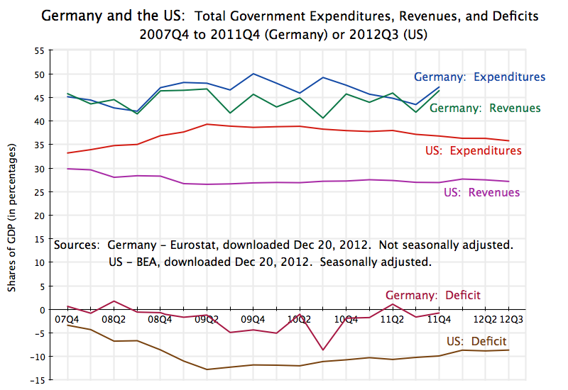
- Germany appears to be an exception, with a path followed for GDP above that of the US, although with a narrowing since mid-2011. But while Germany has argued most strenuously and forcefully on the need for other European countries to follow austerity policies, its own internal government spending policies have been expansionary. This is surprising given its rhetoric, and will be reviewed in a separate post on this blog which will be prepared after this one. And it is also important to note that even with this performance, German GDP was only 2% higher in the third quarter of 2012 than it was in the first quarter of 2008, for a compound growth rate of only 0.4% per annum over four and a half years.
- Each country has its own story, and it is not possible to review them all here. But it is clear that for the Eurozone area as a whole, as well as for the UK but with the exception of Germany (which kept to expansionary government spending), the austerity programs launched in 2010 and 2011 have led to stagnation at best and falling output for most.
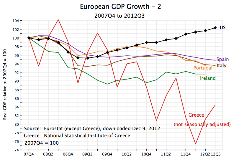
C. Southern Europe and Ireland
There are two other groups of European economies where the response to austerity programs is of interest. The first is the group of mostly Southern European economies were strict austerity policies were imposed as conditions of support programs from the IMF and the rest of Europe. Funds were lent in these programs to those governments to enable them to continue to repay their creditors (who were in large part banks from Northern Europe). This is the group affectionately known as the PIIGS, for Portugal, Italy, Ireland, Greece, and Spain.
The austerity measures led to collapses in output. (A seasonally adjusted series is not available for Greece, but its path is clear.):

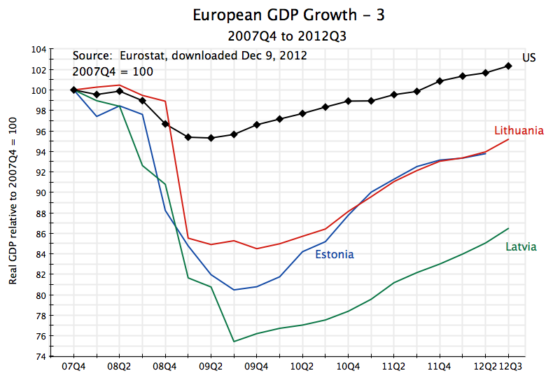
D. The Baltics
The other group of interest is the three small Baltic countries: Estonia, Latvia, and Lithuania. They were each severely impacted by the 2008/09 financial collapse, and each responded with stern austerity programs. With strong growth over the last three years in each of them, these countries are sometimes held as examples of how austerity programs can lead to growth. But this ignores the depth of the downturns that resulted from their austerity measures. From the fourth quarter of 2007 to their troughs in 2009, GDP fell by 15% in Lithuania, by almost 20% in Estonia, and by an astounding 25% in Latvia. There has been growth since then, but their current output remains far below where it was in 2007:

Some have argued that the countries had no choice. Estonia is a member of the Eurozone, and could not as a result depreciate an independent currency without leaving the Eurozone. As in the other Eurozone members, monetary policy for Estonia is determined centrally by the European Central Bank, and fiscal policy is constrained by the extent to which the country will be able to borrow in the financial markets to finance any deficits. But as noted above, the aim here is not to ascertain whether or not the countries had any policy choice on whether to follow some austerity program (or how severe that austerity program should have been), but rather what the impacts on growth have been of the austerity programs followed. And the impacts have been negative.
Lithuania and Latvia had more scope in terms of policies they could have followed, since their currencies, while tied (by government decision) to some rate vis-a-vis the euro, are still independent currencies. The governments could have chosen to devalue these currencies, which would have spurred their exports. However, they decided not to, and instead decided to follow programs of severe fiscal austerity. Output collapsed.
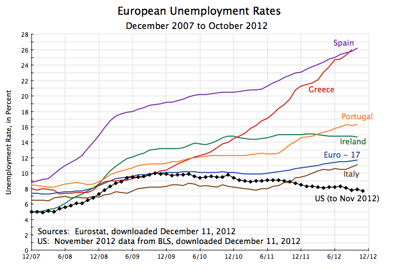
E. Unemployment
The fall in output resulting from the austerity measures is bad enough by itself. The loss in output is a loss in real resources, which could have been used for productive purposes. But the tragedy is in fact much worse, as the pain from falling output is not spread evenly over the population, but rather is concentrated among a few. In particular, those who lose their jobs and become unemployed see a drop not only in their current living standards, but for many also a permanent loss in their real standard of living, and for all a psychological burden as well.
It is therefore tragic to see how unemployment rates have risen, to almost 12% for the Eurozone as a whole, and to 26% in Spain and Greece following their particularly severe austerity programs:
 F. Conclusion
The austerity programs implemented in Europe killed the recoveries which were underway in 2009/2010, and led to double-dip recessions. Unemployment had started to decline in the Eurozone area as a whole, but then rose following the new austerity programs, reaching a rate of almost 12% recently. The US economy has so far fared better, with positive growth and a decline in the unemployment rate from a peak of 10.0% to a rate of 7.7% in November 2012.
But there is now the strong danger that if the negotiations under the threat of the fiscal cliff leads to new austerity measures, with expenditure cuts and tax increases starting in 2013 in order to reduce rapidly the federal fiscal deficit, that the consequences in the US will be similar to that which has been seen in Europe.


You must be logged in to post a comment.