Raising the Minimum Wage Has Not Led to Higher Unemployment: Evidence from California

A.  Introduction

California has aggressively increased its minimum wage since 2014, starting on July 1 of that year and then with increases on January 1 of each year from 2016 through to 2024.  Critics have argued that this would increase unemployment, saying that firms would no longer be willing to employ minimum-wage workers at the new, higher, minimum wage rates.  They argued that the productivity of these workers was simply too low.  If they were right, then one would have seen increases in the unemployment rate in the months following each of the steps up in the minimum wage.  But there is absolutely no evidence that this happened.

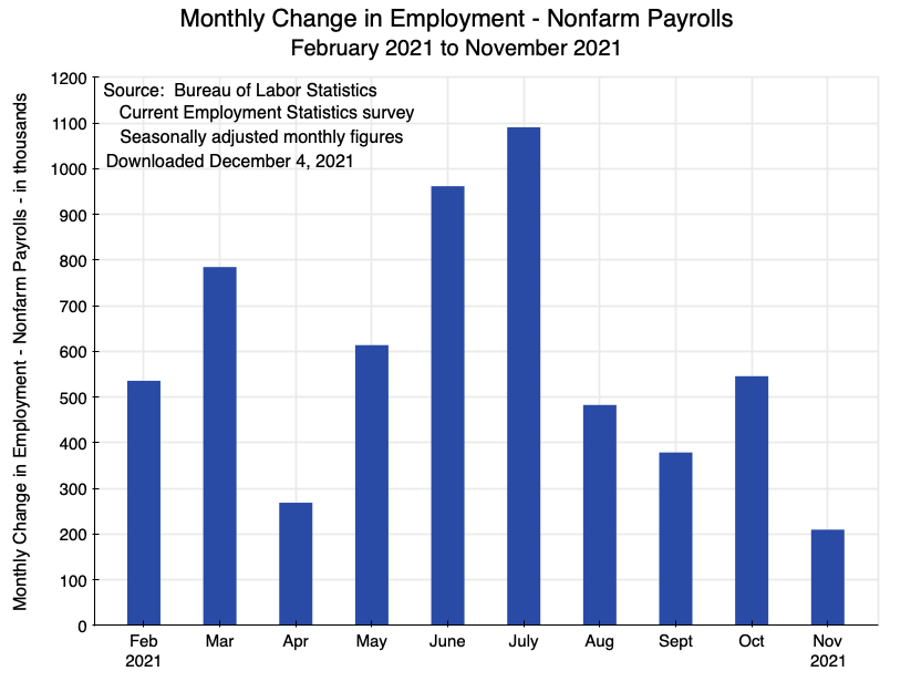
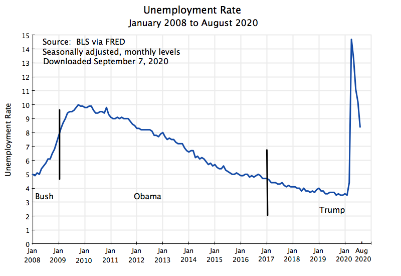
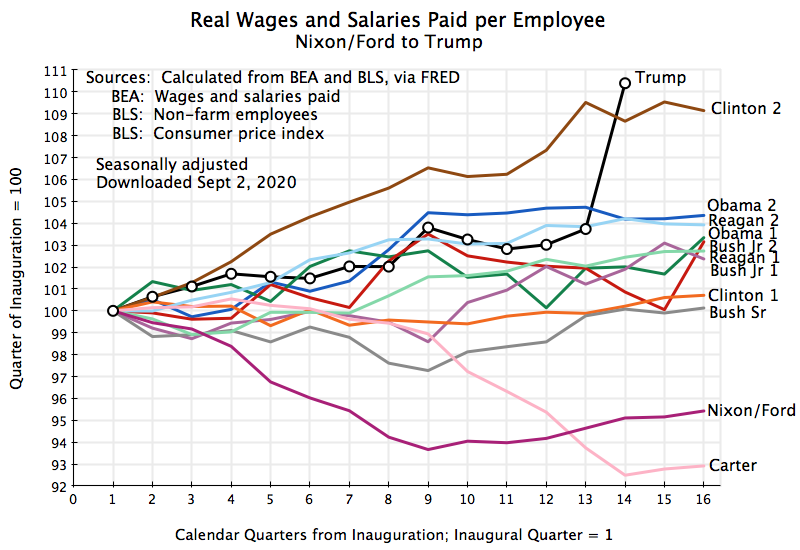
The chart at the top of this post shows this lack of a response graphically.  It may be a bit difficult to see as showing a lack of a response is more difficult than showing the presence of a response.  The chart will be discussed in more detail below, but briefly, it shows the averages in each of the subsequent 12 months following the increases in the California minimum wage (including or excluding 2020 to 2022, as the Covid disruptions dominated in those years), of the change in the unemployment rate in California versus the change in the unemployment rate in the US as a whole.  The changes are defined relative to what the unemployment rates were in the month before the increase in the minimum wage – i.e. the comparison is normally to the rate in December when the new minimum wage became effective on January 1.  The unemployment rate of course goes up and down depending on macro conditions (and was normally going down for most of this period), so to control for this the changes in the unemployment rate in California are defined relative to the changes in the US as a whole.

What was the result?  The chart shows that basically nothing happened.  If anything, what was most common was that the unemployment rate fell slightly in California relative to the rate in the US in the months following increases in the California minimum wage.  These changes were small, however, and are not really significant.  But what is clear and significant is that aggressive increases in the minimum wage in California have not led to increases in unemployment in the state.  The assertion that they would is simply wrong.

As noted above, this chart will be discussed in more detail below.  But the post will first look at the changes in the minimum wage in California since 2014, and how the minimum wage in California compared to the federal minimum wage for the US as a whole as well as to several measures of wages in the US and to the federal poverty line.  Following a look at the (non)-impact on unemployment, we will for completeness also examine what happened to labor force participation rates.  Some might argue that minimum-wage workers who would have lost their jobs might then have left the labor force (in which case they would not have been counted as unemployed).  But we will see that labor force participation rates in California also did not change following increases in the minimum wage.  Finally, the post will discuss possible reasons for why increases in the minimum wage in California did not lead to a rise in unemployment there.  Standard economics under the standard assumptions would have predicted that it would have.  But those standard assumptions do not reflect well what is happening in the real world in labor markets.

B.  The Minimum Wage Rate in California

The federal government sets a minimum wage that applies to the US as a whole.  But due to gridlock in Congress (and opposition by Republicans), the last time the federal minimum wage was raised was in July 2009, when it was set at $7.25 per hour.  As was discussed in a post on this blog from 2013, when adjusted for inflation this minimum wage was below what we had in the Truman administration in 1950, despite labor productivity now being more than three times higher than then.  And from July 2009 to now, inflation has effectively reduced the value of the $7.25 wage of July 2009 to just $4.97 (based on the CPI).  The federal minimum wage has simply become irrelevant.

Due to this lack of action at the federal level. many states have legislated their own minimum wage rules for their respective jurisdictions.  California is one, and has been particularly aggressive.  Over the past decade, the minimum wage in California has been increased to $16 per hour generally and most recently to $20 per hour for fast-food restaurant workers:

California Minimum Wage Recent History

Effective date 25 employees or less 26 employees or more
Jan 1, 2008 $8.00 $8.00
July 1, 2014 $9.00 $9.00
Jan 1, 2016 $10.00 $10.00
Jan 1, 2017 $10.00 $10.50
Jan 1, 2018 $10.50 $11.00
Jan 1, 2019 $11.00 $12.00
Jan 1, 2020 $12.00 $13.00
Jan 1, 2021 $13.00 $14.00
Jan 1, 2022 $14.00 $15.00
Jan 1, 2023 $15.50 $15.50
Jan 1, 2024 $16.00 $16.00
Fast food restaurant employees:
Apr 1, 2024 $20.00 $20.00

Sources:  California Department of Industrial Relations.  See here and here.

The focus of this post is on the series of increases that began on July 1, 2014, with the prior minimum wage set as of January 1, 2008, shown for reference.  That 2008 rate was $8.00 per hour and was raised effective on July 1, 2014, to $9.00 per hour.  California then began to increase the minimum wage annually starting January 1, 2016, with this continuing up to and including on January 1 of this year (2024).  Furthermore, effective January 1, 2017, California began to set separate minimum wage rates for workers employed in businesses with 25 employees or less or with 26 employees or more.   These could differ, although recently they have not.

Finally and most recently, California set a new minimum wage effective on April 1, 2024, of $20 per hour for employees of fast food restaurants (in restaurant chains with 60 or more locations nationwide).  I include this here for completeness, but it is still too early to say whether this has had an impact on unemployment.  So far it has not, but as I write this state-level unemployment data is available only for the months of April and May.  But those figures do not provide any support for the critics:  The unemployment rate in California in fact fell in those two months compared to that in the US.  This will be discussed below.

The general California minimum wage has now doubled – to $16 per hour – from the $8 per hour it was prior to July 1, 2014.  But for a sense of what this means, it is useful to put this in terms of various comparators:

California Minimum Wage:  Selected Comparisons

California minimum wage in firms with 26 employees or more

California Minimum Wage per hour Ratio to US median wage of hourly workers Ratio to US average hourly earnings of all private sector workers Ratio to Poverty Line for family of four Ratio to upper limit of earnings of first decile of US wage & salary workers
2008 $8.00 65% 38% 76% 93%
2014 $9.00 68% 37% 76% 94%
2016 $10.00 71% 39% 83% 102%
2017 $10.50 72% 40% 86% 103%
2018 $11.00 73% 41% 89% 104%
2019 $12.00 78% 43% 94% 109%
2020 $13.00 79% 46% 100% 111%
2021 $14.00 82% 47% 107% 115%
2022 $15.00 83% 47% 109% 113%
2023 $15.50 81% 47% 104% 108%
2024 $16.00 46% 104% 108%
Fast Food:
April 2024 $20.00 58% 129%

The comparisons here are based on the California minimum wage for employees in businesses with 26 or more employees.

The wage measures come from various reports produced by the Bureau of Labor Statistics (BLS).  The first column (following the column with the California minimum wage) shows the ratio of that minimum wage to the BLS estimate of the US median hourly earnings of wage and salary workers paid an hourly wage.  The ultimate source for this is the Current Population Survey (CPS) of the BLS, and this particular series is only provided annually (with 2023 the most recent year).  The California minimum wage rose from 65% of this median wage of hourly workers in 2008 to 83% in 2022 and 81% in 2023).  By this measure of wages – of wage and salary workers paid an hourly wage – the California minimum wage rose significantly in comparison to what a median hourly worker was being paid nationally.

A broader measure of wages is provided in the next column.  The ratios here are for a worker being paid the California minimum wage to the average hourly earnings of all private sector workers – not just workers paid at an hourly rate.  This is also provided by the BLS, but comes from its Current Employment Statistics monthly survey – a survey of business establishments that asks firms how many they employ and what they were paying those workers.  These average wages are higher as they cover all workers and not only those paid at an hourly rate, plus the average will be higher than the median in cases such as this (as the distribution of wages paid is skewed to the right).  By this measure, the California minimum wage rose from 38% of what US private sector workers were being paid on average in 2008 (and 37% in 2014) to 46-47% since 2020.

In terms of the federal poverty line, even full-time workers (40 hours per week for 52 weeks each year) paid the minimum wage in California in 2008 or even 2014 would have been able to earn only 76% of the poverty line income for a family of four.  But with the increases in the minimum wage in the past decade, they would have finally been able to reach that poverty line in 2020, and then 109% of it in 2022.  In 2023 and again in 2024, it would have been 104%.

The final column shows earnings at the California minimum wage compared to the earnings that would place a worker in the first decile (the bottom 10%) of the distribution of earnings of full-time wage and salary workers.  These are also estimates from the BLS, are expressed in terms of usual weekly earnings, and are issued quarterly based on results from the CPS surveys.

With the increases in the California minimum wage over the past decade, full-time workers earning the minimum wage in California had incomes that exceeded the upper limit of the earnings of wage and salary workers in the US as a whole who were in the first decile of the earnings distribution – ranging from 102% of what the bottom 10% earned in 2016 to 115% in 2021 and 108% currently.  Assuming the distribution of earnings in California would be similar to that in the US in the absence of the special California minimum wage laws, this can provide a rough estimate of how many workers were being affected by the California minimum wage laws.

If earnings at the California minimum wage would have matched the earnings at the upper limit of the first decile (i.e. a 100% ratio), the implication would be that the share of workers for which the California minimum wage was applicable would be 10%.  With the ratio above 100% (by varying ratios up to 115%) the share affected would have been somewhat more than 10% – perhaps 11 or 12% of workers as a rough guess.  But the BLS data is not for the entire labor force.  Rather, it is only for wage and salary workers employed full-time.  One has, in addition, part-time workers and those who are self-employed.  The distribution of hourly earnings among those workers is not available, but if it is similar to the hourly earnings of full-time workers, the share affected would be the same 10% (or more).

The purpose here is just to provide a general feel for how many minimum wage workers were being affected by the changes enacted in the California minimum wage over the past decade.  Various factors cannot be accounted for, but they are at least in part offsetting.   For the purposes here, a reasonable estimate would be that at least 10% of the labor force had wages so low that the increases in the minimum wage in California over the last decade had an impact on what they would then be paid.  That is a not insignificant share.

C.  The Impact of Increases in the Minimum Wage on Unemployment

What impact did those increases in the California minimum wage then have on the employment of workers who were being paid the minimum wage? Critics of the minimum wage argue that workers are paid a wage based on their productivity, and if they are being paid at or close to the minimum wage this is only because their productivity is low.  In this view, if the minimum wage that has to be paid is then raised, those workers will be let go and will become unemployed.  Did we see this?

No, we did not.  The evidence from the ten different increases in the minimum wage in California over the past decade (from July 2014 to January 2024) does not show any impact at all on unemployment.  The chart at the top of this post summarizes the results.

The chart is based on calculations using data on the unemployment rate in California and on the unemployment rate in the US as a whole, where I calculated the unemployment rates from underlying data on the number unemployed and the number in the labor force (as published unemployment rates themselves are shown only to the nearest 0.1% point – anything less is not considered significant).

For numerous structural reasons, the unemployment rate in any particular state (including California) will differ from the rate in the nation as a whole.  These structural reasons include the age structure of the population (middle-aged workers are less likely to be unemployed than young workers), the education structure (college-educated workers are less likely to be unemployed than workers with only a high school education), the industrial structure, the racial and ethnic mix of the population, and much more.

But while these structural factors affect the level of the unemployment rate in California relative to the national average, such structural factors change only slowly over time and hence do not have a significant impact on the month-to-month changes in that rate.  The rate of unemployment itself can, however, change significantly from month to month at the national (as well as state) levels due to macroeconomic factors.  In a recession the rate of unemployment goes up, and in a recovery or during periods of rapid growth, the rate of unemployment goes down.  It is just that in the absence of some state-specific event (such as – possibly – a change in its mandated minimum wage), the month-to-month changes in the unemployment rate at the state level will generally be similar to the changes seen at the national level.  They move together, as affected by macroeconomic factors.  The question being examined is thus whether the increases in the minimum wage in California over the past decade led to an increase in the unemployment rate in California in the months following those changes in the minimum wage, as compared to what was observed for the unemployment rate nationally.

This is a simple form of what is called the “difference-in-difference” method.  What is significant is not whether unemployment in California went up or down during the period, but whether it went up or down by more than what was seen at the national level in the same period.  For example, define the changes as relative to the month prior to a change in the minimum wage law (i.e. normally relative to what the rate was in December, as all but one of the changes were effective on January 1 of each year).  The employment and unemployment statistics (gathered by the BLS as part of the CPS household surveys) take place in the middle week of each month, so the mid-January unemployment rate will be treated as month one following the change in the minimum wage.  The mid-February unemployment figures will then be month two, and so on until mid-December of that year will be month twelve.  The minimum wage was then increased again in the next January 1, and the annual cycle was repeated for a second set of observed impacts (or non-impacts).  The changes in the unemployment rate are thus defined as the difference between changes in the California rate for the given number of months following the change in its minimum wage (i.e. in month one, or in month two, and so on to month twelve), relative to what the changes were in the same period for the US as a whole.

As a concrete example using made-up numbers, suppose that in some December the unemployment rate in California was 6.0% while the unemployment rate in the US as a whole was 5.0%.  Suppose then that in, say, month three (March) the observed unemployment rate in the US was 4.5% – a fall of 0.5% point over the period.  If the unemployment rate in California fell to 5.5% in the same period (to March), then the change in California was the same as the change in the US as a whole, and the increase in the minimum wage on January 1 did not appear to have any differential effect.  If, however, the unemployment rate in California fell only by, say, 0.3% points to 5.7%, while the US rate fell by 0.5% in the same period, one would say that it appears the increase in the minimum wage in California led to an increase in its unemployment rate by 0.2% points.  And if the rate in California fell by 0.7% points to 5.3% while the US rate fell by 0.5%, then there was a 0.2% point reduction in the unemployment rate in California following the change in its minimum wage rate.

There will of course be statistical noise, as all the figures are based on household surveys.  And importantly, in any given year there will also be special factors that could enter in that particular year that could affect the results.  More is always happening than just a change in the minimum wage law.  But to address this we have that California changed its minimum wage law on ten separate occasions over this ten-year period.  We therefore have ten separate instances, and we can work out the average over those ten separate episodes.  While special factors may have arisen in any given year, the only common factor in all ten was that California raised its minimum wage ten separate times.

(The exception in the averages is for the January 1, 2024, increase in the minimum wage,  As I write this, we only have data for the five months through May.  Thus the averages over up to the full ten instances can only be calculated for the first five months, while the averages for months six through twelve can only be for the nine cases to 2023.  Also, note that for the July 1, 2014, increase in the minimum wage, the changes were defined relative to the California and US unemployment rates in June, with the subsequent twelve months then covering July 2014 to June 2015.)

Those average impacts were then remarkably small:

Average Changes in the California Unemployment Rate less Changes in the US Unemployment Rate, in the Months Following an Increase in the California Minimum Wage (in percentage points)

Months from Minimum Wage Change July 2014 –   May 2024 July 2014-2019,                   and 2023 – May 2024
0 0.00% 0.00%
1 -0.02% 0.01%
2 -0.06% -0.05%
3 -0.05% -0.04%
4 -0.07% -0.05%
5 0.00% -0.10%
6 -0.00% -0.09%
7 0.03% -0.08%
8 0.04% -0.10%
9 -0.04% -0.05%
10 -0.02% -0.05%
11 -0.02% -0.05%
12 0.02% -0.03%
Overall average -0.02% -0.06%

The chart at the top of this post shows this table graphically.  The two columns are for averages over the full period and with the years 2020 to 2022 excluded.  The Covid disruptions dominated in those years, but the results are basically the same whether those years are included or excluded.

The changes were all essentially zero.  It is not possible to see any increase in the California unemployment rate at all resulting from the increases in the minimum wage in the state over the past decade.  If anything, the increases in the minimum wage were associated in most cases with a small reduction in the unemployment rates.  But these are all small, and are probably simply statistical noise and not significant.

To put this in perspective, recall the discussion above that arrived at the rough estimate that the share of the labor force being paid at or close to the minimum wage might be around 10%, and possibly more.  If – as the critics argue – such workers can be paid only those low wages because their productivity is so low, then they would all lose their jobs if their employers were required to pay them a higher wage.  If true, the unemployment rate would then shoot up by 10% points.  One obviously does not see that.

If we had over-estimated the share employed at the minimum wage by a factor of two, so that it was in fact 5% rather than 10% of the labor force, then the unemployment rate would have shot up by 5% points.  One does not see that either.  One does not even see an increase of 1% point, nor, for that matter, even 0.1%.  The overall average change is in fact generally a small decrease in the rate of unemployment in California relative to the US rate in the months following an increase in the minimum wage, although I suspect this is just statistical noise.

Most recently, California raised the minimum wage for workers at fast food restaurants (at chains with 60 or more locations nationally) to $20 per hour effective April 1, 2024.  We so far only have data for April and May as I write this, but that data provides no support for the belief that this has led to an increase in the unemployment rate.  Fast-food workers are of course only a small share of the labor force:  about 2.2% in California in 2023 based on BLS data for fast-food and counter workers (where fast-food workers make up about 80% of this total in national data).  But in the two months since the April 1 increase to $20 per hour for fast food workers, the California unemployment rate relative to that in the US in fact fell by 0.06% points in April compared to March, and by 0.25% in May compared to March.  It did not go up but rather went down.

Finally, it is possible that critics of the minimum wage may argue that low-wage workers laid off following an increase in the minimum wage will then leave the labor force entirely.  If they did this, they would then not show up in the unemployment statistics and one would not see an increase in the observed unemployment rates.  To be counted as unemployed in the BLS surveys, the unemployed person must have taken some positive action in the prior four weeks to try to find a job (e.g. send out applications, visit an employment center, and similarly) and yet was not employed at the time of the survey.  If they did not take such an action to try to find a job, they would not be counted as “unemployed”.  Rather, they would be counted as not participating in the labor force.

Therefore, for completeness, I calculated what happened to the Labor Force Participation Rate in California compared to the US rate in the months following the increases in the California minimum wage.  The data comes from the BLS (but is most conveniently accessed via FRED, for the US and the California rates respectively):

Average Changes in the California Labor Force Participation Rate less Changes in the US Labor Force Participation Rate, in the Months Following an Increase in the California Minimum Wage (in percentage points)

Months from Minimum Wage Change July 2014 –  May 2024 July 2014-19,                       and 2023 – May 2024
0 0.00% 0.00%
1 -0.01% -0.06%
2 -0.02% -0.10%
3 -0.07% -0.11%
4 0.04% -0.10%
5 0.01% 0.01%
6 0.11% 0.00%
7 0.06% -0.08%
8 -0.02% -0.03%
9 -0.11% -0.10%
10 -0.11% -0.05%
11 -0.04% -0.05%
12 0.02% 0.02%
Overall average -0.01% -0.05%

As with the unemployment rates, there was no significant impact.  Had the 10% of the workers being paid at or close to the minimum wage dropped out of the labor force following the increases in the minimum wage, the figures would have shown a 10% point reduction in the California labor force participation rate.  One does not see anything remotely close to that.  One does not see an impact of even 1.0% point.  There was simply no significant impact on labor force participation rates.

Thus, the data indicates the minimum-wage workers remained in the labor force and did not become unemployed.

D.  The Economics of How Wages are Determined:  In Theory and in the Real World

Economic analysis, when done well, will be clear on what conditions are necessary for certain propositions to hold.  Under those conditions, one might be able to arrive at interesting conclusions.  But a good analyst will examine whether there is reason to believe that those conditions reflect what we should expect in the real world.  Often they do not.  That is, what is of interest is not simply some proposition in isolation, but rather also under what conditions one can expect that proposition to hold.

The economics of how wages are determined is a good example of this approach.  One can show that, under certain conditions, the wages paid to a worker would reflect the value of the marginal product of that worker – that is, the value of the increase in output that was made possible by hiring that worker.  But one should then look at the conditions that are necessary for this to follow.  And in the case of wage determination, they are not at all realistic, particularly for low-wage workers.  The implication is that one should not expect the wages of these workers to reflect necessarily the value of the marginal product of such a worker.

A problem, however, is that some commentators do not follow through and examine the conditions necessary for the theoretical conclusion to hold.  That is, they stop at the proposition that workers will be paid the value of their marginal product, and fail to look at whether the conditions under which that proposition would hold are realistic.  They thus conclude, for example, that increases in the minimum wage will lead to the layoff of all the workers who were being paid the prior minimum wage.  In their world, those workers are being paid a low wage because their productivity is low, and if firms are then required to pay a higher wage then those workers – these analysts conclude – will be laid off and indeed not be employable anywhere.  They assert that their productivity is too low.

Yet as we saw above, we see nothing at all close to this in the data.  California raised its minimum wage repeatedly in the last decade, and in a significant and meaningful way.  We saw that it led to a significant increase in the wages of such workers compared to the overall wage structure in the US.  Yet the unemployment rate in California did not increase at all in the months following those increases.

What, then, are the conditions that are necessary for this theoretical model of wage determination to hold?  And how realistic are they?  This section will provide a brief discussion of that theoretical model, and will then examine some of the conditions necessary for it to hold.  It will not be a comprehensive discussion of all the issues that could arise.  There are others as well.  Rather, the purpose is to show for one set of reasons (there could be others also), the simple notion that wages will be equal to the value of the marginal product of the worker does not reflect the reality of how wages are determined.

a.  The Standard Neoclassical Model of Wage Determination

In the standard model of neoclassical economics, it can be shown that the wages of a worker will equal the value of the marginal product of the worker.  This can be shown to hold under the assumption of “perfectly competitive markets” for both labor (hired as an input) and for firms (hiring the labor).  But for such perfectly competitive markets to exist, one needs:

1.  On the side of the firms, there are many firms within a small geographic zone (small enough that commuting costs to the firms will not differ significantly) that are all competing with each other to hire labor with any given skill set.  That is, the markets are “dense”, with many firms competing for that labor.

2.  On the side of labor, there are many workers with each given skill set who are competing with each other and are seeking to be employed within that geographic zone.

3.  There are no lumpy fixed costs incurred by the firms in hiring or firing a worker, nor are there any lumpy fixed costs for a worker in finding and being hired into a new job.  Economists refer to this as no transaction costs.  That is, that there are no costs incurred (neither on the part of the firm nor the worker) when a worker is fired and replaced with another.

4.  There is full information freely available to all parties on what skills are required for a job, what skills each worker has, and how any worker will perform in any job.  Both the firms and the workers know all this, with no cost to obtain such information.

5.  Production is a smooth, upwardly rising (up to some limit), and always concave function of the hours any individual laborer provides for a job.  Concave means that while the curve is rising, it is rising by less and less as the hours provided by the laborer increases.  That is, there are no “bumps” in the curve.  The slope of that curve at any given number of hours of labor is the marginal product of the laborer at that number of hours.  That is, the slope indicates how much additional output there will be with one additional unit of labor being provided.

If all of the above holds, then one should expect that firms will pay in wages, and workers will receive, the value of the marginal product of what the workers produce.  If workers were paid less than this, they would know the value of what they produce is in fact more and they would immediately move to a nearby competing firm that is willing to pay them up to the value of their marginal product.  And if firms paid more than this, then competing firms could take away business from the firms paying the higher wages.

In this system, workers will thus be paid the value of their marginal product – no more and no less.  And if this were true in the real world, then a mandate from the government to pay a higher minimum wage would mean that all those workers whose productivity was below the new minimum wage rate would be let go.  They would become unemployed and indeed unemployable, as this set of assumptions implies that the productivity of such workers is simply too low for any firm to be willing to pay them the new minimum wage.

b.  But the real world differs

Laying out the assumptions necessary for the neoclassical theory of wage determination allows us then to see whether those assumptions correspond to what we know about the world.  They do not:

1. Markets are rarely dense.  There are usually only a few firms – and often even no other firms hiring workers with similar skills – within a geographic zone so small that a worker is indifferent as to whom they would go to work for.  There may be few or even no firms nearby that a worker could threaten to move to if they are being underpaid.  And the few firms that are there may well follow what they consider to be informal “norms” on what such workers should be paid, rather than compete with each other and bid up the local wages.

2.  There are transaction costs for both a firm considering to fire a worker and then to hire a new worker as a replacement, and for a worker when considering a move to a new employer.  There are major costs incurred by both.  Switching between employers is far from cost-free, so it is rarely done.

3.  There can also be more overt constraints imposed on labor mobility and hence the ability of a worker to threaten to leave for a better-paying job.  Noncompete clauses in many labor contracts – including for low-wage workers – may legally block workers from switching to a new employer in the industry where that worker has the particular skills to do well.  The FTC has estimated that 18% of all US workers are covered by noncompete clauses.  The FTC thus approved on April 23, 2024, new regulations banning their use.  While the rule is scheduled to enter into effect on September 4, 2024, it will undoubtedly be challenged in court, with this leading to delays before it can enter into effect (if it ever does).

There is also the separate practice of antipoaching clauses.  These are common in the fast-food industry as well as in other national chains of franchises.  The antipoaching clauses are not in the labor contracts themselves, but rather in the franchise agreements between the franchise owner and the national firm.  They require that the franchise owner not employ any individual who had worked at another franchisee’s establishment sometime before – typically at some point in the prior six months.  McDonald’s claims it ended requiring those clauses in its franchisee contracts in 2017, and several states have banned the practices within their borders.  But McDonald’s is still being sued in court, and it appears the practice remains common.  The new FTC rule – if upheld in court – may apply to these practices as well.

4.  Information is also far from complete nor is it cost-free.  A firm can never know for sure how a particular worker will perform in a job until they are already on the job (with it then costly to fire and replace them in case the performance is not good).  Nor will the worker easily know what all the job opportunities are out there, and what he or she would be paid at some alternative firm.

The relevant information may also be more readily available to one side of the transaction than to the other – what economists call “asymmetric information”.  The worker may know well his or her skills and abilities, but the prospective hiring firm will not.  Similarly, the hiring firm may know well what is needed to do well in a job, but the prospective worker will not.  Also, doing well in a particular job is more than simply a skill set.  It also requires an ability to work well with colleagues and a willingness to take the work seriously.

Firms will thus be cautious in hiring and may only be willing to pay a relatively low wage to new workers to start.  Alternative firms will act similarly, as those firms are also unsure how well a new employee might work out (information is not complete).  Thus they too will only offer a relatively low wage to start.  Plus there are significant costs in the hiring and firing process itself.  All this serves to lock in workers at the firms where they are now, without a credible threat to move elsewhere if their wages are not raised to reflect their full productivity.

5.  Workers also gain firm-specific skills simply by the time they spend at the job.  This spans the range from skills for the specific tasks that the job entails, to understanding better how the firm approaches what they want from those in these jobs, to getting to know colleagues better and their specific likes, dislikes, and how they do things.  These skills are helpful, and lead to the worker becoming more productive at that particular firm.

But while a worker may see his or her productivity rise over time at some particular firm, they will not necessarily see their wage rise by the same amount.  That is, the workers would be paid less than the value of their marginal product.  While the firm might pay the worker somewhat more simply to help lock them in, this would not necessarily reflect the full amount of their higher productivity at that firm.  The worker would not have a credible threat to leave to go to a competing firm where he or she would be paid more.  Their productivity at an alternative firm – where they would once again be starting out – would not be as high and those firms would not be willing to offer a higher wage.

6.  There is also a more fundamental problem in the ability (or rather inability) to ascertain what the productivity is of an individual worker.  One of the assumptions of the neoclassical economic analysis noted above is that the relationship between the input of individual workers and the output of the firm is strictly concave.  That is, as the input of the worker goes up (more hours) there will be a smooth decline in the extra output of the firm as a result of the increased labor input, with no “bumps” in that curve.

Economists call this diminishing marginal returns.  If one increased labor input by a unit, one would see some increase in output.  Increase the labor input by another unit, one would see an increase in output again, but by less than in the first step.  And when the relationship is strictly convex, the increase in output would be less and less for each unit increase in labor input, up to a point where there would be no further increase in output (and after which it might even decline).

Reality is more complex.  Those working in firms are not working simply as individuals but as part of teams.  Adam Smith in the first few pages of The Wealth of Nations in 1776 already noted how far more productive workers can be when working in teams than when trying to do it all individually – the famous pin factory.  It still applies today, and not simply in factories.  Take, for example, a team working a shift at a fast food restaurant.  There may normally be a team of, say, ten for a particular shift.  Each worker has different responsibilities, but most of the workers have the skills to do most or perhaps all of the individual tasks.

In this made-up example, they arrived at a team of ten as normally best to handle a particular shift based on how the tasks can be divided up and given the number of customers they normally expect.  It would be difficult to do with just nine, and not much gained with an extra worker and thus eleven on that shift.

What then is the marginal product of each of the workers?  They need to know this to determine what wages they could pay in the standard neoclassical theory, but it is not well defined.  Starting with any grouping of nine workers, the marginal product from hiring a tenth worker would be relatively high as they then could organize into the optimal team of ten.  But any one of the workers could be considered to be the tenth one added to the team, and hence responsible for the jump in output in going from what is possible with just nine workers to the more productive team of ten.  And if all of the workers were paid a wage corresponding to that jump in output that is possible when going to a full team of ten, they would together be paid more than the overall value of what is being produced with a team of ten.

While the workers would likely welcome such higher wages, the reality is that fast-food restaurants do not aim to operate at a loss.  And they don’t.  Their workers are simply not paid that much.  There are fundamental conceptual problems in trying to define the marginal product of a worker when work takes place in teams (as it normally is).

E.  Final Points and Conclusion 

California has raised its minimum wage repeatedly in the past decade, but there is no indication in the data that this has led to an increase in unemployment.  While economic theory would predict that in “perfectly competitive markets” the workers being paid below the new minimum wage would be laid off (as wages are set, under these assumptions, based on productivity, and they assert that the productivity of such workers is simply too low), this only holds under unrealistic assumptions.  Wage determination is more complex.  In the real-world conditions under which wages are in fact set, it is not a surprise to find that unemployment did not in fact go up.

This does not mean, however, that any increase in the minimum wage would not lead to higher unemployment.  If the minimum wage was set next year at, say, $100 per hour, one should of course expect issues.  What we see in the data is not that there can be any increase in the minimum wage with then no consequences for unemployment, but rather that the increases in the minimum wage that were mandated in California in the last decade did not lead to an increase in the rate of unemployment.

Increases in the minimum wage may also lead to increases in the prices of certain goods.  If the production of those goods were heavily reliant on minimum wage workers, and the firms would now have to pay a higher wage for those workers, it may well be the case that such goods will now only be available at a higher price.  Fast-food hamburgers may go up in price, but don’t view this as simply affecting “junk food”.  The prices of blueberries and strawberries might go up as well.

Does this mean that the critics of the minimum wage are in fact right?  No, it does not.  First, it remains the case that unemployment did not go up following the major increases in the minimum wage in California over the past decade.  The critics asserted that it would.

Second, while prices of fast-food hamburgers may have gone up following the increases in the minimum wage, those prices did not go up by as much as the minimum wage did.  If wages in fact reflected the value of the marginal product of the worker, the wages of the minimum wage workers would still have gone up relative to that value – just not by as much.  Under this theory of wage determination, they would still have been laid off.  But there is no evidence of this in the data.

Labor markets operate far from what economists would call “perfectly”.  In this reality, minimum wage laws can play a valuable and indeed important role.

The November Jobs Report Was Actually Quite Solid: One Should Not Expect More Going Forward

A.  Introduction

The Bureau of Labor Statistics (BLS) released its regular monthly “Employment Situation” report, for November 2021, on Friday, December 3.  The report is always eagerly awaited.  It provides estimates for the net number of new jobs created in the most recent month, as well as figures on the unemployment rate, certain wage measures, and much else.

The initial reaction to the report by the media was negative.  Net job growth, estimated at 210,000 in the month, was viewed as disappointing.  This was down from 546,000 net new jobs in October, and was well below Wall Street expectations (based on a survey of Wall Street firms by Dow Jones) that the figure for November would come to 573,000.  While it was noted that the unemployment rate also fell – to just 4.2% – the negative reaction contributed to a significant decline in the stock market that day, with the S&P 500 index, for example, down by over 2% at one point.

But the November jobs report was actually pretty solid.  In this post, we will look at what was reported and some factors to take into account when examining such figures.

B.  Monthly Job Gains in 2021

The chart at the top of this post shows the current BLS estimates of monthly net job growth this year, starting in February to cover the period of Biden’s presidency  The estimates are based on a survey of establishments by the BLS, that asks (along with much else) the number of employees on their payroll as of the middle week of each month.  Hence the January numbers would have been for before Biden’s January 20 inauguration.  The news reports following the release by the BLS of the November jobs report were often accompanied by charts such as this one, with the November figure showing a substantial reduction in the number of net new jobs compared to what was seen in earlier months.  The question of interest is whether this was significant.

A number of factors should be taken into account.  One is simply that there is substantial month to month variation, as seen in the chart.  This may be in part due to fluctuations in the economy, but may also be due to idiosyncratic factors (such as how the weather was in the week of the survey) and to statistical noise.  The figures are based on surveys, and surveys are never perfect.  Examined in context, the change in the November figure from the prior month is similar to the changes seen in other months this year.  Indeed, it was less than in several.

There will, however, always be limitations with any single estimate, and in part for this reason the BLS provides in its published document a few different estimates for employment growth. The measure shown in the chart at the top is rightly considered the best one.  It is based on a monthly survey (called the Current Employment Statistics, or CES, survey) of business and other establishments (including government entities as well as non-profits such as universities and hospitals) – whoever employs workers.  The sample size is huge:  144,000 different businesses and government entities, at almost 700,000 different worksites.   The BLS indicates this “sample” covers approximately one-third of all such jobs in the US.

The numbers are specifically for nonfarm payroll jobs, and hence exclude those employed on farms (which is now small in the US – about 1.4% of workers based on figures from other surveys) and more importantly the self-employed (about 6% of the labor force).  Given the large sample size, and also recognizing that those in the sample include not only small firms but also large entities employing thousands of workers, statistical noise is limited.  However, even with such a large sample size, the BLS states that the 90% confidence interval on the month to month changes in employment is +/- 110,000.  At the more commonly accepted 95% confidence interval it would be wider.

Finally, the figures for the prior two months in each report are preliminary and subject to change as more complete data comes in.  The November report, for example, indicated the estimate of net new jobs in October had been revised up by 15,000, and for September by 67,000.  And the October report last month indicated that its earlier estimate for September had been revised up by 118,000.  That is, the initial estimate for September had been 194,000 net new jobs, but this was revised up a month later to 312,000 net new jobs, and then revised again in the estimates published this month to 379,000.  Such revisions are routine, and one should expect that the initial estimate for November of 210,000 net new jobs will likely be revised in the coming months as more complete data becomes available.  While the revisions can in principle be positive or negative, in an expanding job market (as now) they are likely to be positive.  

The figures in the chart are also seasonally adjusted.  This is done via standard algorithms that estimate the normal annual pattern of employment changes in any given month based on historical data.  Employment growth is normally higher in certain months of the year (such as June, following the end of the school year) and normally lower in other months (such as January).  Analysts will therefore usually focus on the seasonally adjusted figures to see whether certain trends are developing outside of the normal seasonal fluctuations.

This is indeed appropriate.  However, it is also worth recognizing that due to Covid, with the resulting lockdowns, opening-ups, quite prudent changes in consumer behavior due to the health risks from Covid-19 even with all the protective measures taken that can be taken, and the truly historic fiscal relief measures provided through the government budget to support households in the light of all these disruptions, seasonal patterns this year (and last) are likely to be not at all similar to what they have been historically.  It is therefore of interest also to look at the underlying employment estimates, before the seasonal adjustment algorithms are run, to see what those numbers might be saying.

The next section will look at this, along with other measures of the change in employment.

C.  Alternative Measures, and Long-Term Limits on What Employment Growth Could Be

As noted, the BLS makes available in its monthly Employment Situation report several measures of how employment is estimated to have changed in the month, in addition to the one discussed above.  These additional measures should not be seen as better measures (at least in normal circumstances) than the seasonally adjusted measure based on the findings from the huge CES survey of establishments.  Rather, it is best to see them as supplementary measures, or alternative measures, that together help us understand what may be going on in terms of employment. There is always uncertainty in any individual measure, as they are all estimates.  It is better to look at several, to see what the overall story might be.

The estimated change in employment in November (or, more precisely, the change in nonfarm payroll), based on figures from the CES survey of establishments, was 210,000 after seasonal adjustment.  But three alternative estimates for employment growth in November were far higher, as depicted in this chart:

In the CES estimate before the normal seasonal adjustment, the growth in net new jobs in November was 778,000.  This difference between the seasonally adjusted and non-seasonally adjusted figures is substantially greater than what one has normally seen for November.  Seasonal adjustment is complicated, but a simple average of the difference between the seasonally adjusted figures for November and the non-seasonally adjusted figures over the 20 years from 2000 to 2019, is 205,000.  But in November 2021 it was 568,000, suggesting something unusual.  If the November 2021 increase in the number of jobs was adjusted by 205,000 rather than the 568,000 estimated by the algorithms, then the “seasonally adjusted” change in the number of jobs would have been 573,000 (= 778,000 – 205,000).  This is exactly what the pre-release expectation was on Wall Street (as noted at the start of this post).  That it was exactly the same as the Wall Street forecast is just a coincidence, but the fact it was close at all might be significant.  It may be suggesting that the standard seasonal adjustment calculations, built from patterns historically seen for the month, might not have captured well the circumstances in this highly unusual year.

Quite separately, the BLS also has an employment measure from the monthly survey of households conducted by the US Census Bureau (with BLS input on what is asked), called the Current Population Survey (CPS).  This survey of a sample of 60,000 households is used by the BLS to determine how many are in the labor force (i.e. are working or are looking for work), whether they are employed (including self-employed and on farms), and thus the number unemployed (those in the labor force but not employed).  The BLS uses this to determine the unemployment rate, but to get to that they have to first estimate, based on this survey, how many are employed.

The November estimates based on the CPS of net new employment were 1,136,000 for the seasonally adjusted figure and 831,000 for the figure before seasonal adjustment.  Why the seasonal adjustment led to a reduction in the job growth estimate from the CPS while it led to an increase in the job growth estimate from the CES is not clear (seasonal adjustment is complicated), but in any case, both figures are relatively close to the 778,000 estimate from the CES estimate before seasonal adjustment.  And all three are all well above the 210,000 seasonally adjusted estimate from the CES that we normally focus on.  Together they suggest that the 210,000 estimate, while usually the most reliable one, might in this case be on the low side.

I have also included in the chart four figures for what I have termed the “long-term limits” on what monthly job growth might be for an economy at full employment.  I included them on the same chart so that one can easily recognize the relative scale.

For an economy at full employment (with unemployment at frictional levels), employment growth cannot exceed the growth of the adult population.  And indeed it will be less, as not all adults (defined by the BLS as all those in the population at age 18 and above) will be in the labor force – some will be retired, some will be students in college, some will have voluntarily left the labor force to raise children or provide care for others, and for other reasons.  Examining what these limits are for the US will provide a sense of what monthly employment growth might be, on average, in the coming years.

First, on population:  Population growth is relatively steady and predictable.  For the ten-year period from November 2011 to November 2021, it averaged 180,000 per month in the US.  It will be similar to this in the coming years, and it sets a (very) crude upper limit on what job growth could be in a steady state.  But one can see even from this figure that it will not be possible to sustain forever monthly net new job growth of even 200,000.  There will not be that many new adults available each month.

But 100% of the adult population are not in the labor force.  As noted, some will be retired, some students, and so on.  The labor force participation rate (LFPR) is the ratio of those who choose to be in the labor force (employed or looking for employment) to the adult population.  In the November CPS figures, that LFPR was 61.8%.  If one assumes that it will remain at that rate, then the monthly growth in the labor force will not be 180,000 (the growth in the adult population) but 61.8% of this, or 111,000.  And if one assumes that unemployment will be something steady, at say 4% at full employment, then potential employment growth would be even less, at 107,000.

The implication is that if the labor force participation rate remains where it is now, one should not be surprised to see monthly figures on job growth of no more than roughly 100,000.  This follows by simple arithmetic.  It could be higher for some period (but not forever) if the labor force participation rate rises from the current 61.8%.  This is possible, and perhaps even likely in the very near term, but probably not for long.  The LFPR in fact rose in the November BLS report to 61.8% from 61.6% in the prior month.  It normally changes only slowly over time.  The disruption that followed from Covid-19 led to relatively wide swings at first, with the LFPR falling from 63.4% in January 2020 to 60.2% in April 2020 with the lockdowns.  But by June 2020 it was back to 61.4% and since has fluctuated in a relatively narrow range before rising the 61.8% of November 2021.

What no one knows is what will happen to the LFPR now.  It might rise a bit more, but the long term trend has been downward.  It peaked in the year 2000, with a steady increase up until then following from a rising participation rate of women in the labor force.  But since 2000 the participation rate for women has moved down, paralleling (but about 20% below) the slow downward trend seen for men since the mid-1950s.  (The factors behind this are discussed in some detail in this earlier blog post.)  It is due to this downward trend over the period of 2011 to 2021 that actual labor force growth over this period was just 67,000 per month (as depicted in the chart above) even though adult population growth was 180,000 per month over this same period.

The current 61.8% LFPR is in fact close to what a simple extrapolation of the trend since 2000 suggests it would be in November 2021.  While the LFPR has behaved unusually since 2016 (when it flattened out for several years and indeed then rose a bit until the start of 2020, before collapsing and then partially recovering in the spring of 2020 due to the Covid-19 crisis), it is now back roughly to what one would find by a simple extrapolation of the trend since the year 2000.

There may well be surprises in what now happens to labor force participation.  After the disruptions of the Covid-19 crisis, it may never revert to where it was just before the crisis.  Those who retired early may mostly choose to stay retired.  And many of those in low-paying jobs, particularly in cases of one spouse in a couple with young children, may have discovered during the Covid-19 crisis that one spouse dropping out of the labor force is not all that costly, and in a two-earner household they may be able to manage financially.

There is therefore a substantial degree of uncertainty on what will now happen to the LFPR.  If it goes up, with a substantial number of adults re-entering the labor force, there will be a transition period when the labor force (and hence the number employed) could rise by significantly more than the 107,000 per month that one would see at a constant LFPR.  Monthly changes in employment during this transition period could be substantial.  For example (and again, this is simple arithmetic), if the LFPR were to increase from the current 61.8% by one percentage point to 62.8% (which would put it back to where it was in much of 2016 through 2018), then the number in the labor force would increase by 2.5 million over what would follow from regular population growth.  Possible employment growth would be about the same 2.5 million if unemployment stays where it is now.  Thus there could be a transition period of five months during which employment could potentially grow by 600,000 per month (a fifth of the extra 2.5 million in the labor force under this scenario, on top of about 100,000 per month from natural population growth).  Or the transition period could be shorter or longer depending on the number of new jobs each month.

But the point is that even if the LFPR should rise, the impact would be a transitory one, after which one should expect employment growth each month of no more than 100,000 or so.  And as noted before, the trend over the last 20 years has been that the LFPR has been moving downward, not upward.

D.  Conclusion

The November jobs report was interpreted by many as disappointing, as the estimated number of net new jobs (based on the estimate normally used – and rightly so) was 210,000.  This was seen as low, and the stock market fell.  However, the report was in fact a pretty strong one, and analysts may have recognized this once they started to look at it more closely.  While one never knows with any certainty why the stock market moves as it does (and there will always be other factors as well), the S&P 500, after falling by over 2% at one point on December 3, started to recover partially by the end of the day.  And it then rose strongly on the next two trading days.

There are reasons to believe the estimate of 210,000 net new jobs in November may have been low.  Seasonal adjustment factors mattered more than normally, and other measures of job growth were significantly higher.  But even at 210,000, analysts need to recognize that as the economy returns to more normal conditions, monthly job growth will likely be a good deal less than that.  While monthly job growth during Biden’s presidency from February to November has so far averaged over a half-million per month (588,000 per month to be more precise), this was only possible because the unemployment rate could come down.  But unemployment is now low – it reached 4.2% in November – and cannot go much lower.  If the labor force participation rate stays where it is now, possible employment growth will only be around 107,000 per month.  If the LFPR rises, then this could go up for some transition period, but that transition period is limited in time and when it is over employment growth will then have to revert to something close to 100,000.

What is more likely is that the LFPR will now return to the longer-term trend seen since it reached its peak in the year 2000, and will fall slowly over time.  Monthly employment growth would then be less, at something less than 100,000 per month (where how much less depends on the pace at which the LFPR falls).

Expectations have to be reset.  Other than during a transition period should the labor force participation rate rise above where it is now, monthly net new jobs growth of 100,000 per month or so is likely to be the limit of what one will see.  But that would be a good performance in an economy that remains at full employment.  Only if unemployment shoots up due to some future downturn could one then see – during a recovery from that downturn – something more.

Trump’s Economic Record in Charts

A.  Introduction

Donald Trump has repeatedly asserted that he built “the greatest economy in history”.  A recent example is in his acceptance speech for the Republican nomination to run for a second term.  And it is not a surprise that Trump would want to claim this.  It would be nice, if true.  But what is surprising is that a number of election surveys have found that Trump polls well on economic issues, with voters rating Trump substantially above Biden on who would manage the economy better.

Yet any examination of Trump’s actual record, not just now following the unprecedented economic collapse this year resulting from the Covid-19 crisis, but also before, shows Trump’s repeated assertion to be plainly false.

The best that can be said is that Trump did not derail, in his first three years in office, the economic expansion that began with the turnaround Obama engineered within a half year of his taking office in 2009 (when Obama had inherited an economy that was, indeed, collapsing).  But the expansion that began under Obama has now been fully and spectacularly undone in Trump’s fourth year in office, with real GDP in the second quarter of 2020 plummeting at an annualized rate of 32% – to a level that is now even well below what it was when Trump took office.  The 32% rate of decline is by far the fastest decline recorded for the US since quarterly data on GDP began to be recorded in 1947 (the previous record was 10%, under Eisenhower, and the next worst was an 8.4% rate of decline in the last quarter of 2008 at the very end of the Bush administration.

This post will look at Trump’s record in comparison to that not just of Obama but also of all US presidents of the last almost 48 years (since the Nixon/Ford term).  For his first three years in office, that Trump record is nothing special.  It is certainly and obviously not the best in history.  And now in his fourth year in office, it is spectacularly bad.

The examination will be via a series of charts.  The discussion of each will be kept limited, but the interested reader may wish to study them more closely – there is a lot to the story of how the economy developed during each presidential administration.  But the primary objective of these “spaghetti” charts is to show how Trump’s record in his first three years in office fits squarely in the middle of what the presidents of the last half-century have achieved.  It was not the best nor the worst over those first three years – Trump inherited from Obama an expanding and stable economy.  But then in Trump’s fourth year, it has turned catastrophic.

Also, while there is a lot more that could be covered, the post will be limited to examination of the outcomes for growth in overall output (GDP), for the fiscal accounts (government spending, the fiscal deficit, and the resulting public debt), the labor market (employment, unemployment, productivity, and real wages), and the basic trade accounts (imports, exports, and the trade balance).

The figures for the charts were calculated based on data from a number of official US government sources.  Summarizing them all here for convenience (with their links):

a)  BEA:  Bureau of Economic Analysis of the US Department of Commerce, and in particular the National Income and Product Accounts (NIPA, also commonly referred to as the GDP accounts).

b)  BLS:  Bureau of Labor Statistics of the US Department of Labor.

c)  OMB Historical Tables:  Office of Management and Budget, of the White House.

d)  Census Bureau – Foreign Trade Data:  Of the US Department of Commerce.

It was generally most convenient to access the data via FRED, the Federal Reserve Economic Database of the St. Louis Fed.

B.  Real GDP

Trump likes to assert that he inherited an economy that was in terrible shape.  Larry Kudlow, the director of the National Economic Council and Trump’s principal economic advisor recently asserted, for example in his speech to the Republican National Convention, that the Trump administration inherited from Obama “a stagnant economy that was on the front end of a recession”.  While it is not fully clear what a “front end” of a recession is (it is not an economic term), the economy certainly was not stagnant and there was no indication whatsoever of a recession on the horizon.

The chart at the top of this post shows the path followed by real GDP during the course of Obama’s first and second terms in office, along with that of Trump’s term in office thus far.  Both are indexed to 100 in the first calendar quarter of their presidential terms.  Obama inherited from Bush an economy that was rapidly collapsing (with a banking system in ruin) and succeeded in turning it around within a half year of taking office.  Subsequent growth during the remainder of Obama’s first term was then similar to what it was in his second term (with the curve parallel but shifted down in the first term due to the initial downturn).

Growth in the first three years of Trump’s presidency was then almost exactly the same as during Obama’s second term.  There is a bit of a dip at the start of the second year in Obama’s second term (linked to cuts in government spending in the first year of Obama’s second term – see below), but then a full recovery back to the previous path.  At the three-year mark (the 12th quarter) they are almost exactly the same.  To term this stagnation under Obama and then a boom under Trump, as Kudlow asserted, is nonsensical – they are the same to that point.  But the economy has now clearly collapsed under Trump, while it continued on the same path as before under Obama.

Does Trump look better when examined in a broader context, using the record of presidents going back to the Nixon/Ford term that began almost 48 years ago?  No:

The best that can be said is that the growth of real GDP under Trump in his first three years in office is roughly in the middle of the pack.  Growth was worse in a few administrations – primarily those where the economy went into a recession not long after they took office (such as in the first Reagan term, the first Bush Jr. term, and the Nixon/Ford term).  But growth in most of the presidential terms was either similar or distinctly better than what we had under Trump in his first three years.

And now real GDP has collapsed in Trump’s fourth year to the absolute worst, and by a very significant margin.

One can speculate on what will happen to real GDP in the final two quarters of Trump’s presidency.  Far quicker than in earlier economic downturns, Congress responded in March and April with a series of relief bills to address the costs of the Covid-19 crisis, that in total amount to be spent far surpass anything that has ever been done before.  The Congressional Budget Office (CBO) estimates that the resulting spending increases, tax cuts, and new loan facilities of measures already approved will cost a total of $3.1 trillion.  This total approved would, by itself, come to 15% of GDP (where one should note that not all will be spent or used in tax cuts in the current fiscal year – some will carry over into future years).  Such spending can be compared to the $1.2 trillion, or 8.5% of the then GDP, approved in 2008/09 in response to that downturn (with most of the spending and tax cuts spread over three years).  Of this $1.2 trillion, $444 billion was spent under the TARP program approved under Bush and $787 billion for the Recovery Act under Obama).

And debate is currently underway on additional relief measures, where the Democratic-controlled Congress approved in May a further $3 trillion for relief, while leaders in the Republican-controlled Senate have discussed a possible $1 trillion measure.  What will happen now is not clear.  Some compromise in the middle may be possible, or nothing may be passed.

But the spending already approved will have a major stimulative effect.  With such a massive program supporting demand, plus the peculiar nature of the downturn (where many businesses and other centers of employment had to be temporarily closed as the measures taken by the Trump administration to limit the spread of the coronavirus proved to be far from adequate), the current expectation is that there will be a significant bounceback in GDP in the third quarter.  As I write this, the GDPNow model of the Atlanta Fed forecasts that real GDP in the quarter may grow at an annualized rate of 29.6%.  Keep in mind, however, that to make up for a fall of 32% one needs, by simple arithmetic, an increase of 47% from the now lower base.  (Remember that to make up for a fall of 50%, output would need to double – grow by 100% – to return to where one was before.)

Taking into account where the economy is now (where there was already a 5% annualized rate of decline in real GDP in the first quarter of this year), what would growth need to be to keep Trump’s record from being the worst of any president of at least the last half-century?  Assuming that growth in the third quarter does come to 29.6%, one can calculate that GDP would then need to grow by 5.0% (annualized) in the fourth quarter to match the currently worst record – of Bush Jr. in his second term.  And it would need to grow by 19% to get it back to where GDP was at the end of 2019.

C.  The Fiscal Accounts

Growth depends on many factors, only some of which are controlled by a president together with congress.  One such factor is government spending.  Cuts in government spending, particularly when unemployment is significant and businesses cannot sell all that they could and would produce due to a lack of overall demand, can lead to slower growth.  Do cuts in government spending perhaps explain the middling rate of growth observed in the first three years of Trump’s term in office?  Or did big increases in government spending spur growth under Obama?

Actually, quite the opposite:

Federal government spending on goods and services did rise in the first year and a half of Obama’s first term in office, with this critical in reversing the collapsing economy that Obama inherited.  But the Republican Congress elected in 2010 then forced through cuts in spending, with further cuts continuing until well into Obama’s second term (after which spending remained largely flat).  While the economy continued to expand at a modest pace, the cuts slowed the economy during a period when unemployment was still high.  (There is also government spending on transfers, where the two largest such programs are Social Security and Medicare, but spending on such programs depends on eligibility, not on annual appropriations.)

Under Trump, in contrast, government spending has grown, and consistently so.  And indeed government spending grew under Trump at a faster pace than it had almost any other president of the last half-century (with even faster growth only under Reagan and Bush, Jr., two presidents that spoke of themselves, as Trump has, as “small government conservatives”):

The acceleration in government spending growth under Trump did succeed, in his first three years in office, in applying additional pressure on the economy in a standard Keynesian fashion, which brought down unemployment (see below).  But this extra government spending did not lead to an acceleration in growth – it just kept it growing (in the first three years of Trump’s term) at the same pace as it had before, as was seen above.  That is, the economy required additional demand pressure to offset measures the Trump administration was taking which themselves would have reduced growth (such as his trade wars, or favoritism for industries such as steel and aluminum, which harmed the purchasers of steel and aluminum such as car companies and appliance makers).

Trump has also claimed credit for a major tax cut bill (as have Reagan and Bush, Jr.).  They all claimed this would spur growth (none did – see above and a more detailed analysis in this blog post), and indeed such sufficiently faster growth, they predicted, that tax revenue would increase despite the reductions in the tax rates.  Hence fiscal deficits would be reduced.  They weren’t:

Fiscal deficits were large and sustained throughout the Reagan/Bush Sr. years.  They then moved to a fiscal surplus under Clinton, following the major tax increase passed in 1993 and the subsequent years of steady and strong growth.  The surplus was then turned back again into a deficit under Bush Jr., with his major tax cuts of 2001 and 2003 coupled with his poor record for economic growth.  Obama then inherited a high fiscal deficit, which grew higher due to the economic downturn he faced on taking office and the measures that were necessary to address it.  But with the economic recovery, the deficit under Obama was then reduced (although at too fast a pace –  this held back the economy, especially in the early years of the recovery when unemployment was still high).

Under Trump, in contrast, the fiscal deficit rose in his first three years in office, at a time when unemployment was low.  This was the time when the US should have been strengthening rather than weakening the fiscal accounts.  As President Kennedy said in his 1962 State of the Union Address: “The time to repair the roof is when the sun is shining.”  Under Trump, in contrast, the fiscal deficit was reaching 5% of GDP even before the Covid-19 crisis.  The US has never before had such a high fiscal deficit when unemployment was low, with the sole exception of during World War II.

This left the fiscal accounts in a weak condition when government spending needed to increase with the onset of the Covid-19 crisis.  The result is that the fiscal deficit is expected to reach an unprecedented 16% of GDP this fiscal year, the highest it has ever been (other than during World War II) since at least 1930, when such records began to be kept.

The consequence is a public debt that is now shooting upwards:

As a share of GDP, federal government debt (held by the public) is expected to reach 100% of GDP by September 30 (the end of the fiscal year), based on a simple extrapolation of fiscal account and debt data currently available through July (see the US Treasury Monthly Statement for July, released August 12, 2020).  And with its momentum (as such fiscal deficits do not turn into surpluses in any short period of time), Trump will have left for coming generations a government debt that is the highest (as a share of GDP) it has ever been in US history, exceeding even what it was at the end of World War II.

When Trump campaigned for the presidency in 2016, he asserted he would balance the federal government fiscal accounts “fairly quickly”.  Instead the US will face this year, in the fourth year of his term in office, a fiscal deficit that is higher as a share of GDP than it ever was other than during World War II.  Trump also claimed that he would have the entire federal debt repaid within eight years.  This was always nonsense and reflected a basic lack of understanding.  But at least the federal debt to GDP ratio might have been put on a downward trajectory during years when unemployment was relatively low.  Instead, federal debt is on a trajectory that will soon bring it to the highest it has ever been.

D.  The Labor Market

Trump also likes to assert that he can be credited with the strongest growth in jobs in history.  That is simply not true:

Employment growth was higher in Obama’s second term than it ever was during Trump’s term in office.  The paths were broadly similar over the first three years of Trump’s term, but Trump was simply – and consistently – slower.  In Obama’s first term, employment was falling rapidly (by 800,000 jobs a month) when Obama took his oath of office, but once this was turned around the path showed a similar steady rise.

Employment then plummeted in Trump’s fourth year, and by a level that was unprecedented (at least since such statistics began to be gathered in 1947).  In part due to the truly gigantic relief bills passed by Congress in March and April (described above), there has now been a substantial bounceback.  But employment is still (as of August 2020) well below what it was when Trump took office in January 2017.

Even setting aside the collapse in employment this year, Trump’s record in his first three years does not compare favorably to that of other presidents:

A few presidents have done worse, primarily those who faced an economy going into a downturn as they took office (Obama) or where the economy was pushed into a downturn soon after they took office (Bush Jr., Reagan) or later in their term (Bush Sr., Nixon/Ford).  But the record of other presidents was significantly better, with the best (which some might find surprising) that of Carter.

Trump also claims credit for pushing unemployment down to record low levels.  The unemployment rate did, indeed, come down (although not to record low rates – the unemployment rate was lower in the early 1950s under Truman and then Eisenhower, and again in the late 1960s).  But one cannot see any significant change in the path on the day Trump was inaugurated compared to what it had been under Obama since 2010:

And of course now in 2020, unemployment has shot upwards to a record level (since at least 1948, when these records began to be kept systematically).  It has now come down with the bounceback of the economy, but remains high (8.4% as of August).

Over the long term, nothing is more important in raising living standards than higher productivity.  And this was the argument Trump and the Republicans in Congress made to rationalize their sharp cuts in corporate tax rates in the December 2017 tax bill.  The argument was that companies would then invest more in the capital assets that raise productivity (basically structures and equipment).  But this did not happen.  Even before the collapse this year, private non-residential investment in structures and equipment was no higher, and indeed a bit lower, as a share of GDP than what it was before the 2017 tax bill passed.

And it certainly has not led to a jump in productivity:

Productivity growth during Trump’s term in office has been substantially lower (by 3%) than what it was during Obama’s first term, although somewhat better than during Obama’s second term (by a cumulative 1% point at the same calendar quarter in their respective terms).

And compared to that of other presidents, Trump’s record on productivity gains is nothing special:

Finally, what happened to real wages?  While higher productivity growth is necessary in the long term for higher wages (workers cannot ultimately be paid more than what is produced), in the short term a number of other factors (such as relative bargaining strength) will dominate.  When unemployment is high, wage gains will typically be low as firms can hire others if a worker demands a higher wage.  And when unemployment is low, workers will typically be in a better bargaining position to demand higher wages.

How, then, does Trump’s record compare to that of Obama?:

During the first three years of Trump’s tenure in office, real wage gains were basically right in the middle of what they were over the similar periods in Obama’s two terms.  But then it looks like real wages shot upwards at precisely the time when the Covid-19 crisis hit.  How could this be?

One needs to look at what lies behind the numbers.  With the onset of the Covid-19 crisis, unemployment shot up to the highest it has been since the Great Depression.  But two issues were then important.  One is that when workers are laid off, it is usually the least senior, least experienced, workers who are laid off first.  And such workers will in general have a lower wage.  If a high share of lower-wage workers become unemployed, then the average wage of the workers who remain employed will go up.  This is a compositional effect.  No individual worker may have seen an increase in his or her wage, but the overall average will go up if fewer lower-wage workers remain employed.

Second, this downturn was different from others in that a high share of the jobs lost were precisely in low-wage jobs – workers in restaurants, cafeterias, and hotels, or in retail shops, or janitors for office buildings, and so on.  As the economy shut down, these particular businesses had to close.  Many, if not most, office workers could work from home, but not these, commonly low-wage, workers.  They were laid off.

The sharp jump in average real wages in the second quarter of 2020 (Trump’s 14th quarter in office) is therefore not something to be pleased about.  As the lower-wage workers who have lost their jobs return to being employed, one should expect this overall average wage to fall back towards where it was before.

But the path of real wages in the first three years of Trump’s presidency, when the economy continued to expand as it had under Obama, does provide a record that can be compared.  How does it look relative to that of other presidents of the last half-century?:

Again, Trump’s record over this period is in the middle of the range found for other presidents.  It was fairly good (unemployment was low, which as noted above would be expected to help), but real wages in the second terms of Clinton and Obama rose by more, and performance was similar in Reagan’s second term.

E.  International Trade Accounts

Finally, how does Trump’s record on international trade compare to that of other presidents?  Trump claimed he would slash the US trade deficit, seeing it in a mercantilistic way as if a trade deficit is a “loss” to the country.  At a 2018 press conference (following a G-7 summit in Canada), he said, for example, “Last year,… [the US] lost  … $817 billion on trade.  That’s ridiculous and it’s unacceptable.”  And “We’re like the piggybank that everybody is robbing.”

This view on the trade balance reflects a fundamental lack of understanding of basic economics.  Equally worrisome is Trump’s view that launching trade wars targeting specific goods (such as steel and aluminum) or specific countries (such as China) will lead to a reduction in the trade deficit.  As was discussed in an earlier post on this blog, the trade balance ultimately depends on the overall balance between domestic savings and domestic investment in an economy.  Trade wars may lead to reductions in imports, but then there will also be a reduction in exports.  If the trade wars do not lead to higher savings or lower investment, such trade interventions (with tariffs or quotas imposed by fiat) will simply shift the trade to other goods or other nations, leaving the overall balance where it would have been based on the savings/investment balance.

But we now have three and a half years of the Trump administration, and can see what his trade wars have led to.  In terms of imports and exports:

Imports did not go down under Trump – they rose until collapsing in the worldwide downturn of 2020.  Exports also at first rose, but more slowly than imports, and then leveled off before imports did.  They then also collapsed in 2020.  Going back a bit, both imports and exports had gone up sharply during the Bush administration.  Then, after the disruption surrounding the economic collapse of 2008/9 (with a fall then a recovery), they roughly stabilized at high levels during the last five years of the Obama administration.

In terms of the overall trade balance:

The trade deficit more than doubled during Bush’s term in office.  While both imports and exports rose (as was seen above), imports rose by more.  The cause of this was the housing credit bubble of the period, which allowed households to borrow against home equity (which in turn drove house prices even higher) and spend that borrowing (leading to higher consumption as a share of current income, which means lower savings).  This ended, and ended abruptly, with the 2008/9 collapse, and the trade deficit was cut in half.  After some fluctuation, it then stabilized in Obama’s second term.

Under Trump, in contrast, the trade deficit grew compared to where it was under Obama.  It did not diminish, as Trump insisted his trade wars would achieve, but the opposite.  And with the growing fiscal deficit (as discussed above) due to the December 2017 tax cuts and the more rapid growth in government spending (where a government deficit is dis-saving that has to be funded by borrowing), this deterioration in the trade balance should not be a surprise.  And I also suspect that Trump does not have a clue as to why this has happened (nor an economic advisor willing to explain it to him).

F.  Conclusion

There is much more to Trump’s economic policies that could have been covered.  It is also not yet clear how much damage has been done to the economic structure from the crisis following the mismanagement of Covid-19 (with the early testing failures, the lack of serious contact tracing and isolation of those who may be sick, and importantly, Trump’s politicizing the wearing of simple masks).  Unemployment rose to record levels, and this can have a negative impact (both immediate and longer-term) on the productivity of those workers and on their subsequent earnings.  There has also been a jump in bankruptcies, which reduces competition.  And bankrupt firms, as well as stressed firms more generally, will not be able to repay their loans in full.  The consequent weakening of bank balance sheets will constrain how much banks will be able to lend to others, which will slow the pace of any recovery.

But these impacts are still uncertain.  The focus of this post has been on what we already know of Trump’s economic record.  It is not a good one. The best that can be said is that during his first three years in office he did not derail the expansion that had begun under Obama.  Growth continued (in GDP, employment, productivity, wages), at rates similar to what they were before.  Compared to paths followed in other presidencies of the last half-century, they were not special.

But this growth during Trump’s tenure in office was only achieved with rapid growth in federal government spending.  Together with the December 2017 tax cuts, this led to a growing, not a diminishing, fiscal deficit.  The deficit grew to close to 5% of GDP, which was indeed special:  Never before in US history has the fiscal deficit been so high in an economy at or close to full employment, with the sole exception of during World War II.

The result was a growing public debt as a share of GDP, when prudent fiscal policy would have been the reverse.  Times of low unemployment are when the country should be reducing its fiscal deficit so that the public debt to GDP ratio will fall.  Reducing public dis-saving would also lead to a reduction in the trade deficit (other things being equal).  But instead the trade deficit has grown.

As a consequence, when a crisis hits (as it did in 2020) and government needs to spend substantial sums for relief (as it had to this year), the public debt to GDP ratio will shoot upwards from already high levels.  Republicans in Congress asserted in 2011 that a public debt of 70% of GDP was excessive and needed to be brought down rapidly.  Thus they forced through spending cuts, which slowed the recovery at a time when unemployment was still high.

But now public debt under Trump will soon be over 100% of GDP.  Part of the legacy of Trump’s term in office, for whoever takes office this coming January 20, will therefore be a public debt that will soon be at a record high level, exceeding even that at the end of World War II.

This has certainly not been “the greatest economy in history”.