

A. Introduction
It is well known that with current Social Security tax and benefit rates, the Social Security Trust Fund is projected to run out by the 2030s. The most recent projection is that this will happen in 2034. And it is commonly believed that this is a consequence of lengthening life spans. However, that is not really true. Later in this century (in the period after the 2030s), life spans that are now forecast to be longer than had been anticipated before will eventually lead, if nothing is done, to depletion of the trust funds. But the primary cause of the trust funds running out by the currently projected 2034 stems not from longer life spans, but rather from the sharp growth in US income inequality since Ronald Reagan was president. Had inequality not grown as it has since the early 1980s, and with all else as currently projected, the Social Security Trust Fund would last to about 2056.
This particular (and important) consequence of the growing inequality in American society over the last several decades does not appear to have been recognized before. Rather, the problems being faced by the Social Security Trust Fund are commonly said to be a consequence of lengthening life expectancies of Americans (where it is the life expectancy of those at around age 65, the traditional retirement age, that is relevant). I have myself stated this in earlier posts on this blog.
But this assertion that longer life spans are to blame has bothered me. Social Security tax rates and benefit formulae have been set based on what were thought at the time to be levels that would allow all scheduled benefits to be paid for the (then) foreseeable future, based on the forecasts of the time (of life expectancies and many other factors). Thus it is not correct to state that it is longer life spans per se that can be to blame for the Social Security Trust Fund running out. Rather, it would be necessary for life spans to be lengthening by more than had been expected before for this to be the case.
This blog post will look first at these projections of life expectancy – what path was previously forecast in comparison to what in fact happened (up to now) and what is forecast (now) for the future. We will find that the projections used to set the current Social Security tax and benefit rates (last changed in the early 1980s) had in fact forecast life spans which would be longer than what transpired in the 1980s, 1990s, and 2000s. That is, actual life expectancies have turned out to be shorter than what had been forecast for those three decades. However, life spans going forward are currently forecast to be longer than what had been projected earlier. On average, it turns out that the earlier forecasts were not far off from what happened or is now expected through to 2034. Unexpectedly longer life spans do not account for the current forecast that the Social Security Trust Fund will run out by 2034.
Rather, the problem is due to the sharp increase in wage income inequality since the early 1980s. Only wages up to a ceiling (of $118,500 in 2016) are subject to Social Security tax. Wages earned above that ceiling amount are exempt from the tax. In 1982 and also in 1983, the ceiling then in effect was such that Social Security taxes were paid on 90% of all wages earned. But as will be discussed below, increasing wage inequality since then has led to an increasing share of wages above the ceiling, and hence exempt from tax. It is this increasing wage income inequality which is leading the Social Security Trust Fund to an expected depletion by 2034, if nothing is done.
This blog post will look at what path the Social Security Trust Fund would have taken had wage inequality not increased since 1983. Had that been the case, 90% of wages would have been covered by Social Security tax since 1984, in the past and going forward. But since it is now 2016 and we cannot change history, we will also look at what the path would be if the ceiling were now returned, from 2016 going forward, to a level covering 90% of wages. The final section of the post will then look at what would happen if the wage ceiling were lifted altogether so that the rich would pay at the same rate of tax as the poor.
One final point for this introduction: In addition to longer life spans, many commentators assert that it is the retiring baby boom generation which is depleting the Social Security Trust Fund. But this is also not true. The Social Security tax and benefit rates were set in full knowledge of how old the baby boomers were, and when they would be reaching retirement age. Demographic projections are straightforward, and they had a pretty good estimate 64 years ago of how many of us would be reaching age 65 today.
B. Projections of Increasing Life Spans for Those in Retirement
Life expectancies have been growing. But this has been true for over two centuries, and longer expected life spans have always been built into the Social Security calculations of what the Social Security tax rates would need to be in order to provide for the covered benefits. The issue, rather, is whether the path followed for life expectancies (actual up to now and as now expected for the future) is higher or lower than the path that had been expected earlier.
What we have seen in recent decades is that while life spans for those of higher income have continued to grow, they have increased only modestly for the bottom half of income earners. Part of the reason for this stagnation of life expectancy for the bottom half of the income distribution is undoubtedly a consequence of stagnant real incomes for lower income earners. As discussed in an earlier post on this blog, median real wages have hardly risen at all since 1980. And indeed, average real household incomes of the bottom 90% of US households were lower in 2014 than they were in 1980.
Thus it is an open question whether life spans are turning out to be longer than what had been projected before, when Social Security tax and benefit rates were last adjusted. The most recent such major adjustment was undertaken in 1983, following the report of the Greenspan Commission (formally titled the National Commission on Social Security Reform). President Reagan appointed Alan Greenspan to be the chair (and later appointed him to be the head of the Federal Reserve Board), with the other members appointed either by Reagan or by Congress (with a mix from both parties).
The Greenspan Commission made recommendations on a set of measures (which formed the basis for legislation enacted by Congress in 1983) which together would ensure, based on the then current projections, that the Social Security Trust Fund would remain adequate through at least 2060. They included a mix of increased tax rates (with the Social Security tax rate raised from 10.8% to 12.4%, phased in over 7 years, with this for both the old-age pensions and disability insurance funds and covering both the employer and employee contributions) and reduced benefits (with, among other changes, the “normal” retirement age increased over time).
It is now forecast, however, that the Trust Funds will run out by 2034. What changed? The common assertion is that longer life spans account for this. However, this is not true. The life spans used by the Greenspan Commission (see Appendix K of their report, Table 12) were in fact too high, averaging male and female together, up to about 2010, but are now forecast to be too low going forward. More precisely, comparing those forecasts to those in the most recent 2015 Social Security Trustees Report:

The chart shows the forecasts (in blue) used by the Greenspan Commission (which were in turn taken from the 1982 Social Security Trustees Report) overlaid on the current (2015, in red) history and projections. The life span forecasts used by the Greenspan Commission turned out actually to be substantially higher than what were the case or are forecast now to be the case for females to some point past 2060, higher up to the year 2000 for males, and based on the simple male/female average, higher up to about 2010 for all, than what were estimated in the 2015 report. For the full period from 1983 to 2034 (using interpolated figures for the periods when the 1982 forecasts were only available for every 5 and then every 10 years), it turns out that the average over time of the differences in the male/female life expectancy at age 65 between the 1982 forecasts and those from 2015, balances almost exactly. The difference is only 0.01 years (one-hundreth of a year).
For the overall period up to 2034, the projections of life expectancies used by the Greenspan Commission are on average almost exactly the same as what has been seen up to now or is currently forecast going forward (cumulatively to 2034). And it is the cumulative path which matters for the Trust Fund. Unexpectedly longer life expectancies do not explain why the Social Security Trust Fund is now forecast to run out by 2034. Nor, as noted above, is it due to the pending retirement of more and more of the baby boom generation. It has long been known when they would be reaching age 65.
C. The Ceiling on Wages Subject to Social Security Tax
Why then, is the Social Security Trust Fund now expected to run out by 2034, whereas the Greenspan Commission projected that it would be fine through 2060? While there are many factors that go into the projections, including not just life spans but also real GDP growth rates, interest rates, real wage growth, and so on, one assumption stands out. Social Security taxes (currently at the rate of 12.4%, for employee and employer combined) only applies to wages up to a certain ceiling. That ceiling is $118,500 in 2016. Since legislation passed in 1972, this ceiling has been indexed in most years (1979 to 1981 were exceptions) to the increase in average wages for all employees covered by Social Security.
The Greenspan Commission did not change this. Based on the ceiling in effect in 1982 and again in 1983, wages subject to Social Security tax would have covered 90.0% of all wages in the sectors covered by Social Security. That is, Social Security taxes would have been paid on 90% of all wages in the covered sectors in those years. If wages for the poor, middle, and rich had then changed similarly over time (in terms of their percentage increases), with the relative distribution thus the same, an increase in the ceiling in accordance with changes in the overall average wage index would have kept 90% of wages subject to the Social Security tax.
However, wages did not change in this balanced way. Rather, the changes were terribly skewed, with wages for the rich rising sharply since the early 1980s while wages for the middle classes and the poor stagnated. When this happens, with wages for the rich (those earning more than the Social Security ceiling) rising by more (and indeed far more) than the wages for others, indexing the ceiling to the average wage will not suffice to keep 90% of wages subject to tax. Rather, the share of wages paying Social Security taxes will fall. And that is precisely what has happened:
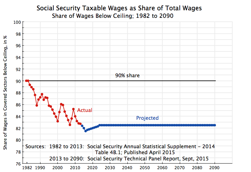
Due to the increase in wage income inequality since the early 1980s, wages paying Social Security taxes fell from 90.0% of total wages in 1982 and again in 1983, to just 82.7% in 2013 (the most recent year with data, see Table 4.B1 in the 2014 Social Security Annual Statistical Supplement). While the trend is clearly downward, note how there were upward movements in 1989/90/91, in 2001/02, and in 2008/09. These coincided with the economic downturns at the start of the Bush I administration, the start of the Bush II administration, and the end of the Bush II administration. During economic downturns in the US, wages of those at the very top of the income distribution (Wall Street financiers, high-end lawyers, and similar) will decline especially sharply relative to where they had been during economic booms, which will result in a higher share of all wages paid in such years falling under the ceiling.
Why did the Greenspan Commission leave the rule for the determination of the ceiling on wages subject to Social Security tax unchanged? Based on the experience in the decades leading up to 1980, this was not unreasonable. In the post-World War II decades up to 1980, the distribution of incomes did not change much. As discussed in an earlier post on this blog, incomes of the rich, middle, and poor all grew at similar rates over that period, leaving the relative distribution largely unchanged. It was not unreasonable then to assume this would continue. And indeed, there is a footnote in a table in the annex to the Greenspan Commission report (Appendix K, Table 15, footnote c) which states: [Referring to the column showing the historical share in total wages of wages below the ceiling, and hence subject to Social Security tax] “The percent taxable for future years [1983 and later] should remain relatively stable as the taxable earnings base rises automatically based on increases in average wage levels.”
Experience turned out to be quite different. Income inequality has risen sharply since Reagan was president. This reduced the share of wages subject to Social Security tax, and undermined the forecasts made by the Greenspan Commission that with the changes introduced, the Social Security Trust Fund would remain adequate until well past 2034.
Going forward, the current forecasts for the path of the share of wages falling under the ceiling and hence subject to Social Security tax are shown as the blue curve in the chart. The forecasts (starting from 2013, the year with the most recent data when the Social Security Administration prepared these projections) are that the share would continue to decline until 2016. However, they assume the share subject to tax will then start a modest recovery, reaching a share of 82.5% 2024 at which it will then remain for the remainder of the projection period (to 2090). (The figures are from the Social Security Technical Panel Report, September 2015, see page 64 and following. The annual Social Security Trustees Report does not provide the figures explicitly, even though they are implicit in their projections.)
This stabilization of the share of wages subject to Social Security tax at 82.5% is critically important. Should the wage income distribution continue to deteriorate, as it has since the early 1980s, the Social Security Trust Fund will be in even greater difficulty than is now forecast. And it is not clear why one should assume this turnaround should now occur.
Finally, it should be noted for completeness that the share of wages subject to tax varied substantially over time in the period prior to 1982. Typically, it was well below 90%. When Social Security began in 1937, the ceiling then set meant that 92% of wages (in covered sectors) were subject to tax (see Table 4.B1 in the 2014 Social Security Annual Statistical Supplement). But the ceiling was set in nominal terms (initially at $3,000), which meant that it fell in real terms over time due to steady, even if low, inflation. Congress responded by periodically adjusting the annual ceiling upward in the 1950s, 1960s, and 1970s, but always simply setting it at a new figure in nominal terms which was then eroded once again by inflation. Only when the new system was established in the 1970s of adjusting the ceiling annually to reflect changes in average nominal wages did the inflation issue get resolved. But this failed to address the problem of changes in the distribution of wages, where an increasing share of wages accruing to the rich in recent decades (since Reagan was president) has led to the fall since 1983 in the share subject to tax.
Thus an increasing share of wages has been escaping Social Security taxes. The rest of this blog post will show that this explains why the Social Security Trust Fund is now projected to run out by 2034, and what could be achieved by returning the ceiling to where it would cover 90% of wages, or by lifting it entirely.
D. The Impact of Keeping the Ceiling at 90% of Total Wages
The chart at the top of this post shows what the consequences would be if the ceiling on wages subject to Social Security taxes had been kept at levels sufficient to cover 90% of total wages (in sectors covered by Social Security), with this either from 1984 going forward, or starting from 2016. While the specific figures for the distant future (the numbers go out to 2090) should not be taken too seriously, the trends are of interest.
The figures are calculated from data and projections provided in the 2015 Social Security Trustees Annual Report, with most of the specific data coming from their supplemental single-year tables (and where the share of wages subject to tax used in the Social Security projections are provided in the 2015 Social Security Technical Panel Report). Note that throughout this blog post I am combining the taxes and trust funds for Old-Age Security (OASI, for old age and survivor benefits) and for Disability Insurance (DI). While technically separate funds, these trust funds are often combined for analysis, in part because in the past they have traditionally been able to borrow from each other (although Republicans in Congress are now trying to block this flexibility).
The Base Case line (in black) shows the path of the Social Security Trust Fund to GDP ratio based on the most recent intermediate case assumptions of Social Security, as presented in the 2015 Social Security Trustees Annual Report. The ratio recovered from near zero in the early 1980s to reach a high of 18% of GDP in 2009, following the changes in tax and benefit rates enacted by Congress after the Greenspan Commission report. But it then started to decline, and is expected to hit zero in 2034 based on the most recent official projections. After that if would grow increasingly negative if benefits were to continue to be paid out according to the scheduled formulae (and taxes were to continue at the current 12.4% rate), although Social Security does not have the legal authority to continue to pay out full benefits under such circumstances. The projections therefore show what would happen under the stated assumptions, not what would in fact take place.
But as noted above, an important assumption made by the Greenspan Commission that in fact did not hold true was that adjustments (based on changes in the average wage) of the ceiling on wages subject to Social Security tax, would leave 90% of wages in covered sectors subject to the tax. This has not happened due to the growth in wage income inequality in the last 35 years. With the rich (and especially the extreme rich) taking in a higher share of wages, the wages below a ceiling that was adjusted according to average wage growth has led to a lower and lower share of overall wages paying the Social Security tax. The rich are seeing a higher share of the high wages they enjoy escaping such taxation.
The blue curves in the chart show what the path of the Social Security Trust Fund to GDP ratio would have been (and would be projected going forward, based on the same other assumptions of the base case) had the share of wages subject to Social Security taxes remained at 90% from 1984. The dark blue curve shows what path the Trust Fund would have taken had Social Security benefits remained the same. But since benefits are tied to Social Security taxes paid, the true path will be a bit below (shown as the light blue curve). This takes into account the resulting higher benefits (and income taxes that will be paid on these benefits) that will accrue to those paying the higher Social Security taxes. This was fairly complicated, as one needs to work out the figures year by year for each age cohort, but can be done. It turns out that the two curves end up being quite close to each other, but one did not know this would be the case until the calculations were done.
Had the wage income distribution not deteriorated after 1983, and with all else as in the base case path of the Social Security Trustees Report (actual for historical, or as projected going forward), the Trust Fund would have grown to a peak of 26% of GDP in 2012, before starting on a downward path. It would eventually still have turned negative, but only in 2056. Over the long term, the forecast increase in life expectancies (beyond what the Greenspan Commission had assumed) would have meant that further changes beyond what were enacted following the Greenspan Commission report would eventually have become necessary to keep the Trust Fund solvent. But it would have occurred more than two decades beyond what is now forecast.
At this point in time, however, we cannot go back in time to 1984 to keep the ceiling sufficient to cover 90% of wages. What we can do now is raise the ceiling today so that, going forward, 90% of wages would be subject to the tax. Based on 2014 wage distribution statistics (available from Social Security), one can calculate that the ceiling in 2014 would have had to been raised from the $117,000 in effect that year, to $185,000 to once again cover 90% of wages (about $187,000 in 2016 prices).
The red curves on the chart above show the impact of starting to do this in 2016. The Trust Fund to GDP ratio would still fall, but now reach zero only in 2044, a decade later than currently forecast. Although there would be an extra decade cushion as a result of the reform, there would still be a need for a longer term solution.
E. The Impact of Removing the Wage Ceiling Altogether
The financial impact of removing the wage ceiling altogether will be examined below. But before doing this, it is worthwhile to consider whether, if one were designing a fair and efficient tax structure now, would a wage ceiling be included at all? The answer is no. First, it is adds a complication, and hence it is not simple. But more importantly, it is not fair. A general principle for tax systems is that the rich should pay at a rate at least as high as the poor. Indeed, if anything they should pay at a higher rate. Yet Social Security taxes are paid at a flat rate (of 12.4% currently) for wages up to an annual ceiling, and at a zero rate for earnings above that ceiling.
While it is true that this wage ceiling has been a feature of the Social Security system since its start, this does not make this right. I do not know the history of the debate and political compromises necessary to get the Social Security Act passed through Congress in 1935, but could well believe that such a ceiling may have been necessary to get congressional approval. Some have argued that it helped to provide the appearance of Social Security being a self-funded (albeit mandatory) social insurance program rather than a government entitlement program. But for whatever the original reason, there has been a ceiling.
But the Social Security tax is a tax. It is mandatory, like any other tax. And it should follow the basic principles of taxation. For fairness as well as simplicity, there should be no ceiling. The extremely rich should pay at least at the same rate as the poor.
One could go further and argue that the rates should be progressive, with marginal rates rising for those at higher incomes. There are of course many options, and I will not go into them here, but just note that Social Security does introduce a degree of progressivity through how retirement benefits are calculated. The poor receive back in pensions a higher amount in relation to the amounts they have paid in than the rich do. One could play with the specific parameters to make this more or less progressive, but it is a reasonable approach. Thus applying a flat rate of tax to all income levels is not inconsistent with progressivity for the system as a whole.
Leaving the Social Security tax rate at the current 12.4% (for employer and employee combined), but applying it to all wages from 2016 going forward and not only wages up to an annual ceiling, would lead to the following path for the Trust Fund to GDP ratio:

The Trust Fund would now be projected to last until 2090. Again, the projections for the distant future should not be taken too seriously, but they indicate that on present assumptions, eliminating the ceiling on wages subject to tax would basically resolve Trust Fund concerns for the foreseeable future. A downward trend would eventually re-assert itself, due to the steadily growing life expectancies now forecast (see the chart in the text above for the projections from the 2015 Social Security Trustees Annual Report). Eventually there will be a need to pay in at a higher rate of tax if taxes on earnings over a given working life are to support a longer and longer expected retirement period, but this does not dominate until late in the forecast period.
As a final exercise, how high would that tax rate need to be, assuming all else (including future life expectancies) are as now forecast? The chart below shows what the impact would be of raising the tax rate to 13.0% from 2050:

The Social Security Trust Fund to GDP ratio would then be safely positive for at least the rest of the century, assuming the different variables are all as now forecast. This would be a surprisingly modest increase in the tax rate from the current 12.4%. If separated into equal employer and employee shares, as is traditionally done, the increase would be from a 6.2% tax paid by each to a 6.5% tax paid by each. Such a separation is economically questionable, however. Most economists would say that, under competitive conditions, the worker will pay the full tax. Whether labor markets can be considered always to be competitive is a big question, but beyond the scope of this blog post.
F. Summary and Conclusion
To summarize:
1) The Social Security Trust Fund is projected to be depleted under current tax and benefit rates by the year 2034. But this is not because retirees are living longer. Increasing life spans have long been expected, and were factored into the estimates (the last time the rates were changed) of what the tax and benefit rates would need to be for the Trust Fund not to run out. Nor is it because of aging baby boomers reaching retirement. This has long been anticipated.
2) Rather, the Social Security Trust Fund is now forecast to run out by the 2030s because of the sharp increase in wage income inequality since the early 1980s, when the Greenspan Commission did its work. The Greenspan Commission assumed that the distribution of wage incomes would remain stable, as it had in the previous decades since World War II. But that turned out not to be the case.
3) If relative inequality had not grown, then raising the ceiling on wages subject to Social Security tax in line with the increase in average wages (a formula adopted in legislation of 1972, and left unchanged following the Greenspan Commission) would have kept 90% of wages subject to Social Security tax, the ratio it covered in 1982 and again in 1983.
4) But wage income inequality has grown sharply since the early 1980s. With the distribution increasingly skewed distribution, favoring the rich, an increasing share of wages is escaping Social Security tax. By 2013, the tax only covered 82.7% of wages, with the rest above the ceiling and hence paying no tax.
5) Had the ceiling remained since 1984 at levels sufficient to cover 90% of wages, and with all other variables and parameters as experienced historically or as now forecast going forward, the Social Security Trust Fund would be forecast to last until 2056. While life expectancies (at age 65) in fact turned out on average to be lower than forecast by the Greenspan Commission until 2010 (which would have led to a higher Trust Fund balance, since less was paid out in retirement than anticipated), life expectancies going forward are now forecast to be higher than what the Greenspan Commission assumed. This will eventually dominate.
6) If the wage ceiling were now adjusted in 2016 to a level sufficient to cover once again 90% of wages ($187,000 in 2016), the Trust Fund would turn negative in 2044, rather than 2034 as forecast if nothing is done.
7) As a matter of equity and following basic taxation principles, there should not be any wage ceiling at all. The rich should pay Social Security tax at least at the same rate as the poor. Under the current system, they pay zero on wage incomes above the ceiling.
8) If the ceiling on wages subject to Social Security tax were eliminated altogether, with all else as in the base case Social Security projections of 2015, the Trust Fund would be expected to last until 2090.
9) If the ceiling on wages subject to Social Security tax were eliminated altogether and the tax rate were raised from the current 12.4% to a new rate of 13.0% starting in 2050, with all else as in the base case Social Security projections of 2015, the Trust Fund would be expected to last to well beyond the current century.


You must be logged in to post a comment.