Initial Claims for Unemployment Insurance Are at Record Lows

Weekly Initial Claims for Unemployment Insurance, January 7, 2006, to November 21, 2015

Weekly Initial Claims for Unemployment Insurance as a Ratio to Employment, January 1967 to October 2015


Initial claims for unemployment insurance are now at their lowest level, in terms of absolute numbers, in forty years, and the lowest ever when measured relative to employment (although the series goes back only to 1967).  There has been a steady improvement in the job market since soon after Barack Obama took office in January 2009, with (as discussed in a recent post on this blog) a steady increase in private sector jobs and an unemployment rate now at just 5.0%.  Yet the general discussion still fails to recognize this.  I will discuss some of the possible reasons for this perception later in this post.

Initial claims for unemployment insurance provides a good measure of the strength of the labor market, as it shows how many workers have been involuntarily laid off from a job and who are then thus eligible for unemployment insurance.  The US Department of Labor reports the figure weekly, where the numbers in the chart above are those updated through the release of November 25, 2015 (with data through November 21).  While there is a good deal of noise in the weekly figures due to various special factors (and hence most of the focus is on the four week moving average), it does provide a high frequency “yardstick” of the state of the labor market.  The charts above are for the four week moving averages.

The measure has been falling steadily (abstracting from the noise) since soon after President Obama took office.  News reports have noted that the weekly figures have been below 300,000 for some time now (close to a year).  This is a good number.  Even in the best year of the Bush administration (2006, at the height of the housing bubble), weekly initial claims for unemployment insurance averaged 312,000.  So far in 2015 (through November 21) it has averaged 279,000, and the lowest figure was just 259,250 for the week of October 24.  Initial claims for unemployment have not been so low in absolute numbers since December 1973.

But the population and labor force have grown over time.  When measured as a ratio to the number of those employed, initial claims for unemployment insurance have never been so low, although the series only begins in January 1967.  It is now well below the lowest points ever reached in the George W. Bush administration, in the Reagan administration, and even in the Clinton administration, under which the economy enjoyed the longest period of economic expansion ever recorded in the US (back to at least 1854, when the recession dating of the NBER begins).

Why then has the job market been seen by many as being especially weak under Obama? It should not be because of the unemployment rate, which has fallen steadily to 5.0% and is now well below where it was at a similar point during the Reagan administration.  Private job creation has also been steady and strong (although government jobs have been cut, for the first time in an economic downturn in at least a half century).  There has also been no increase in the share of part time employment, despite assertions from Republican politicians that Obamacare would have led to this.  And growth in GDP, while it would have been faster without the fiscal drag of government spending cuts seen 2010, has at least been steady.

What has hurt?  While no one can say for sure as the issue is some sense of the general perception of the economy, the steady criticism by Republican officials and pundits has probably been a factor.  The Obama administration has not been good at answering this.

But also important, and substantive, is that wages have remained stagnant.  While this stagnation in wages has been underway since about 1980, increased attention is being paid to it now (which is certainly a good thing).  In part due to this stagnation, the recovery that we have seen in the economy since the trough in mid-2009 has mostly been for the benefit of the very rich.  Professor Emmanuel Saez of UC Berkeley has calculated, based on US tax return data, that the top 1% have captured 58% of US income growth over the period 2009 to 2014.  The top 1% have seen their real incomes rise over this period by a total of 27% in real terms, while the bottom 99% have seen income growth over the period of only 4.3%.  Furthermore, most of this income growth for the bottom 99% only started in 2013.  For the period from 2009 through 2012, the top 1% captured 91% of the growth in national income.  The bottom 99% saw their real incomes rise by only 0.8% total over that period.

The issue then is not really one of jobs or overall growth.  Rather it is primarily a distribution problem.  The recovery has not felt like a recovery not because jobs or growth have been poor (although they would have been better without the fiscal drag), but rather because most of the gains of the growth have accrued to the top 1%.  It has not felt like a recovery for the other 99%, and for an understandable reason.

An Update on Progress in the Labor Market Recovery Under Obama

Cumul Private Job Growth from Inauguration to Oct 2015

Cumul Govt Job Growth from Inauguration to Oct 2015

A)  Introduction

The Bureau of Labor Statistics released on November 6 its most recent report on the state of the job market.  It was a strong report, with net job gains of 271,000 in October and the unemployment rate falling to 5.0%.  One should not, however, put too much weight on the figures in just one month’s report.  Indeed, the report for October followed relatively weaker reports in the two previous months.  Rather, one should put all these reports in the longer term context of how the labor market has moved in recent years.  And what they show is continued, and remarkably steady, improvement.

This post will look at that longer term context by updating several labor market charts that have been discussed in previous posts on this blog.  It will look first at net job growth in the private sector and in the government sector in the period since Obama’s inauguration, with a comparison to the similar period during George W. Bush’s term.  The post will then look at the continued fall in the unemployment rate, with a comparison to the similar period under Reagan, and finally to the share of part time workers in total employment.  The last is to see whether there is any evidence to support the assertion coming from Republican critics that Obamacare has led to a shift by employers to part time workers so that they can avoid providing health insurance in the overall wage compensation package for their staff.  We will find that there is no indication in the data that this has been the case.

B)  Total Job Growth

The charts at the top of this post show total net job growth, in the private sector and in the government sector, in the period since Obama’s inauguration (up to October 2015) and under Bush (for his two full terms).  They update similar charts discussed in several earlier posts on this blog, most recently from June 2014.

Private sector job growth has been strong under Obama, and continues to be.  And the record is clearly far better than that under the George W. Bush administration.  There has been a net increase of 9.3 million new private jobs under Obama since the month he was inaugurated, versus just 4.0 million new private jobs over the similar period in the Bush administration.  Furthermore, this 4.0 million additional private jobs was close to the peak achieved in the Bush years, before it started to fall and then plummet as the housing bubble burst and the economy collapsed in the last year of his second term.  By the end of his presidency there were fewer private jobs than there were on the day he was inaugurated, eight years before.

Obama faced this collapse in the jobs market as he took office.  The economy was losing 800,000 private jobs per month, with the economy contracting at the fastest pace since the Great Depression.  The new administration was able to turn this around with the stimulus package and with aggressive Fed actions, with the fall in employment first slowing and then turning around.  The result has been a net growth of 13.5 million new private jobs from the trough just one year into the new administration until now.

Government jobs, in contrast, have been cut.  This hurt total job growth both directly (government jobs are part of total jobs obviously) as well as indirectly.  Indirectly, the government job cuts (as well as the fiscal austerity that began in 2010) reduced demand for goods and hence production at a time when the economy was still depressed and suffering from insufficient demand to keep production lines going.  As discussed in an earlier post on this blog, without the fiscal austerity introduced from 2010 onwards the economy would have recovered from the economic downturn by 2013 and perhaps even 2012.  The initial stimulus package in 2009 turned things around.  It is unfortunate that the government then moved to cuts from 2010 onwards, which reduced the pace of the recovery.

It should be recognized that government jobs as recorded here include government jobs at all levels (federal, state, and local), with federal government jobs only a relatively small share of the total (12.4%).  But government jobs have fallen at all three levels, federal as well as state and local.

The cuts on government jobs during Obama’s time in office stand in sharp contrast to the growth in government jobs during Bush’s two terms.  Yet Obama is charged with being a big government liberal while the Republicans claim to be small government conservatives.

C)  The Rate of Unemployment

Unemployment Rates - Obama vs Reagan, up to Oct 2015After peaking at 10.0% in October 2009, the rate of unemployment has fallen at a remarkably steady pace under Obama (aside from the monthly fluctuations in the reported figures, which will in part be statistical noise as unemployment estimates come from household surveys).  This was discussed in this earlier post on this blog.  The record is certainly better than that under Reagan.  The unemployment rate is now 5.0%, while it was still 6.0% at the same point in the Reagan presidency.

Furthermore, Reagan was not confronted, as Obama was, with an economy in collapse as he took office.  Rather, unemployment began to rise only about a half year after Reagan took office, as he began to implement his new budgetary and other policies.  The unemployment rate then rose to a peak of 10.8% in late 1982 before starting to fall.  And while the recovery was then rapid for a period, supported by rising government spending, it stalled by mid-1984 with unemployment then fluctuating in the range of 7.0% to 7.5% for most of the next two years.  One does not see the steady improvement as one has had under Obama.

With the unemployment rate now at 5.0%, it is expected that the Fed will soon start to raise interest rates.  This would be unfortunate in my view (as well as that of many others, such as Paul Krugman).  Inflation remains low (only 0.2% over the past year for personal consumption expenditures for all goods, or 1.3% over the past year if one excludes the often volatile food and energy costs).  And while wages ticked up by 2.5% over the year before in the most recent BLS labor market report, this is still below the roughly 3 1/2% increases that would be consistent (after expected productivity gains in a normally functioning job market) with the Fed’s 2.0% inflation target.  And if wages are not allowed to rise faster than inflation, then by definition there will be no increase in real wages.

It is of course recognized that the rate of unemployment cannot fall forever.  There will always be some slack in the labor market as workers transition between jobs, and if the unemployment rate is too low, there will be excessive upward pressure on wages, and inflation can become a problem.  But where that “full employment rate of unemployment” is, is not clear.  Different economists have different views.  It does not appear to be at 5.0% under current conditions, as the rate of inflation remains low.  But whether it is at 4.5% or 4.0% is not clear.  At some point, it would be reached.

When it is, the pace of job creation will need to fall to match the pace of labor force growth (from population growth).  Otherwise, by simple arithmetic, the rate of unemployment would continue to fall.  And this cut in employment growth would be the objective of the Fed in raising interest rates:  It would be to slow down the pace of job growth to the rate that matches labor force growth.

Once the Fed does start to raise interest rates, one should then not be surprised, nor criticize, that the pace of job growth has slowed.  That is the aim.  And it will need to slow sharply from what the pace of job growth has been in recent years under Obama.  Over the past two years, for example, employment growth has averaged 236,000 per month. The labor force has grown at a pace of 101,000 per month over this period.  As a result, unemployment has fallen at a pace of 135,000 per month (= 236,000 – 101,000), with this leading the unemployment rate to fall to 5.0% now from 7.2% two years ago.  If unemployment is now to be kept constant rather than falling, the pace of job growth will need to fall by more than half, from 236,000 per month to just 101,000 per month (or slightly more, to be precise, taking into account the arithmetic of a constant unemployment rate).

I have no doubt that when this happens, and the pace of job growth slows, that Obama will be criticized by his Republican critics.  But this will reflect a fundamental confusion of what full employment implies for the labor market.

D)  Part-Time Employment as a Share of Total Employment

Part-Time Employment #2 as Share of Total Employment, Jan 2007 to Oct 2015

Finally, it is of interest to update the graph in an earlier post to see whether there is now any evidence that the Affordable Care Act (Obamacare) has led employers to fire their regular full time workers and replace them with part-timers, in order to avoid the mandate of including health insurance coverage in the wage compensation package they pay to their workers.  Conservative politicians and media asserted this as a fact (see the earlier blog post cited for several references).  But as discussed before, and as confirmed with the more recent data, there is no indication in the data that this has been the case. Indeed, the share of part time workers in the total has been falling at an accelerated pace in the most recent two years, at a time when the Obamacare insurance mandate provisions have come into effect.

The acceleration in the pace of this improvement is consistent with the improvement seen in the overall labor market over the past several years, as discussed above.  As the economy approaches full employment, those who are working part time (not by choice, but because they have no alternative) are able to find full time jobs.  The share of part-time workers in total employment is still somewhat above (at about 4%) what would be normal when the economy is at full employment (at about 3%), lending support to those arguing that while the labor market is improving, we are not yet at full employment (and the Fed should thus wait longer before it starts to raise interest rates).  But it is getting better.

I have also added to the graph a line (in red) showing what the share of part-time employment workers were in total employment during the Reagan years.  At the comparable time in his presidency, the share was higher than what it is now under Obama.  Furthermore, it had improved only slowly under Reagan over the three years leading up to that point.  Yet Reagan is praised by conservatives for his purportedly strong labor market.

E)  Conclusion

The labor market has improved considerably in recent years under Obama.  It could have been better had the government not turned to austerity in 2010, but even with the government cuts, job growth has been reasonably good.  The unemployment rate has now fallen to 5%, and it is expected the Fed will soon begin to raise interest rates in order to slow the pace of job creation.  One should not then be surprised if fewer net new jobs are created each month, nor criticize Obama when it does.  That will be precisely the aim of the policy.  But I strongly suspect that we will nonetheless hear such criticisms.

The Highly Skewed Growth of Incomes Since 1980: Only the Top 0.5% Have Done Better Than Before

Piketty - Saez 1947 to 2014, June 2015, log scale

A)  Introduction

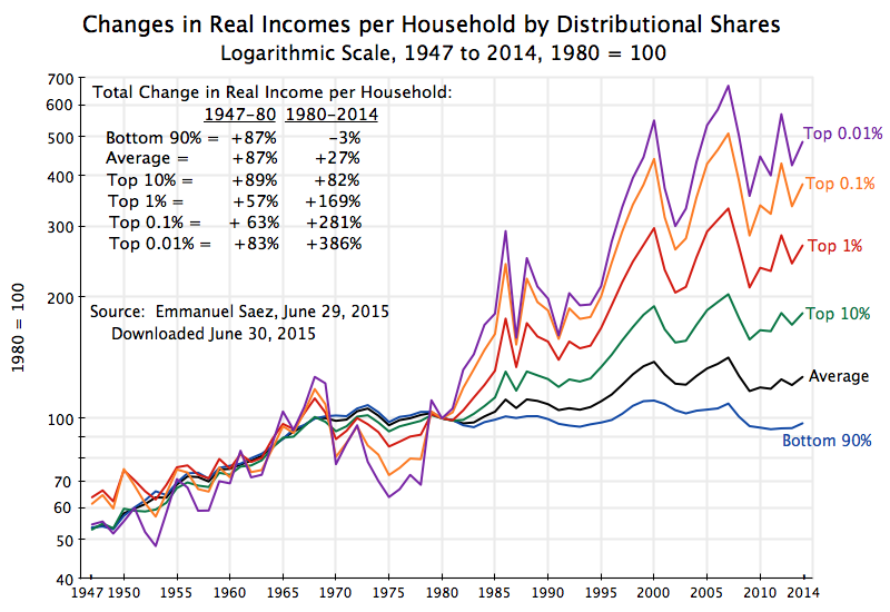
The distribution of the gains from growth have become terribly skewed since around 1980, as the chart above shows and as has been discussed in a number of posts on this blog (see, for example, here, here, here, here, and here).  From 1980 to 2014, the bottom 90% of households have seen their real income fall by 3%, while the top 0.01% have enjoyed growth of 386%.  This was not the case in the post-war years up to 1980:  Over those decades the different income groups saw similar increases in their real per household incomes:  By 87% for average income for the period between 1947 and 1980. But that ended around 1980.

The data underlying these figures were recently updated to include estimates for 2014, and this may be an opportune time to look at them again and more closely.   Specifically, most analyses (as well as the chart above) focus on the incomes of the top 10%, the top 1%, and so on, even though these are overlapping groups.  The top 10% includes the top 1%, and an open question is the extent to which the gains of the top 10% reflects gains primarily in the top 1% or also gains of those in the 90 to 99% income range.  This will be examined below.  Finally, the post will look at the question of what share of the growth in overall incomes over the full 1980 to 2014 period went to the various groups.  As one would expect, the gains were highly concentrated for the rich.  What one might find surprising is how concentrated it was.

B)  Real Income Growth (or Decline) Between 1980 and 2014 

As seen in the chart above, the rich got far richer in the period since 1980, while not just the poor but even those making up fully 90% of the population, got poorer.

The data in the chart come from Professor Emmanuel Saez of UC Berkeley, who has for some years been providing the figures from which the incomes of the very rich can be calculated, often in collaboration with the now better known Thomas Piketty.  In late June, Saez released data updated through 2014:  See his June 29 post at the Washington Center for Equitable Growth website, with links there to an Excel spreadsheet from which the data used here was downloaded.  The basic data are now also available at the World Top Incomes Database, of Facundo Alvaredo, Tony Atkinson, Thomas Piketty, and Emmanuel Saez.  Note that this data for 2014 reflects initial estimates.  They may change as more detailed figures are released by the IRS (the ultimate source for the data).

The chart covers the 1947 to 2014 period, indexed to 1980 = 100 for each of the groups. A logarithmic scale is used as equal proportional changes will then show as equal distances on the vertical axis.  That is, the distance between index values of 50 and 100, between 100 and 200, and between 200 and 400, will all be equal as all represent a doubling on income.  This makes it easier to see and track relative changes in values across different periods, for example between 1947 and 1980 in comparison to 1980 to 2014.

The data through 2014 confirm the trends discussed before in this blog, with a sharp increase in inequality since 1980 but also with large year to year fluctuations.  The year to year fluctuations are especially large for the very richest.  The incomes reported here come from anonymized tax return data, and hence reflect incomes by tax reporting units (generally households) with incomes as defined for tax purposes.  The income figures include income from realized capital gains, and hence one sees peaks (especially among the very rich) around 2000 (due to the dotcom bubble) and again in the middle of the first decade of the 2000s (coinciding with the housing as well as stock market bubbles of those years). The fluctuations between 2012 and 2014 can also be explained, at least in part, from tax law changes.  The Bush tax cuts were allowed to expire for the very rich in 2013 (they were made permanent for everyone else), which created an incentive for the rich to bring forward their taxable incomes into 2012.  This increased reported income in 2012 (when their tax rates were lower) while reducing it in 2013.  There was then a return to more normal levels in 2014.

Average household incomes rose only by 27% over 1980 to 2014, a sharp slowdown from the 87% growth achieved on average between 1947 and 1980 (with one less year as well in that period, compared to 1980 to 2014).  An earlier post on this blog discussed the immediate factors that led to this sharp deceleration in growth for average incomes (at least for wages).  But I want to focus here on the growth in incomes of the higher income groups, where there was no such slowdown.

Between 1980 and 2014, the top 10% saw their average incomes rise by 82%.  This was far better than the 27% growth in overall average household income in the period, and even more so than the 3% fall in incomes for the bottom 90%.  But it is actually similar to the growth seen for most income groups between 1947 and 1980, when average incomes rose by 87%.  One could reasonably argue that the top 10% did not do especially well over this period, but rather only saw a continuation for them of the previous trend growth.

The ones who undisputedly did especially well post 1980 were the top 1%, top 0.1%, and especially the top 0.01%.  The richer you were, the greater the increase enjoyed in the post-1980 economy.  Note there is no necessity in this:  The households are stratified by their rank in income in each year, but the growth in incomes over the period could be greater for the top 10%, say, than the top 1%.  Indeed, this was the case over the 1947 to 1980 period.  But between 1980 and 2014, the higher your income, the higher your growth in income:  The average income of the top 1% rose by 169% between 1980 and 2014, by 281% for the top 0.1%, and by 386% for the top 0.01%.

It should not be surprising that the extreme rich are pleased with how their incomes have grown since 1980, which many have not unreasonably attributed to the election that year of Ronald Reagan.  But you have not done well if you are in the bottom 90% of the population – your real income has stagnated over this period of more than a third of a century, and indeed even fell slightly.

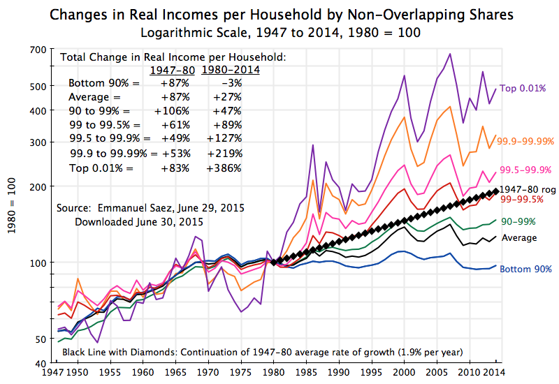
C)  Real Income Growth of Non-Overlapping Groups

As noted above, there is a potential issue when figures are provided for the top 10%, top 1%, top 0.1%, and top 0.01%.  Even though commonly done, the figures for the top 10% include the incomes of the top 1% (and the top 0.1% and top 0.01%).  That is, these are overlapping groups, and one cannot determine just from figures presented in such a way whether the share of the top 10% increased because of higher incomes for most of those in the group, or because those in the top 1% saw an especially sharp increase.  Similarly for the top 1% and top 0.1%.  Since the very richest enjoyed such a sharp increase in their incomes, one cannot say with certainty from just these figures whether the widening distribution reflected higher incomes for most of those with higher incomes, or just for the extremely rich.

Thus it is of interest to break down the population categories into non-overlapping groups:

Piketty - Saez 1947 to 2014, by exclusive categories, log scale, June 2015The bottom 90% is as in the chart at the top of this post (decline of 3% in their real per household incomes between 1980 and 2014), and growth was 27% for average household incomes over this period.

But then it is of interest to note that those with incomes in the 90 to 99% range of households saw real income growth over this period of just 47%.  While better than the overall average of 27%, it is worse than the average growth achieved of 87% in the third of a century before 1980.  It would be difficult to argue that they have done especially well in the period since 1980.  They did worse than what average growth for everyone was before.

The group in the 99 to 99.5% percentile of income (in red in the graph) saw their incomes over the 1980 to 2014 period as a whole rise by 89%.  This was almost exactly what their growth in incomes would have been had they grown at the same rate as average incomes grew between 1947 and 1980.  Thus they did not do worse post-1980, but also not better than what the average for everyone was before.

The groups that did do better post-1980 were those in the top 0.5% of the distribution. Those whose income put them in the top 99.5 to 99.9% of the population saw income growth of 127% over this period; those in the top 99.9 to 99.99% of the population saw income growth of 219%; while those in the top 0.01% enjoyed income growth of 386%. These groups did extremely well in the post-1980 economy.

Thus the slogans about the top 1% should perhaps be refined.  It is really the top 0.5%.

D)  The Share of Growth Going to the Rich

Finally, one can calculate what share of the growth in the economy over this period accrued to the different income groups.  The measure used here is the one the Professor Saez has used in his work, and has applied to various periods (although not to the 1980 to 2014 period).  It shows what share of the growth in the overall economy was captured, in per household terms, by the group identified:

Bottom 90%

Top 10%

Top 1%

Top 0.5%

Share of income in 1980

65%

35%

10%

7%

Share of 1980-2014 growth

-7%

107%

63%

54%

Share of income in 2014

50%

50%

21%

17%

Difference in Share 1980 – 2014

-15%

15%

11%

10%

The top 10% of households accounted for a little over a third (35%) of overall household incomes in 1980.  But between 1980 and 2014, they captured 107% of the gains in overall growth, raising their share of overall incomes to 50%.  The bottom 90%, in contrast, saw their per household real incomes fall.  They “gained” a negative share of the income growth, of -7% (the mirror image of the top 10%).  Their share of overall incomes fell from almost two-thirds (65%) in 1980 to just one-half (50%) by 2014.  These are huge changes in national income shares over such a period.

Breaking this down further, it is the top 1% and even more the top 0.5% that accounted for the bulk of this worsening in distribution.  The top 1% captured 63% of the gain in overall incomes between 1980 and 2014 (in per household terms), and saw their share of overall income more than double to 21% in 2014 from “just” 10% in 1980.  But the top 0.5% captured 54% of the gains, and saw their share rise from 7% to 17% over this period, or an increase of 10% points.  That is, the increased share of the top 0.5% accounted for, by itself, fully two-thirds of the 15% point increase for the top 10%.  Yet there are only one-twentieth (1/20) as many households in the top 0.5% as the 10%.

The distribution of the gains from growth have become extremely concentrated.  Just the top 0.5% (five-thousandths of the population) captured more than half of income growth generated by the economy over this 34 year period.

E)  Conclusion

The gains from growth have accrued overwhelmingly to the very rich since 1980.  And it is not really the top 10% who have done so well, nor even the top 1%, but rather the top 0.5% .  At the same time, the bottom 90% have seen their real incomes fall.

Something changed around 1980.  Growth before then (in the period since 1947) had been much more evenly distributed, with the rich as well as the bottom 90% doing similarly well, with growth of 1.9% per annum in average household incomes (a cumulative 87%).  To be fair, one cannot say with certainty that the turning point was in 1980 rather than a few years before or a few years after.  Incomes in any given year will depend a good deal on whether the economy is growing strongly or is in recession, and (especially for the rich) whether the stock market and other asset prices are booming or in a bust. The economy was also already struggling in the 1970s.  It is therefore difficult to mark when there has been a change in trend as opposed to fluctuations caused by year to year factors.  But something happened to the economy in either 1980 or in the years surrounding it.

Ronald Reagan was of course elected president in 1980.  He launched a broad set of policies that conservatives like to praise as the “Reagan Revolution”.  There is no doubt that a deterioration in distribution resulted from many of the policies that Reagan won (large tax cuts focussed on the rich, attacks on labor unions, a focus of macro policy on inflation rather than unemployment, deregulation of financial markets and other sectors, changing wage norms which led to giant compensation packages for CEOs and others at the top, and so on).  But to be fair, one should add that other structural changes in the economy in recent decades have also had an impact on distribution, such as changes in technology, from globalization, and following from these, an increasing number of “winner-take-all” markets.

But whether due to policy or structural changes or (almost certainly) a combination of both, it is clear that policy did not counteract the resulting extreme concentration in the benefits of growth accruing to very rich.  And that is a challenge that needs to be addressed.