Government Spending During Obama’s First Term – The Facts

Govt 2 During Presidential Terms - Cons & Invest, 1953-2012

A.  Introduction

Republicans continue to assert that government spending has exploded under Obama.  It is a myth.  Depending on which specific measure of government spending is used, such expenditures have either fallen during Obama’s presidency or have increased at one of the lowest rates in the last six decades.

This myth is unfortunately important as conservative politicians continue to use it aggressively to push for drastic cuts in government spending, despite the damage such cuts have done to the economic recovery.  And drastic government spending cuts loom with the rapidly approaching deadline of March 1 when the automatic across-the-board sequester budget cuts will enter into force, unless Congress pulls back from the brink before then with new legislation.  Yet as of this writing, Congress is on vacation, and there is little sign that any agreement will be reached by March 1.  An already weak economy (GDP fell by 0.1% in the fourth quarter of 2012 largely due to government spending cuts in that quarter), will almost certainly be driven into decline if the sequester spending cuts happen.

Yet Republican leaders continue to assert big increases in government spending during Obama’s presidential term are the source of the economy’s problems.  A recent example was in the formal Republican response (by Senator Rubio of Florida) to Obama’s State of the Union address.  Rubio asserts that the rise in government under Obama is the cause of our weak economy, and that our problems would be solved by cutting government spending.  But government spending has not risen as he asserts.

B.  Government Consumption and Investment Expenditures

Government consumption and investment expenditures have in fact fallen during Obama’s presidential term.  It is the first such fall in 40 years.  And such government spending rose fastest in this period during the presidential terms of Reagan and George W. Bush.

The graph above shows the growth rates for government spending on consumption and investment as recorded in the National Income and Product Accounts (often referred to as the GDP accounts) published by the Bureau of Economic Analysis of the Department of Commerce.  Such government spending accounts for one component of GDP (along with private consumption, private investment, and exports less imports).  It encompasses all direct spending by government on goods and services, and does not include government transfer payments (which will be considered below).  We now have such data for the full four calendar years of Obama’s presidential term, and can compare the record during Obama’s term to that during previous presidential terms.

Earlier posts on this blog have noted that such fiscal spending has in fact been falling for much of Obama’s term, and that this has acted as a drag on the recovery (see here, here, here, and here).  The now complete data for the full four years of Obama’s first presidential term shows that such government spending fell sharply in both 2011 and 2012, and that while there was growth in 2009 with the stimulus package, the average rate of growth over the full four years of Obama’s term has been negative.  Such government spending is now less than when he took office.

This government spending (all figures in real, inflation adjusted, terms) fell at an average annual rate of 0.2% during Obama’s term.  This fall can be contrasted with the substantial increases during George W. Bush’s two terms, and the even larger increases during Reagan two terms.  (See the graph above, and the table at the bottom of this post provides the specific numbers.)  The only comparable performance to Obama in recent decades was the growth of close to zero during Clinton’s first term.  One would have to go back 40 years, to Nixon’s 1969-72 presidential term, before one again sees a fall in government spending as one had under Obama.  There was also a fall during Eisenhower’s first term, as spending fell sharply in 1954 and 1955 following the end of the Korean War in 1953.

It should be noted that there is certainly no reason to aim for zero growth of government spending over the long term.  Over the sixty years from 1952 to 2012, real GDP grew at a 3.0% annual rate, so real government spending could also grow at a 3.0% annual rate and leave the spending we do as a society for public goods such as infrastructure, education, defense, and so on, at a constant share of GDP.  And it is interesting to note that despite the Republican complaints on government spending, the only periods when government spending grew at a 3% rate or faster over the last 60 years were during the first George W. Bush term, the second Reagan term, the Kennedy/Johnson and Johnson terms, and almost the second Eisenhower term (growth then at a 2.8% annual rate).

The average rate of growth of government spending for goods and services over the full 60 year period was indeed only 1.9% a year in real terms, and hence such government spending as a share of GDP has fallen.  This is the fundamental reason our infrastructure is falling apart and our public services are so poor compared to that found elsewhere among the richer countries of the world.

C.  Total Government Spending, including Transfers

One can reasonably argue that a better measure of government spending is not simply that which enters directly into the GDP accounts (expenditures by government directly on goods and services), but which includes also expenditures by government on transfer payments.  Transfer payments are made by government to others, without goods or services provided in return.  They are mostly to households (such as for Social Security, Medicare and Medicaid, unemployment insurance, and similarly), but include also subsidies to corporate and business entities (such as for agricultural subsidies, energy subsidies, and similarly) as well as interest payments on public debt.  There are also significant transfer payments between levels of government (e.g. federal to state, federal to local, and state to local), but these are netted out for spending at all government levels (but federal transfers will be included when federal spending alone is discussed below).

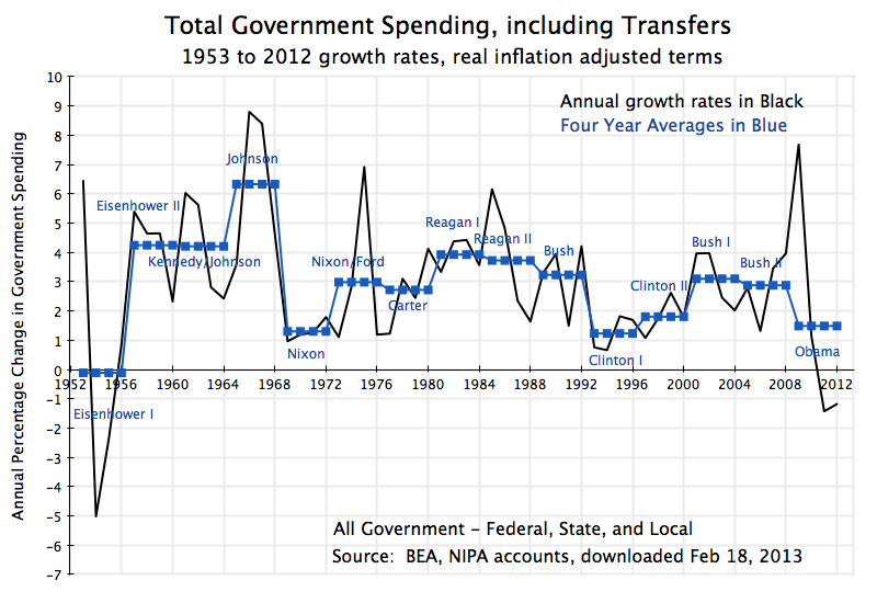
By this measure as well, the rate of growth of government spending during the Obama term has been one of the lowest in decades:

Govt During Presidential Terms - Total Spending, 1953-2012The rate of growth of such government spending during Obama’s first term was just 1.5% a year, with absolute falls in 2011 and 2012.  This is well below the growth during the two terms of George W. Bush, the term of George H. W. Bush, and the two terms of Reagan.  And it is noteworthy that this slow overall growth in total government expenditures during Obama’s term was achieved despite the collapsing economy and resulting high unemployment that Obama inherited on taking office.  The collapsing economy Obama confronted automatically drove up expenditures on unemployment insurance, food stamps, and other safety net programs, all of which count as government transfer programs.  Hence (and along with spending from the stimulus package) there was a sharp peak in 2009, with this increase critical to stopping and then reversing the economic collapse.  But this was then followed by a sharp fall in government spending soon thereafter, which slowed the recovery.

The only comparable periods of such slow growth in total government spending in the last 60 years were during the two Clinton terms and the Nixon term, while such spending was flat during the first Eisenhower term, when Korean War spending ended.

D.  Federal Government Spending Only

The analysis so far has covered expenditures at all levels of government – federal, state, and local.  It is such expenditures which matter in terms of impact on the economy.  And consolidation makes sense as transfers from the federal level cover a substantial share of expenditures that are then carried out by state and local governments.  However, if one wants to focus more narrowly on government expenditures where the role of the president is more direct, then a case can be made to focus exclusively on expenditures at the federal level.  The president is still not omnipotent, as expenditures will depend on budgets passed by the Congress as well as on laws that established programs many years before (such as Social Security or Medicare) .  But the influence of the president will be more direct when focused on federal only expenditures.

Here again, growth in government expenditures during Obama’s term in office has been one of the lower ones of recent decades, and in particular well below the growth seen under Bush or Reagan.  First, for government direct spending on goods and services:

Govt During Presidential Terms - Fed only Cons & Invest, 1953-2012Such expenditures grew at an annual rate of 1.3% over Obama’s term, with out right reductions in 2011 and 2012.  In contrast, such expenditures grew at rates of 5.5% in George W. Bush’s first term and 2.9% in his second, and at rates of 4.6% in Reagan’s first term and 3.8% in his second.  Yet Republicans assert that Obama must be blamed for a rapid expansion in government spending over his term, while Reagan and Bush are praised for their promises to cut government.

In sharp contrast to the increases under Reagan and George W. Bush, federal government expenditures on consumption and investment were cut sharply during Clinton’s first term (at a rate of -2.9% a year), and were basically flat during Clinton’s second term.  There is no basis for the attack that such spending increases at explosive rates under Democrats.

One can similarly look at federal government total spending, including transfers (to households and businesses, and also here transfers from the federal level to the state or local levels):

Govt During Presidential Terms - Fed only Total Spending, 1953-2012

Here again, the growth under Obama has been moderate, with growth at a rate of just 2.7% a year, despite the consequences for mandated expenditures in programs such as unemployment insurance and food stamps that resulted from the economic collapse that Obama inherited.  And despite the weak economy (and indeed contributing importantly to that weakness), federal government total expenditures fell in 2011 and 2012.

Furthermore, growth in such expenditures were higher during the the two terms of George W. Bush, during the term of George H. W. Bush, and during the two terms of Reagan.  They were significantly slower during the two Clinton terms.  Here again, there is no basis for the assertion made by Republicans that Democrats are responsible for sharp growth in government spending, while the Republican presidents have kept it low.

E.  Conclusion

It is important to know the facts when making statements asserting that government spending has exploded under Obama, with this then asserted as the cause of the slow recovery.  In fact, the opposite is true, with government spending either falling during the term of Obama’s presidency or rising at a slower rate than seen in recent Republican presidential terms.  This has then diminished demand for goods and services, and hence has slowed a recovery where the problem is lack of demand to make use of currently underemployed resources (with high unemployment as well as low capital utilization rates).

What has been high in recent years is not government spending, but rather the fiscal deficits.  But these have been high due both to the 2008 economic collapse and slow recovery (which diminished tax revenues and raised certain government expenditures, such as for unemployment insurance), but more importantly to lower tax rates stemming from a series of tax cuts enacted over the last decade (starting with the Bush tax cuts of 2001 and 2003) and continuing into the Obama term.  The size and impact of these tax cuts were discussed in a previous posting on this blog.  These tax cuts reduced government revenues and, along with the impact of the downturn, account for most of the resulting fiscal deficit.  The problem is not high government spending, as government spending has either not grown or has grown only slowly.  The problem, rather, is low government revenue.

=====================================================

Table of Data, and Technical Notes

The specific numbers on four-year growth rates by presidential terms going back to Reagan are presented in the following table:

real average annual growth rates Obama Bush II Bush  I Clinton II Clinton I Bush Reagan II Reagan I
2009-12 2005-08 2001-04 1997-00 1993-96 1989-92 1985-88 1981-85
A)  All Levels of Govt
  1)  Direct Spending -0.2% 1.4% 3.0% 2.4% 0.2% 1.9% 4.2% 2.4%
  2)  Total Spending 1.5% 2.9% 3.1% 1.8% 1.2% 3.2% 3.7% 3.9%
B)  Federal Govt only
  1)  Direct Spending 1.3% 2.9% 5.5% 0.1% -2.9% 0.4% 3.8% 4.6%
  2)  Total Spending 2.7% 4.0% 4.0% 0.9% 0.8% 3.0% 3.0% 4.5%

Direct spending is all government spending directly on the purchases of goods and services.  Such spending is for either government consumption or for government investment, and is the government spending presented in the standard GDP accounts.  Government investment is in gross investment terms (i.e. estimated depreciation is not subtracted).  The price deflator used is as estimated by the BEA in the GDP accounts.

Total spending is direct spending by government on goods or services plus transfer payments.  Inter-governmental transfers (e.g. from the federal to the state level, state to local, or federal to local) are netted out in the figures for spending at all government levels together, but federal transfers to state or local governments are counted when federal only spending is calculated.  Transfer payments are mostly to households (such as for Social Security, Medicare, unemployment compensation, food stamps, and so on), but also include transfers to businesses (such as for agricultural subsidies and energy subsidies) and interest payments on public debt.  Since most are to households, these transfer payments were deflated using the personal consumption deflator estimated by the BEA in the GDP accounts.

Europe GDP Falls Again: Austerity Programs Lead to Contraction

Europe GDP Growth, 2007Q4 to 2012Q4

The European Statistical Agency Eurostat released today its “flash” estimate of GDP growth in the European economies in the fourth quarter of 2012.  The results are terrible.  The initial estimate is that GDP fell at a seasonally adjusted annualized rate of 2.4% in the fourth quarter (or a fall of 0.6% quarter on quarter) in the 17 economies that make up the Eurozone, and that GDP fell at an annualized rate of 2.0% (0.5% quarter on quarter) in the 27 economies in the European Union as a whole.  The 2.4% rate of fall of GDP in the Eurozone, and fall of 2.0% in the EU as a whole, can be contrasted with the recently released estimate that GDP in the US was essentially flat (a 0.1% rate of decline in the initial estimate) in the fourth quarter of 2012.

The flat GDP in the US at the end of 2012 was not a good performance, and has been justly criticized as well below what is needed.  But the fall at a rate of 2.4% in the Eurozone was far worse.  As shown in the graph above, Eurozone GDP has now fallen steadily for five quarters in a row.  Europe is well into a double-dip recession, having never fully recovered from the 2008 downturn, and its GDP is now 3% below what it was in the first quarter of 2008, almost five years ago.

Not only is output falling in Europe as a whole, but it is also falling in each of the major countries.  Especially notable is the fall in GDP at an annualized rate of 2.4% in Germany.  GDP in Germany had been rising at a modest rate since mid-2009, although the recovery slowed in 2011 and has now turned negative.  But in addition to Germany, there were falls in GDP at annualized rates of 1.2% in France and the UK, of 0.8% in the Netherlands, and also of 2.8% in Spain and 3.6% in Italy (not shown in the graph above).

UK output is now even further below the path it followed during the Great Depression in the 1930’s.  As discussed in an earlier posting on this blog, the UK economy is performing worse now than it did during the Great Depression.  The turnaround from what had been a modest but steady recovery occurred in mid-2010, when the newly elected Conservative-led government embarked on an austerity plan similar to what Republicans have called for the US to follow.  But the consequences have been terrible.  By 19 quarters into the downturn (one quarter shy of five years), the UK economy is producing 3% less than it had in early 2008.  At the same point during the Great Depression, the UK economy was producing 4% more than at its previous cyclical peak, and growth was steadily positive.

The fall in German GDP is significant, as it may now induce Germany to agree to steps that would allow Europe as a whole to recover and start to grow.  Germany has been a forceful advocate for austerity in both fiscal and monetary programs, even though (as discussed in an earlier posting on this blog), Germany itself had until 2011 had its government expenditures grow relatively strongly.  But its economy slowed in late 2011 and into 2012, and output has now fallen sharply in the last quarter of 2012.  Germany has strongly resisted measures which would have served to boost European growth, but there may now be a basis for the hope that this will change, now that Germany sees its interests aligned with those of others in Europe.

There are steps that Europe could take to recover from this downturn.  These include:

  1. Reverse the austerity policies, at least among the economies with ready access to the financial markets.  Ten year government borrowing rates are only 1.5% in Germany, 1.7% in the Netherlands, 1.8% in the UK, and 2.2% in France.  These are either below, or close to, the 2% inflation target of the ECB and others.  That is, these governments can borrow ten year funds at essentially zero or even negative real cost.  It is madness not to make use of such funds to pay for investments in infrastructure, education, and other purposes, at a time when resources (both labor and capital) are idle due to lack of demand.  Indeed, it is in times like these when such public investments are best made.  Not only do they boost the recovery, but they do not displace the use of such resources for other purposes.  When the economy is close to full employment, with capital also being fully utilized, using resources for infrastructure and other public investments entails a trade-off, as the resources then used for such public investment have to be drawn from their use for other purposes.  The trade-off might then still be warranted, but it is far better to make such public investments in times like today, when there is no such trade-off.
  2. The European Central Bank should follow the more supportive monetary policies that have been followed by all the other major central banks in the world, including in the US, the UK, and Japan.  The main policy interest rates at all these other central banks have been kept at 25 basis points (0.25%) or below since their economies started crashing in late 2008.  The European Central Bank, in contrast, kept its main policy interest rate at 100 basis points from May 2009 to April 2011.  This relatively high rate at a time of economic weakness led to greater economic weakness, as shown in the graph above.  It then made the mistake of starting to raise the rate, first to 125bp and then to 150bp in the spring and summer of 2011.  The renewed downturn in GDP of the Euro 17 started soon thereafter (see the graph above).  The ECB then started to lower the rate again in late 2011, but it was too little and too late. And the policy rate remains (since mid-2012) at 75bp, well above the rates followed by the other major central banks of the world.  The ECB should lower its rate to 25bp immediately.
  3. Weakness in the commercial banking system in Europe remains a major problem, particularly as financial markets in Europe are far more dependent on their commercial banking systems than is the case in the US (where capital markets are relatively larger).  When the euro was under intense pressure last summer, European leaders agreed to move to some form of a system of more centralized commercial bank regulation and supervision.  But while an important agreement was reached in December 2012, under which the European Central Bank would supervise directly the larger banks in Europe, this agreement did not go as far as had been earlier anticipated.  While it was agreed that the ECB would have direct responsibility for the supervision of the major banks, its authority to deal with failing banks and the resources it could use to do so, were kept limited.  There is also no central system of deposit insurance, but rather still a set of different systems at the national level.  A euro-wide system of bank regulation and supervision, with the power and resources to address failing banks and with a consolidated deposit insurance system, would go far to addressing the weaknesses of a common currency zone.  In a common currency zone, the ability of national authorities to deal with failing banks is constrained.

Europe is now in a double-dip recession.  The austerity programs have failed.  Yet Republicans in the US continue to push for the US to follow similar policies.

Inflation in Obama’s First Term: The Lowest in a Half Century

Inflation During Presidential Terms, 1953-2012

One of the most persistent criticisms of Obama and the economic policies followed during his term as president is that they would inevitably lead to high inflation, or indeed hyperinflation according to some.  The argument was that high deficits, driven by high government spending (even though government spending has in fact been coming down, see my previous blog postings here and here), plus the aggressive actions taken by the Fed to help the economy recover from the 2008 collapse, were boosting government debt and the money supply, and this would inevitably lead to soaring inflation.

The arguments have been made not only by conservative politicians and political pundits (see here and here for examples), but also by conservative economists such as John Taylor and Michael Boskin, both full professors at Stanford, who served in high positions in the administrations of Bush, Jr. and Bush, Sr. (respectively), and who also both served as senior advisors to Mitt Romney during his recent presidential campaign.  For examples of some of their non-academic writings on the issue (some co-authored with Congressman Paul Ryan), see here, here, here, and here.  John Taylor has indeed like to joke that the US is heading down the hyperinflationary path of Zimbabwe, and carries around a hundred trillion Zimbabwe dollar note in his wallet (as does Paul Ryan) to show people what may soon happen to the US.  And the forecasts that Obama’s policies will lead to soaring inflation continue.

The forecasts were that soaring inflation would soon be upon us.  But nothing could be further from the truth.  We now have data for the full four years of Obama’s first term, and can compare inflation during this period to that of other presidents.  The graph above shows that average inflation over the four years of Obama’s presidency was the lowest of any presidential term going back a half century to the 1961-64 term of Kennedy/Johnson.  It was substantially lower than inflation during Bush’s two terms, was also somewhat below inflation during Clinton’s two terms (when inflation was less than during Bush), and so on back to Kennedy/Johnson.

The inflation measure graphed above is the GDP price deflator.  This is the most broad-based measure of inflation for the economy as all goods or services produced or used in the economy are covered, weighted by the value of what was used.  One could alternatively have used the price deflator from the GDP accounts for just the personal consumption component of GDP, but the results would have been the same:  inflation by this measure was less under Obama than under any presidency going back to Kennedy/Johnson.  And similarly, one could also have used the consumer price index, the common measure of inflation of goods and services used by households, and again have found the same results.

Inflation during Obama’s first term averaged 1.5% a year (as measured by the price deflator for GDP, and also 1.5% a year as measured by the deflator for the personal consumption component of GDP).  Will it stay so low?  Hopefully not.  The Fed indeed now targets inflation to be about 2% a year, so average inflation during Obama’s first term has been below that target (although close to it in 2011 and 2012:  see the graph above).  With the economy still weak, some analysts have indeed argued that moderately higher inflation of perhaps 4 or 5% a year would help the economy to recover more quickly.  Prominent proponents of such a higher target include Professor Paul Krugman (see here and here) and Olivier Blanchard, the chief economist of the IMF (see here).

Inflation can thus be expected to rise above what it has been, and indeed there would be benefits were it to rise to a still modest level such as 4 or 5% for a period.  But inflation over Obama’s presidency up to now has been exceptionally low, and the forecasts by the conservative politicians, pundits, and even some economists that Obama’s policies would quickly lead to soaring inflation could not have been more wrong.