Employment Growth in January: Better, but Sustainability is a Concern

The employment report for January, released this morning by the Bureau of Labor Statistics, is a positive report.  But while employment growth is now improving, it is still not rapid enough, and its sustainability is a concern.

As I had noted in a posting on December 5 in this blog, monthly employment growth in the US needs to be in a range of roughly 200 to 250,000 per month for unemployment to fall on a sustainable basis.  One is now starting to see that, with overall employment growth of 203,000 in December and 243,000 in January.  With such growth, the unemployment rate fell from 8.9% in October to 8.7% in November to 8.5% in December and to 8.3% in January.  This is certainly welcome.  But unemployment at 8.3% is still far too high.  In a more robust recovery, one would be seeing monthly employment growth figures of over 300,000.

And the overall employment figures are still being held back by falling employment in government (mostly state and local government, which accounts for 87% of government employment in the US, but there have also been falls in federal employment).  In January, total government employment fell by 14,000, thus partly offsetting the rise in private employment of 257,000, to produce the overall gain of 243,000.

For the past year (January 2011 to January 2012), government employment fell by 276,000.  This has been a significant factor in holding down overall employment growth.  And government employment fell by 230,000 in the year before that (January 2010 to January 2011), and fell by 97,000 in the year before that (January 2009, when Obama was inaugurated, to January 2010), for a total fall in government employment of 603,000 over the three years.  In the three years before Obama took office, government employment rose by 248,000 in 2006, rose by 281,000 in 2007, and rose by 200,000 in 2008, for a total increase of 729,000.

Yet Obama has been repeatedly accused of creating an explosion of government.  (For a more detailed review of what has happened to Federal Government employment alone, see this blog.)  Had total government employment risen by 600,000 rather than fallen by 600,000 since Obama took office, one would have had an extra 1.2 million jobs directly.  Even ignoring any multiplier impact, this by itself would have led to an unemployment rate now of 7.5% rather than 8.3%.  And assuming, conservatively, a multiplier of just two (so that one additional government job leads to one additional private job, to supply the goods to cover the increased personal spending of the now employed government workers), the unemployment rate would now be a more respectable 6.7%.

While the January employment report was positive, one should keep in mind that there are threats on the horizon.  Two to consider:

1)  As noted in a January 27 blog, GDP growth in the fourth quarter of 2011 was only 2.8%, and 70% of this came from the change in the change in private inventories.  Without this inventory change, GDP would have grown by just 0.8%.  For the first quarter of 2012, it is unlikely that private inventories will again go up by so much.  And note that because it is the change in the change in private inventories that is the contribution to GDP growth (see this blog), then should private inventories once again increase by as much as they did in the fourth quarter of 2011, the growth in GDP in the current quarter would only be 0.8% (everything else being equal as in the fourth quarter of 2011, which of course it won’t be).  That is, inventories would have to continue to rise by as much as they did in the fourth quarter of 2011 simply to keep GDP growth at 0.8%.  They are likely to rise by far less, and quite possibly might fall if the high level of inventory accumulation in late 2011 was more than suppliers wanted.  This could then significantly hold back production and GDP growth, and hence employment growth, over the next several months.

2)  Europe continues to be problematic, with the focus on policies (fiscal austerity) which will make the situation worse rather than better.  Europe will certainly be in recession in 2012, and probably already is, and this will hurt the US recovery.

And there are of course other risks, such as, for example, an escalation in tensions with Iran leading to disruption of shipping through the Strait of Hormuz, that could cause oil prices to skyrocket.  There are many such scenarios that one can imagine, so a US recovery is anything but certain.  So while the January employment report was a positive one, there are still reasons to be concerned.

The Impact of Reagan: Good for the Rich, Bad for Most

No belief is more firmly held in Republican dogma than that the Reagan “Revolution” turned the US economy around from perpetual stagnation to strong growth, with consequent benefits for all.  It is now 30 years since Reagan took office and started his program of tax cuts, financial deregulation, and other measures, and we therefore now have 30 years of data to see what the impact has been.  We can compare this to how the US economy performed in the 30 years before Reagan, 1950 to 1980, to see what the differences have been.

We will do this with a series of graphs, starting with:

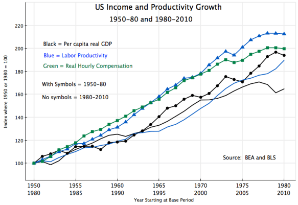
This shows the path of per capita real GDP, real labor productivity, and real hourly compensation (everything will be in real terms in this note).  Per capita GDP grew by 94% over this 30 year period, or an average of 2.2% a year, while labor productivity grew by a bit more, by a total of 113% or 2.5% a year.  Real hourly compensation grew similarly, by 100%, for a 2.3% annual rate.  In “normal” times one would expect these three measures of productivity and real incomes to grow at similar rates and to track each other, and this is basically what one observes in the pre-Reagan period.

If the Reagan measures helped spur growth, then these growth rates should have shot upwards in the next 30 years.  But one finds:

Per capita real GDP and labor productivity still grew following Reagan, but at a slower rate than before.  Per capita GDP grew only by 65% in the thirty years following Reagan (1.7% a year), vs. 94% (i.e. 45% higher) in the thirty years before.  Much of this difference is due to the weak economy at the very end of the period, due to the 2008 collapse at the end of the Bush administration and only weak recovery after, and it could be argued that one should allow for this.  Growth in the 25 years to 2005 was almost as high as the growth in the 25 years to 1975.  But then growth was strong during the Carter years (despite the widespread and oft-repeated incorrect assertion that the economy was stagnant then), while it collapsed at the end of the Bush Administration.

Growth in the economy ultimately comes from growth in labor productivity, and here the record post-Reagan is consistently weaker relative to before.  Labor productivity over 1980 to 2010 consistently tracks below where it was over 1950 to 1980, and grew by a total of 90% (2.2% a year) vs. 113% (2.5%) before Reagan.

But the really startling difference is in real hourly labor compensation:

Instead of tracking closely to the growth in labor productivity, as one would normally expect, real hourly compensation was well below.  For all workers, average real hourly compensation grew only by 39% (1.1% a year) over the thirty years post-Reagan, vs. 100% in the thirty years before.  There clearly was a change, post-Reagan, but if you were a worker, it was sharply for the worse.

The figures so far have been about overall averages:  for per capita GDP, productivity per worker, and hourly compensation per worker.  But it is also of interest to see how the average gains have been distributed across income groups.

First, for 1950 to 1980:

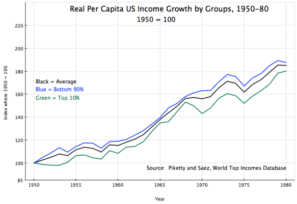
This data comes from Piketty and Saez, and is based on incomes as reported in US income tax returns (deflated to real terms using the GDP deflator).  Taxable income (including income from capital gains) is a different concept from income as defined in the GDP accounts, but the two concepts track each other fairly well over time, so comparisons in terms of growth relative to a base period will be similar.

For 1950 to 1980, one sees that average real incomes, the real incomes of the bottom 90%, and the real incomes of the top 10%, all track each other within a relatively narrow band.  Overall growth (of taxable income) was 85% (2.1% a year), with slightly more (88%, still 2.1% a year) for the bottom 90%, and a bit less (80%, or 2.0% a year) for the top 10%.  Pre-Reagan, all income groups shared similarly in income growth.  A rising tide lifted all boats.  And with incomes of the bottom 90% growing a bit faster than that of the top 10%, income equality improved some.

But things changed post-Reagan:

First of all, note that the scale here is very different than that in the previous graphs.  Note also that the data goes only up to 2008, the most recent year for which such US income tax return data has been released in a form that Piketty and Saez could analyze.  Note also that with the economic collapse in 2008, some comparisons can better be made using 2007 instead of to a trough in the business cycle.

For the full period of 1980 to 2008, average real taxable income for everyone grew by 60% (1.7% a year).  This is a somewhat slower pace than that for the thirty years before Reagan (where average real taxable income grew by 2.1% a year), consistent with and similar to the slower pace noted above for per capita real GDP.  But real incomes of the bottom 90% grew only by a total of 26% over 1980 to 2008, or 1.1% a year.  In contrast, the top 10% saw their incomes grow by 122% in the post-Reagan period, or 2.9% a year.  Distribution became more unequal, with incomes of the top 10% growing substantially faster than the incomes of the bottom 90%.

But what is startling is the growth in the shares of income going to the increasingly rich.  The top 10% enjoyed income growth over 1980 to 2008 of 122% (2.9% a year), vs. just 26% for the bottom 90%, as noted above.  But the top 1% enjoyed income growth of 234% (4.4% a year) over this period, while the top 0.1% saw their real incomes grow by 387% (5.8% a year), and the top 0.01% saw their incomes grow by 527% (6.8% a year).  The super-rich became far far richer.

Furthermore, the last year of the Bush Administration, 2008, was a year of economic collapse, with the stock market also crashing.  There were few capital gains to report as part of taxable income.  If one takes 2007 rather than 2008 as a more reasonable point of comparison, real income growth over the 27 years post-Reagan was only 33% for the bottom 90%, but 149% for the top 10%, 306% for the top 1%, 523% for the top 0.1%, and 716% for the top 0.01%.  Distribution became sharply worse.

To summarize:

1)  Overall growth in per capita GDP and in labor productivity was not higher post-Reagan, but rather was lower.  Per capita GDP, relative to the starting point, grew by 45% more in the 30 years before Reagan than in the 30 years after Reagan.

2)  Before Reagan, the paths of per capita GDP, labor productivity, and hourly compensation, tracked each other fairly closely.  After Reagan, hourly compensation rose at a far slower rate than labor productivity or per capita GDP.  Wage earners did far worse relative to others post-Reagan.

3)  Before Reagan, the incomes of the bottom 90% and the top 10% grew at fairly similar rates.  Indeed, income growth of the bottom 90% was a bit higher than that of the top 10%, indicating some move in the direction of greater equality of incomes.  But this was shattered post-Reagan, with the bottom 90% seeing income growth of just 26% over the 28 years from 1980 to 2008, while the top 10% enjoyed income growth of 122%.  But even this growth by the top 10% was small compared to that enjoyed by the top 1%, top 0.1% and especially the top 0.01%.

In other words, if you are among the rich, and especially the super-rich, you have benefited post-Reagan.  It is this elite that account for most of the money given to political campaigns, who drive the political discussion, and from the evidence considered here, have good reason to believe Reagan was positive.

But for the economy as a whole, and especially for those in the middle and lower classes all the way to the 90% mark, growth in living standards was far better before Reagan than it has been after.

GDP Growth in the Fourth Quarter of 2011: Not a Very Good Report

BEA release of 1/27/12 2011 Q3% growth 2011 Q4% growth Contribution to GDP growth in 2011 Q4
Total GDP 1.8 2.8
A.  Personal Consumption Expenditure 1.7 2.0 1.45
B.  Gross Private Investment 1.3 20.0 2.35
   1.  Non-Residential Fixed Investment 15.7 1.7 0.18
   2.  Residential Fixed Investment 1.3 10.9 0.23
   3.  Change in Private Inventories nm* nm* 1.94
C.  Net Exports nm* nm* -0.11
D.  Government Consumption and Investment -0.1 -4.6 -0.93
   1.  Federal Government 2.1 -7.3 -0.62
   2.  State and Local Government -1.6 -2.6 -0.32
Memo:  Final Sales 3.2 0.8 0.82
        nm* = not meaningful

The Bureau of Economic Analysis of the US Department of Commerce released this morning its first estimate of GDP growth in the fourth quarter of 2011.  The headline figure of 2.8% growth of total GDP might look reasonably good (actually, it is less than is needed in the on-going recovery, with unemployment still so high; it would be a reasonable growth rate if the US were already at full employment).  But the underlying details that led to this overall growth are worrisome.

As has been noted before in this blog, the short run dynamics of the quarter to quarter change in GDP is heavily influenced by what is happening to the change in private inventories.  Keep in mind that it is the change in the change in private inventories that is one component of the change in GDP in any given quarter.  In the third (and final) revision to the estimated GDP accounts for the third quarter of 2011, the change in private inventories was essentially zero.  This was down from a positive growth in inventories in the second quarter, and hence the contribution to the change in GDP in the third quarter was negative.  I noted then that there was a good chance that inventories would return to some positive growth in the fourth quarter, and hence spur the GDP growth figure for the quarter.  And this they did.  According to this first estimate for the fourth quarter, 1.94 percentage points of the 2.76% growth in total GDP (rounded to 2.8% in the reports), was due to this bounce back of  private inventories.  That is, 70% of the growth (1.94 / 2.76) was due to the change in the change in private inventories.

Leaving out this change in the change of private inventories, the growth of final sales was just 0.8%.  This is substantially down from the 3.2% figure for the third quarter.  This is a disappointment.  If final sales do not grow by more than that now, in the first quarter of 2012, one can easily see private inventories being cut back, and overall GDP growth would then be negative.  If that happens for two quarters, one will have met the standard definition of a new recession.  Not good in an election year (or any year for that matter).

There were two main reasons why final sales grew so much more slowly in the fourth quarter of 2011 than in the third quarter.  One was that non-residential fixed private investment grew by only 1.7% in the fourth quarter, sharply down from the 15.7% annualized growth in the third quarter.  It was still positive growth, and hence contributed to overall GDP growth, but only by 0.18 percentage points vs. a contribution of 1.49 percentage points in the third quarter.

Offsetting this a bit was the encouraging figure that residential fixed investment (mainly housing construction) grew at a 10.9% rate in the fourth quarter.  This was the fastest growth for such investment in a year and a half.  But this quarter to quarter figure can bounce around substantially.  More importantly for the contribution to overall GDP growth, residential fixed investment has declined by so much (since 2006), that it is now a relatively small share of GDP.  It would need to triple (i.e. grow by 200%) to get back to where it was before.  And non-residential fixed investment is 4.6 times as large, so what is happening to non-residential fixed investment is much more important.

But the most important reason for the disappointing growth in fourth quarter GDP was an absolute decline in government expenditure.  Total government consumption and investment expenditure fell by 4.6% in the fourth quarter, with federal government expenditure falling by a sharp 7.3% and state and local government expenditure falling by 2.6%.  For 2011 as a whole, federal expenditure fell by 2.0%, while state and local expenditure fell by 2.3%.

With this drag caused by falling government expenditures, it should not be surprising that GDP growth was so weak, held up mainly by inventory accumulation.  And if inventories now revert (over time, the quarter to quarter changes average close to zero), the US could fall back into a recession.  Yet many Republicans and especially the Tea Party supporters continue to claim that the way to get strong growth is for government to contract.  They claim that such contractionary policies will be expansionary.  Yet one sees no evidence of this in the new figures.  If it were not for the accumulation of private inventories (items produced but then not sold), GDP growth in the fourth quarter of 2011 would have been extremely weak.  Contractionary policies are contractionary.

But there was good news on the inflation front, assuming one believes lower inflation is always good.  As part of the GDP accounts, the BEA also estimates the price deflators for the various GDP components (so as to go from the nominal measures to real ones, so one can then get real growth rates and changes), and in particular the price deflator for Personal Consumption Expenditures (PCE).  This PCE deflator is favored by many, including reportedly Alan Greenspan (although he in fact focused more on the core PCE deflator, which excludes food and energy prices), as the best estimate of what is happening to US inflation.  The PCE deflator rose by 1.8% in 2010 as a whole, and then at an (annualized) rate of 3.9% in the first quarter of 2011.

Conservative economists, such as John Taylor of Stanford and Allan Meltzer of Carnegie Mellon, as well as Republican politicians such as Congressman Paul Ryan and others, had complained of the Fed’s aggressive policies to spur the economy, and asserted that they would lead to high inflation in the US (see, for example, here and here).  John Taylor often invoked the hyperinflation in Zimbabwe as a warning of what could happen if monetary policy was not brought under control (see, for example, here).  The rise in the PCE deflator in early 2011 was promoted as evidence of inflation starting to rise.  Keynesian economists, such as Paul Krugman, argued inflation was not a concern, with the economy in a liquidity trap and high unemployment keeping down wages so that unit labor costs were falling or flat.  They argued that the rise in observed inflation in early 2011 was due to changes in volatile commodity prices such as oil, and that such changes are rarely sustained.

What has happened since early 2011 clearly supports Krugman and the Keynesians.  After  rising at a 3.9% rate in the first quarter of 2011, the PCE deflator rose at a 3.3% rate in the second quarter and a 2.3% rate in the third quarter.  And the newly released figures for the fourth quarter indicate an estimate of just a 0.7% rise in the fourth quarter.  While the fourth quarter figures are subject to change, the trend is clearly down, with an inflation rate that is indeed arguably now too low.  Such a low inflation rate makes it more difficult for the economy to adjust (as relative prices are then more difficult to adjust), plus the very low rate increases the risk of the economy declining into price deflation, where it can be very difficult to emerge (as Japan faced in the 1990s).

One final point:  One should not put too much weight on any figures on the economy for just one quarter.  Quarter to quarter figures can bounce around a lot.  And the figures released today are simply the first estimates of what the economy was doing in the last quarter of 2011.  Over the next two months, these initial estimates will be revised twice, as is always done.  Sometimes the revisions can be significant.

Still, some of the initial estimates are of concern, and should the trends continue into 2012, the economy will be in trouble.