The (Lack of) Recovery in the Employment to Population Ratio: Not the Concern It Might Appear to Be

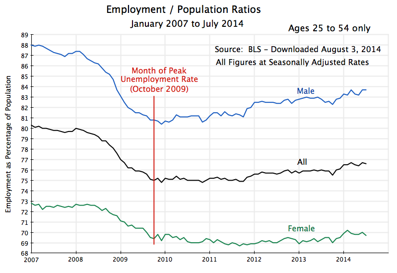
Employment to Population Ratios, Jan 2007 to July 2014

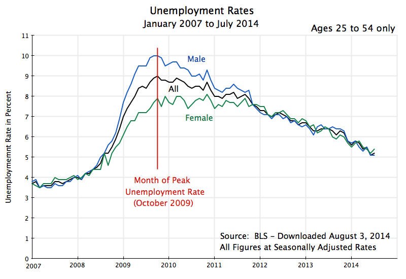
Unemployment Rates, Ages 25 to 54, Jan 2007 to July 2014A.  Introduction

A critically important policy question is how close the US economy now is to full employment.  The unemployment rate has been falling, albeit slowly, from a peak of 10.0% in October 2009, to a current 6.2% as of mid-July (ticking up from 6.1% in June, but a 0.1% change is not statistically significant).  That is, the unemployment rate has come down by a bit less than 4% points from its peak.

However, some have noted that one does not see such a recovery if one focusses on the employment to population ratio.  Excellent analysts, such as Paul Krugman and Brad DeLong, have argued that one should.  If the unemployment rate has come down by close to 4% points, then the employment to population ratio should have gone by almost the same in percentage points unless people are dropping out of the labor force.  [It will not go up by exactly the same amount in percentage points since the base for the employment to population ratio is population while the unemployment rate is expressed as a share of the labor force.  But, all else equal, they will be close.  One could make the relationship exact by expressing the unemployment rate in terms of the share of population rather than share of the labor force, but this is not how the unemployment rate is normally reported.]

If the employment to population rate has not recovered by the same amount (in percentage points) as the unemployment rate has, then by arithmetic this is only possible if the labor force participation rate has come down.  The concern is that the pool of unemployed is coming down not because people are finding jobs (which would then be seen in a rising employment to population ratio), but rather because they are dropping out of the labor force after trying, but failing, to find a decent job (thus lowering the labor force participation rate).

There are of course demographic factors as well to take into account to explain what might be happening to the labor force participation rate, in particular the increasing share of the baby boom generation that is reaching normal retirement age.  One way to do this is to focus the analysis on the prime working age group of those aged 25 to 54 only.  All the charts in this post therefore do this.  But even with this refinement, the apparent concern remains:  The employment to population ratio does not show the same recovery that one sees in the falling unemployment rate.  What is going on?

B.  Recent Years

The chart at the top of this post shows the employment to population ratios from January 2007 to July 2014, for those aged 25 to 54, and for everyone together as well as for males and females separately.  The chart below it shows the unemployment rates for these same groups.  The data all come from the Bureau of Labor Statistics.  The peak unemployment rate was hit in October 2009, after which there was a fairly steady recovery.  [The month to month fluctuations mostly reflect statistical noise.  The employment, unemployment, and labor force participation figures are all based on surveys of households, and there will be statistical noise in any such surveys.]

For the group as a whole (male and female), the unemployment rate for those aged 25 to 54 rose by about 5% points between late 2007 / early 2008 and its peak in October 2009.  Over this period the employment to population ratio fell by a similar 5% points.

But this relationship then broke down going forward.  Over the two years between October 2009 and October 2011, for example, the unemployment rate for those aged 25 to 54 fell by 1.1 percentage points, dropping to 7.9% from 9.0% at the peak (for this age group).  But the employment to population ratio hardly moved.  And between October 2009 and the most recent figures (for July 2014), the unemployment rate came down 3.8% points, while the employment to population ratio rose by only 1.6% points.

The question for policy makers is whether the 3.8% fall in the unemployment rate is a reasonable measure of how far the economy has recovered from the 2008 collapse, or the 1.6% recovery in the employment to population ratio is.  As noted above, both the unemployment rate and the employment to population ratio deteriorated by 5% points during the 2008 collapse and follow-on into 2009.  If the 3.8% recovery in the unemployment rate is the right indicator, then we would have retraced about three-quarters of the fall (3.8/5.0 = 0.76).  But if the 1.6% recovery in the employment to population ratio is the right indicator, then we are less than one-third of the way (1.6/5.0 = .32) back.  This is a huge difference.

Since the difference between the two measures must be reflected, by arithmetic, in a declining labor force participation rate, one needs to look there to see what is going on.  For the January 2007 to July 2014 period, the picture is:
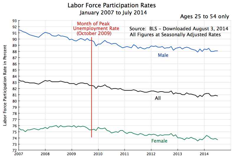
Labor Force Participation Rates, Jan 2007 to July 2014

The rates are all falling after October 2009, for males and females, and hence for the two combined.  What is interesting is that they appear to be falling at a fairly steady pace throughout the period (aside from the month to month squiggles that are mostly statistical noise).  And for males, the rate appears to be falling at a broadly similar pace before October 2009.  The trend is not so clear for females before October 2009, whose rate may have been rising until a few months before October 2009.  This then leads to little change in the overall rate for males and females combined, but the period is so short that the trends are not clear.

C.  A Longer Term Perspective

When one then takes a longer view, the trends do become clear:
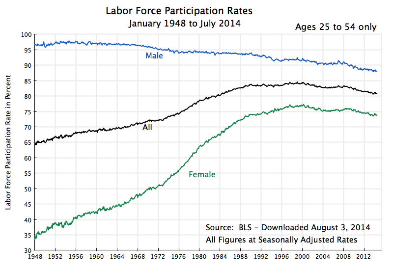
Labor Force Participation Rates, Jan 1948 to July 2014

Going back to 1948 (the first year in the BLS series for all these labor market indicators), one sees a pretty steady fall in the labor force participation rate for males from around the mid-1950s (with the squiggles in the curves due to statistical noise), and a strong rise in the female labor force participation rate from the initial year with data (1948) to around 2000.  There was some acceleration in the rise for females in the 1970s, and then a deceleration from the early 1990s, leading to a leveling off around 2000.  Since then, the labor force participation rate for females has fallen, on a path that appears to parallel the similar fall in the rate for males, but at 14 to 15% points lower.

The data are consistent with the broader socio-economic story we have of the labor market in the post-World War II period.  Male labor force participation rates are quite high, but have fallen some over time.  Female rates started very low but then grew, and grew at an especially rapid rate starting in the 1970s.  Female labor market participation rates then reached maturity and leveled off around 2000, after which the female rates paralleled the downward path of the male rates, but at a certain distance below.

In this longer term perspective, the decline in the labor force participation rates since 2009 therefore does not appear to be unusual, but rather a continuation of the longer term trend.  There have been some small fluctuations around the long term trends in recent years that appear to coincide with the business cycle (in particular for the female rates), but they are small and dominated over time by the long term trends.  There have also been similar fluctuations in the participation rates in the past (such as in the mid-1990s) that did not coincide in the same way with the business cycle, as well as large business cycle changes in the past that did not show such fluctuations (such as during the big downturn in the early 1980s at the start of the Reagan presidency, that did not lead to such fluctuations in the labor force participation rates).

The implication of this analysis is that the reported unemployment rates are a better indicator of the state of the labor market than the employment to population ratio is.  The fall in the labor market participation rates in recent years has not been something new, driven by the 2008 economic downturn, but rather a continuation of the trend seen in these rates over the longer term.

Looking at unemployment rates for this age group going back to 1948 provides a useful perspective on what to expect for it:
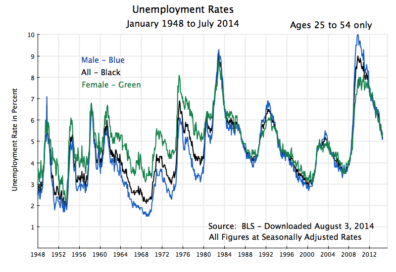
Unemployment Rates, Jan 1948 to July 2014

Unemployment rates continue to be high in mid-2014.  Even though they have retraced about three-quarters of the deterioration in 2008/2009 (more for males, less for females), they are, at 5.2% currently (for males and females together) still well above the unemployment rates for this group of about 4% in late 2007 /early 2008, and of only 3 1/2% in late 2006 / early 2007.  And the unemployment rate for this group was only 3.0% in late 2000, at the end of the Clinton years.

There is therefore still a significant distance to go before the economy will have returned to full employment.  But the improvement since October 2009 is substantial, and is real.

D.  Implications of the Long Term Trends for Aggregate GDP

Finally, while the employment to population ratio might not be a good indicator of how much slack there is in the labor market in the short run, there are long term implications of the trends noted above.  Specifically, while the overall labor force participation rate rose steadily from 1948 (the earliest year for which we have this data) to about 2000, this was entirely due to the strong rise in the female rate over this period.  The male rate was falling, steadily but slowly.  Once the female rate peaked in the year 2000 and then began to fall at a rate similar to that for males, the overall rate began to fall.  There is no indication this will be reversed any time soon.  Indeed, the degree to which the female rate is now paralleling the male rate suggests that this really is a “new normal”.

A falling labor force participation rate is not necessarily an indication of something bad in itself.  It might reflect increased prosperity, which is being enjoyed by choosing not to work but to retire early, or to attend university or post-graduate education programs in your 20s, or to stay at home and raise a family.  But to the extent it reflects lack of free choice, such as being fired in your 40s or 50s and then not being able to find a job, or to remain a perpetual student due to lack of job opportunities, or to stay at home due to the unavailability of affordable child care, the implications are different.  But it is well beyond the scope of this blog post to dig into this deeper.

But there will be important long term implications of declining labor force participation rates on long term GDP growth.  With fewer in the labor force, aggregate GDP growth will be less.  Note that this does not imply growth in GDP per capita (or more precisely, GDP per worker) will be less.  GDP per worker is a function of productivity growth.  But with fewer workers than otherwise, aggregate GDP growth will be less.

Two final charts, then, to close this blog post.  The first shows the absolute number of people in the ages 25 to 54 population cohort, who are not in the labor force:
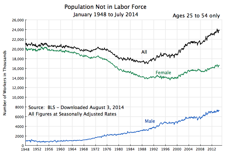
Population Not in Labor Force, Jan 1948 to July 2014

The number of males in this age group not in the labor force has been growing steadily since the late 1960s.  The number of females not in the labor force fell until around 1990, was then flat for a decade, and then began to grow.  Overall, the number aged 25 to 54 not in the labor force started to grow around 1990, and has continued to grow since.

Looking at the numbers of those in the 25 to 54 age group in the labor force:
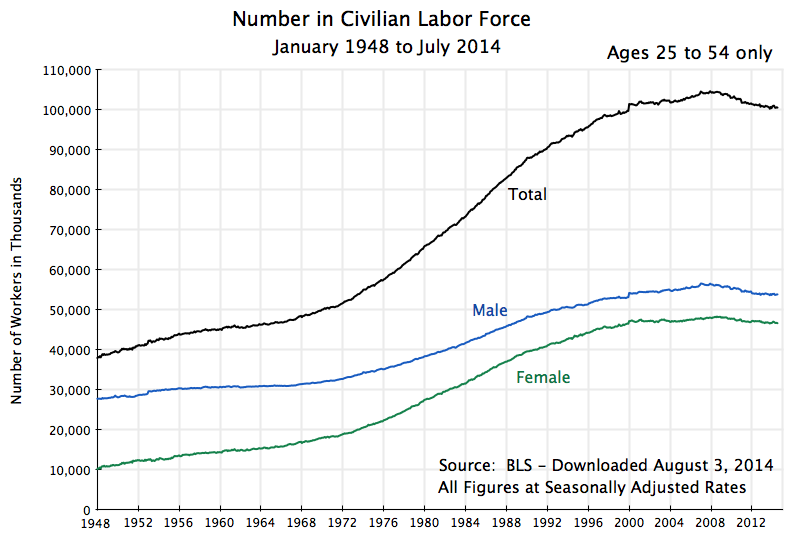
Labor Force Number, Jan 1948 to July 2014

Due to a growing population in this age group (baby boomers, for example, but others as well), and the growing labor force participation rates of females until 2000, the total labor force in this group rose from the starting year (1948) until 2008.  It grew especially fast in the 1970s, 80s, and 90s.  But the absolute size of the labor force (in the 25 to 54 age group) then started to fall from 2008.  This is a historic change for the US, and based on the fall in labor force participation rates discussed above, as well as slowing population growth, should be expected to continue.  While GDP growth per capita (or per worker) might continue to grow as it has in the past (and it has grown at a remarkably consistent 1.9% a year since 1870 in the US, as discussed in this earlier blog post), one should expect aggregate GDP growth to slow.

E.  Summary and Conclusion

The unemployment rate has fallen substantially since hitting its peak in October 2009, but one does not see a similar recovery in the employment to population ratio.  The labor force participation rate therefore has to have fallen.  However, it does not appear that this fall in the labor force participation rate has been driven by the economic downturn, where high unemployment and poor job prospects led workers to drop out of the labor force on a widespread basis.  Rather it appears largely to be a continuation of longer term trends, that become clear when one separates out the paths for male and female labor force participation rates.

The implication is that the unemployment rate is probably a good indicator of how much slack there is in the labor force.  The unemployment rate has retraced about three-quarters of the rise during the 2008/2009 downturn, but is still high.  And it is substantially higher than what was seen as possible in late 2006 / early 2007, and especially the rate achieved in late 2000.

But there are longer term implications.  The analysis suggests that we should not expect much of a recovery in the labor force participation rate when the economy finally returns to full employment.  Rather, the labor force participation rate is on a downward slope, and has been since the year 2000 (when the female rates reached maturity).  This is likely to continue.  The result is that the absolute size of the labor force in the prime working age years of 25 to 54 should be expected to continue to fall for the foreseeable future.  Japan and most of the European economies have already been facing this.  While GDP per worker, which is driven by productivity change, need not necessarily slow, one should expect growth in aggregate GDP to be less than what one saw in the past.  The ability to adapt to, and manage in, this new economic environment remains to be seen.

Employment Growth During the Presidencies of Obama and Bush

Cumul Private Job Growth from Inauguration to May 2014

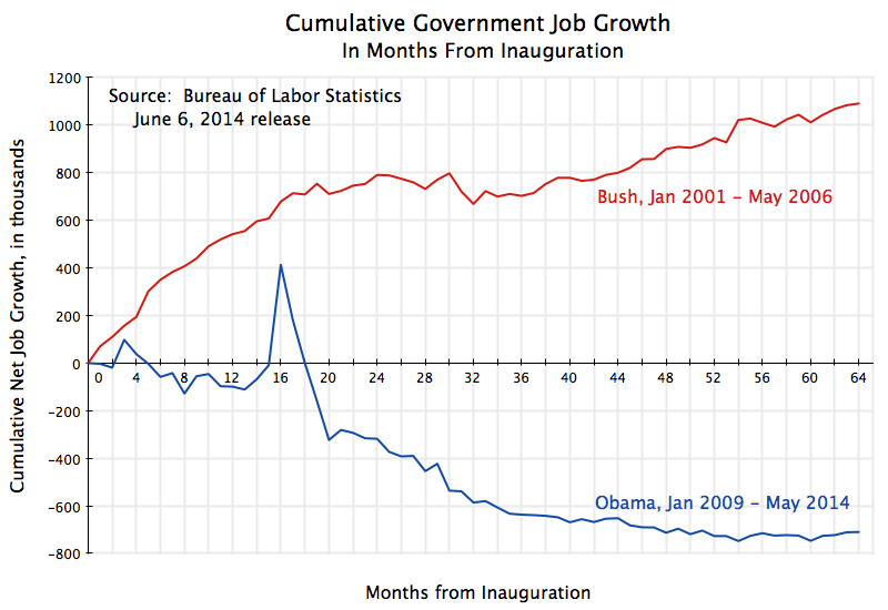
Cumul Govt Job Growth from Inauguration to May 2014

The Bureau of Labor Statistics released its regular monthly jobs report on June 6.  Nonfarm payroll employment rose by 217,000 – a broadly similar pace as in recent months.   But most news reports focussed on noting that total jobs in the US (actually, total nonfarm payroll jobs) have now for the first time exceeded the peak previously reached in January 2008, before the sharp fall that began in the last year of the Bush presidency.  It took the economy six years and four months to get back to the level of employment it had then.

While this is a significant benchmark, it is not all that meaningful by itself.  The labor force has continued to grow over the last six years, so unemployment remains high (at a rate of 6.3% currently).  Conservative critics have charged that the pace of job creation under Obama has been slow, and assert that the slow pace is due to Obama’s anti-business administration (they allege), with high taxes and increased regulation, the negative effects (they assert) of the measures under the Affordable Care Act to make it possible for the uninsured to obtain health insurance coverage, plus an allegation of “increased uncertainty”, as all acting to hold back the private sector from creating new jobs.

To judge such allegations, one might examine the pace of job creation during Obama’s term to the pace during the term of George W. Bush, a conservative Republican who was purportedly pro-business and anti-regulation, and who presided over record tax cuts.  One needs also to separate net job growth in the private sector from net job growth in the public sector to understand the story.

The two charts above do this, and update similar charts in previous posts on the blog that have examined the issue (the most recent from January 2013).  Points to note include:

1)  Net private job growth has been far higher under Obama than under Bush.  As the top chart shows, there were 5.2 million additional private sector jobs in May 2014 compared to when Obama was inaugurated, and an additional 9.4 million private jobs from the trough reached in February 2010, a little over a year after Obama took office.  Private jobs were disappearing at a rate of over 800,000 every month when Obama was taking the oath of office.  This was soon turned around as a result of stimulus measures and the aggressive actions of the Fed, with the rate of decline at first diminishing and then positive job growth appearing a year later.

Under Bush, in contrast, there were only 2.4 million more private jobs at the same point in his presidency relative to when he took office.  A primary reason for this difference is that while the economy was collapsing when Obama took office (which he then turned around within a year), the downturn at the start of the Bush term in 2001 began after he took office.  The economy then began to turn around (in terms of job growth) only two and a half years into Bush’s term in office.  Only then did private jobs begin to grow under Bush.

2)  Once the private job growth began (13 months into Obama’s term, and 30 months into Bush’s term), the pace of that job growth has been remarkably steady in both administrations.  There were month to month variations, of course, particularly in the data as originally announced (but then later revised, in the regular process to incorporate more complete data as it becomes available).  That is, the lines in the chart above for private job growth are both remarkably straight once the turning points were reached.

3)  Not only was the pace of private job growth remarkably steady after the turning points, they are also remarkably similar in terms of that pace for Obama and Bush.  That is, the two lines in the graph above are roughly parallel to each other after the respective troughs.  The pace of private job growth has been 184.5 thousand per month under Obama up to now, and a bit less, at 168.2 thousand per month, under Bush from his trough up to the same point in his presidency.

Thus there is no support in this data for the assertion that private sector job growth has been especially slow under Obama, due to an alleged anti-business administration.  Private sector job growth under Obama has been similar to, and in fact a somewhat higher than, the pace under Bush during the respective recoveries.  And total private job growth is far higher under Obama than it was at the same point in the Bush presidency, as the recovery was earlier under Obama.

4)  Where Obama and Bush do differ, and markedly so, has been in net government job growth.  Government jobs grew strongly under Bush (as they have for all recent presidents other than Obama; see this blog post).  But net government jobs have fallen sharply and consistently under Obama.  Only in the last year or so have they leveled off, but with no recovery in number.  Keep in mind that government jobs include jobs at all levels of government, including state and local government.  It is not just the federal administration that is covered here.  But the impact on the economy is similar whether it is a locally employed school teacher being laid off, or a researcher employed by the National Institutes of Health.

Bush is viewed as the small government conservative.  But government jobs grew by 1.1 million from the month of his inauguration to May 2006.  Government jobs fell by 710,000 over the similar period in Obama’s term.

5)  Thus part of the reason net overall job growth has been disappointing during Obama’s term is not that private job growth has been slow, but rather that government has cut back on those it employs, hence bringing down the overall total.  If government jobs had simply remained flat during Obama’s term in office, rather than fall by 710,000, the direct impact on the unemployment rate would have been to bring that rate down to 5.8% from the current 6.3%.  But that would be the direct impact only.  There would also be indirect impacts.  The now employed school teacher or researcher would spend their newly earned income on what they need, which would lead to increased demand for products and employment of additional workers to make them.  (See this Econ 101 blog post on the multiplier and what it means.)  Assuming a not unreasonable employment multiplier of 2 under current conditions, the impact of simply keeping government employment steady rather than allowing it to fall by 710,000 would have been to bring the unemployment rate down to 5.4%.

Had government employment been allowed to grow under Obama as it had under Bush, the impacts would have been significantly larger.  The direct impact alone (before the multiplier) would have brought the unemployment rate down to 5.1%.  Mechanically applying a multiplier still of 2 would imply an unemployment rate brought down to 4.0%.  But this would have then been at the low end of the range normally taken to represent full employment (of perhaps 4% to 5 1/2%, depending on the assessments of different analysts), and it would no longer be correct to assume a multiplier would have remained at 2.  Rather, and as discussed in the blog post cited above on multipliers, there would have been other reactions, including most likely by the Federal Reserve Board.  With the unemployment rate having been brought down to the full employment range, one would expect that the Fed would have shifted back to a more normal interest rate and monetary policy from its current policy (due to the still high unemployment) of targeting interest rates to as close to zero as possible.

Summary and Conclusion

To conclude,  far more private jobs have been created during the Obama presidential term  than during the same period in the term of George W. Bush.  In part this was due to the more rapid recovery under Obama (due to the stimulus and other measures taken) from the economic collapse he inherited from the last year of the Bush administration, than the recovery under Bush from the downturn that began a few months after he became president in 2001.  But it is interesting to see that once the respective recoveries began, the pace of private job growth was similar during the Obama recovery as under the Bush recovery (and indeed somewhat faster under Obama).  And this is despite the contractionary policies followed by government since 2010.  For the first time since at least the 1970s (I did not look back further in that blog post), government spending has been cut in an economic downturn, rather than allowed to rise to make up for insufficient aggregate demand.

Where the Obama and Bush periods differ, and substantially, is in government employment.  Government employment grew under Bush (as is normal, and as has been the case under every prior president since at least Eisenhower), but has been cut sharply under Obama.  It is because of these cuts that total employment growth under Obama has been disappointing.  Without those cuts, the economy would have returned to full employment some time ago.

ObamaCare Has Not Led to a Shift of Employees From Full-Time to Part-Time Work

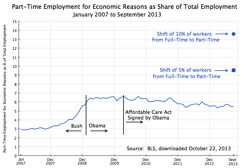
Part-Time Employment #2 as Share of Total Employment, Jan 2007 to Sept 2013

Conservative media have repeatedly asserted that due to ObamaCare (formally the Affordable Care Act), there has been and will be a big shift of workers from full-time to part-time status.  Publications such as Forbes, the Wall Street Journal, and of course Fox News, have asserted that this is a fact and a necessary consequence of ObamaCare.  The argument is that since ObamaCare will require employers to include health care benefits as part of the wage compensation package to full time employees (defined as those who normally work more than 30 hours a week for the firm), firms will have the incentive, and by competition the necessity, of shifting workers to part-time status.  It is argued that instead of employing three workers for 40 hours each (for 120 employee hours), firms will instead employ four part time workers at just below 30 hours each to obtain the 120 employee hours.

There are a number of problems with this argument.  First, the ObamaCare requirements for health coverage only apply to firms with more than 50 full time employees.  There is no change for firms employing fewer than 50 workers.  Second, almost all of the firms in the US with more than 50 employees, and indeed a majority also of the workers in firms of fewer than 50 employees, are already in firms that provide health insurance coverage for their workers.   Specifically, 97% of the workers in firms with more than 50 employees are in firms offering health insurance coverage as part of their wage compensation package.  ObamaCare will require this (to avoid a per worker penalty) to go from 97% to 100%, which is not a big change.  And even though ObamaCare will not have such a requirement for firms employing fewer than 50 workers, it is already the case that 53% of the workers in such firms are in firms providing health insurance coverage.   Firms provide health insurance coverage as part of the total compensation package they pay their employees both because they have a direct interest in having healthy workers, but also because there are tax and financial advantages to doing so.

Notwithstanding these issues, the conservative media and Republican politicians continue to assert that ObamaCare is leading to a large substitution of part-time for full-time workers.  But as Jason Furman, the Chairman of the Council of Economic Advisors in the White House has recently noted, this is not seen in the data.  The graph at the top of this blog post is one way to look at this data.

The graph shows the share of part-time workers (part time for economic reasons and not part time by choice) in all workers, by month, for the period from January 2007 to September 2013.  The data come from the Bureau of Labor Statistics.  If ObamaCare is leading to a large shift of workers from full-time to part-time status, then this ratio would be rising since ObamaCare was passed or at some more recent date.  But it is not.

The share of part-time workers in all workers rose in the last year of the Bush administration due to the economic crisis, from about 3% before to about 6 1/2% after.  It was rising rapidly as Obama took office, but stabilized soon thereafter as the economy began to stabilize with the passage of Obama’s stimulus package and aggressive actions by the Fed.  Since then the ratio has trended downwards, albeit slowly.  As has been noted previously in this blog, the continued fiscal drag from government expenditure cuts since 2010 has held back the economy and hence the recovery in the job market.  The blog post noted that if government spending had simply been allowed to grow at its long term average rate, we would likely have already returned to full employment (and would have returned to full employment in 2011, if government expenditures had been allowed to rise at the same pace as they had during the Reagan years).

The Affordable Care Act was signed by Obama in March 2010.  As the graph above indicates, there was no sharp change in trend once that act was signed.  If anything, the share of part-time workers in all workers then began to decline from a previous steady level.  Such a response is the opposite of what the conservative media and Republican politicians have asserted has been the result of ObamaCare coming into effect.

To put the figures in perspective, the graph above also shows how high the ratio of part-time workers to all workers would have had to jump, had either just 5% (the square point) or 10% (the round point) of full-time workers been substituted for by an equal number of part-time workers, additional to where the September 2013 ratio in fact was.   An equal number is used between the full-time and part-time workers to be conservative in the estimate.  The argument being made by the critics is in fact that a higher number of part-time workers would have been hired to substitute for the full-time workers let go, to get the same number of working hours.  But even with an equal number being substituted, such a shift of 5% of the workers would have led to rise in the ratio by 74% relative to where it was in September 2013, and a shift of 10% would have led to a rise of 148%.  One does not see anything like this.

It is not known what the paths would have been to reach those 5% or 10% shifts, but the resulting changes in the paths would have been obvious.  Such changes did not occur.  Since one is comparing the figures to what otherwise would have been the case, the conservative critics would need to argue that the ratio of part-time to all workers would have plummeted in the absence of ObamaCare.  There is no reason given on why this would have been so.  Furthermore, for the case of a 10% shift the number of part-time workers would have had to be negative in the absence of ObamaCare, which is of course impossible.

There is simply no evidence to support the assertion in the conservative media that ObamaCare is leading a significant share of firms to shift workers from full-time to part-time status.