What GDP Means: A Not Terribly Surprising Lack of Understanding by Elon Musk and Trump’s Secretary of Commerce

Update, March 28, 2025:  The BEA released on March 27 its initial estimate of GDP as measured from wage and profit income for the fourth quarter of 2024.  The BEA labels this, to avoid confusion, Gross Domestic Income – GDI.  In principle, it should be the same as GDP but will differ as data from different sources are used to estimate both; see the discussion in the post below.  The BEA also released its initial estimate for the fourth quarter of 2024 of value-added produced by sector, from which one can calculate growth in production by private industries and in production by government.  The two together sum to GDP.  Charts 1 and 3 in the post and related text have been updated to reflect these new estimates.

Economic growth was strong in the last quarter of 2024 – the last full quarter of the Biden administration.  Real GDP grew at a 2.4% annual pace when estimated from demand-side measures, and at a substantially faster 4.5% pace when estimated from income-side measures (i.e. GDI).  Growth in the average of the two measures – GDI and GDP – was 3.5%.  This is exceptionally strong.  And price inflation was modest, with growth in the Personal Consumption Expenditures (PCE) price deflator of 2.4% at an annual rate, and 2.6% in the core PCE price deflator.

Along with an unemployment rate of just 4.0% (as of January), Trump has inherited an extremely strong economy from Biden.  We will now see what develops.


A. Introduction

On February 28, Elon Musk posted on his social media site X the comment:

“A more accurate measure of GDP would exclude government spending.

Otherwise, you can scale GDP artificially high by spending money on things that don’t make people’s lives better.”

Two days later, on March 2, Secretary of Commerce Howard Lutnick followed up on this and said in an interview on Fox News:

“You know that governments historically have messed with GDP.  They count government spending as part of GDP.  So I’m going to separate those two and make it transparent.”

These statements reveal a lack of understanding of what GDP means by two of the most prominent officials (or in Musk’s case, a non-official official) in the Trump administration – both key players on economic issues.  While that lack of understanding is not surprising – how GDP is defined is a technical issue – what is worrying is that these prominent Trump appointees would assert this with confidence and without bothering to check first with experts whether it was in fact true.  Such arrogance is unfortunately now the norm in this administration.

Lutnick’s assertion that “governments have historically messed with GDP” (in fact they have not) is also worrisome as it looks like preparation for the Trump administration to do precisely that.  GDP estimates are prepared by the Bureau of Economic Analysis (BEA), a bureau in the Department of Commerce now headed by Lutnick.  Also, just a few days before his confused statement on GDP Lutnick disbanded the standing external technical advisory committee that advised the BEA on how GDP estimates might be improved.  Committee members were professionals at universities and in industry who were specialists on these issues.  They were not paid and only had their travel costs covered when meetings were called.  At the same time, Lutnick also disbanded several similar committees of unpaid specialists advising the Census Bureau – also part of the Department of Commerce.

The concern is that Lutnick is setting things up precisely to “mess with” how GDP is estimated.  The concern is that he could very well order the BEA to manipulate the standard methodology and estimation process to come up with figures that make it look like the economy is in less trouble than it in fact is in the coming years of Trump’s second presidential term.

Musk and Lutnick do not appear to realize that GDP – which stands for Gross Domestic Product – is a measure of the market value of all the economy produces in a given period (normally expressed in annualized terms).  Gross Domestic Product is a measure of production; production that takes place domestically (i.e. within the nation’s borders); and in gross terms (meaning without depreciation of capital taken out).  The BEA also produces estimates with depreciation subtracted – which it calls Net Domestic Product or NDP – but less attention is paid to those figures as depreciation is especially hard to estimate, both conceptually and in practice.

The aim of the GDP measure is thus to arrive at an estimate of how much the nation’s economy is producing.  How that production is used is not the purpose of the measure, and there is no assessment of whether that use should be considered “good” or “not so good”.  But it is disparaging to assert (as Musk and Lutnick have) that the services that the government provides – such as the services of the school teacher pictured above – are worthless and hence should not be counted.

Those statements of Musk and Lutnick do, however, provide a “teachable moment”.  Many others – including some in the news media – are also confused about what GDP means and signifies.  This post will seek to sort through those confusions.  The first section below will review what GDP means and how it is estimated.  Those are two separate things.  Lutnick and Musk are conflating what GDP is designed to measure (i.e. production) with one way in which GDP may be estimated (from the demand side, by estimating how that production is used).  The BEA in fact estimates GDP in three different ways, with this serving to provide also cross-checks on the estimates.  In principle, GDP as estimated by each of the three methods should be the same.  But one is dealing with real-world data, there will always be statistical noise, and hence by using three different approaches the BEA can arrive at a more robust overall estimate.

Lutnick also asserted there is a lack of transparency in the GDP figures, in that the BEA includes figures on government spending in GDP.  This is confused and it is also defamatory to assert that the BEA is anything other than transparent.  The BEA issues each month regularly updated figures not just on GDP but also on much else in what is more formally called the National Income and Product Accounts (NIPA).  In these, the BEA provides estimates on all sorts of aggregates with and without government spending.  While Lutnick and Musk are not clear about what they are seeking, one guess is that they are looking for a figure on domestic production that excludes whatever is produced directly by government (such as the services of the public school teacher pictured above).  But the BEA in fact provides this:  It is called Value-Added by Private Industries.  The BEA provides estimates of this for each calendar quarter and in both real and nominal terms.  Charts below will show (using the published BEA figures) what growth would have been whether measured by GDP as defined or by a measure of growth that excludes government-produced services.

We will also look at some simple measures of the productivity of federal government workers over time.  The calculations are of necessity rough, but if one counts only the management of federal discretionary expenditures, the growth in federal worker productivity in fact matched (over the period 1997 to 2023) the growth in overall labor productivity in the economy.  And if one includes also the management of mandatory spending (entitlement programs such as Social Security and Medicare), federal worker productivity has grown far faster than overall labor productivity in the economy.  These estimates should not be taken too seriously, as there is no way to assess how well-managed the programs are.  But in simple but crude terms, there is no evidence that growth in federal worker productivity has lagged what the rest of the economy has achieved.  Indeed, by one measure it was far better.

The post will end with some final comments.  While I am sure Musk and Lutnick do not realize it, their notion of what GDP should and should not include is in many respects similar to concepts used in the Material Balances System of national accounts (also called the Material Product System) developed in the 1930s by Gosplan in Stalin’s USSR.  It was then used (by command – there was no choice here) in the communist countries of Eastern Europe up until 1990.  Those systems excluded the concept of certain services as contributing to production, similar to what Musk and Lutnick are advocating now.  It was built on the concept from Karl Marx of productive and unproductive labor, with Musk and Lutnick asserting that certain labor (those employed in government) is unproductive.

It is ironic that senior figures in the Trump administration appear to be advocating for a system similar in nature to that developed in Stalin’s USSR.  We know that that did not end well.

B.  The Meaning of GDP versus How GDP is Estimated

GDP – Gross Domestic Product – is a measure of the market value of what the economy is producing.  That is not the same concept as what the economy is using.  While statisticians can make use of data on how output is being used in order to arrive at an estimate of what was produced, confusion on this point appears to have led to the error Musk and Lutnick made.  While what they did mean is not fully clear, they mistakenly asserted that eliminating one of the uses of output (that by government) would yield “a more accurate measure of GDP” (as Musk put it in the quote above).  That is not correct.  It would no longer be GDP.

The confusion – which others have made as well – stems from how GDP is estimated.  The BEA (and also the international standard on national account concepts) estimates GDP in three different ways.  The three should in principle yield the same figure for GDP (after some minor adjustments to reflect indirect taxes and subsidies).  But with real-world data, the three estimates will normally differ only by some – hopefully small – amount.  The three approaches will serve, however, as cross-checks on each other, and can flag that there is an issue if one of the estimates differs significantly from the others.

An earlier post on this blog discussed those three methods for estimating GDP.  Readers may wish to read that post (which covers also how recessions are identified and formally declared) for a more complete discussion.  And for a much more detailed review, they may refer to Chapter 2 of the NIPA Handbook issued by the BEA.  But briefly, GDP is estimated by:

a)  The initial, and most widely viewed, estimate of GDP comes not from estimates of what is produced, but rather from how that production is used.  As those who have studied any economics know, GDP will be equal to the sum of Personal Consumption, Private Investment, Government Consumption and Investment, and Net Exports (i.e. Exports less Imports).  This holds not because Personal Consumption and the other uses of GDP are themselves producers of GDP (although some commentators often imply that), but rather because Private Investment includes investment in inventory accumulation.  Whatever is produced and not sold will accumulate in inventories, and with this as a balancing item one can go from the sum of all the uses of output to what production itself was.

It is a simple trick, but often misunderstood.  It allows the BEA to arrive at a fairly good estimate of how much production (GDP) grew in any calendar quarter just one month after the end of each quarter.  The BEA formally calls this its “Advance Estimate” of GDP, although many refer to it as the first or initial estimate of GDP.  It is then revised a month later (to produce the “Second Estimate”), and again a month after that (to produce the “Third Estimate”), as more complete data become available to the BEA.

The components of demand are also interesting and important in themselves.  They provide figures on what happened to personal consumption, fixed as well as inventory investment, and the other demand components of GDP.  To many, these figures on spending are of more interest than what happened in a particular sector of production.  And perhaps more importantly, in a modern economy production itself is largely driven by what producers can sell.  As Keynes taught us, production cannot be taken as a given at some “full employment” level, but rather will respond to what producers believe they can sell at a price that will cover their costs.

If, as Musk and Lutnick appear to be saying (again, they are not fully clear), the use of production by government (or some portion of that use) were to be subtracted from GDP, then the sum of what is used in the economy will no longer match what is produced by the economy.  That simple identity will no longer hold.

b)  GDP is also estimated by summing up the incomes (wages and profits) generated by the act of production.  This is based primarily on data obtained by the BLS from its monthly survey of business establishments (the Current Employment Statistics – or CES – survey; most commonly known for the monthly employment estimates it provides); from the Quarterly Census of Employment and Wages (QCEW) also of the BLS and with more detail on earnings; from the Quarterly Financial Report (QFR) of the Census Bureau (that obtains, for a sample of business firms, statistics on their financial positions and profits); and from a range of other sources to fill in the gaps (e.g. on farm incomes).

The value of all that is produced in the economy will accrue as someone’s income.  Thus by arriving at an estimate of aggregate incomes, the BEA will have a second approach to estimating GDP.  Those incomes include wages and other compensation paid to labor (e.g. health insurance, pension contributions, and such) plus the profits (or gross margin) accruing to the owners of the firms.  Since GDP is a gross concept (meaning before any deduction for depreciation of capital), the profit concept will be profits before any deduction for depreciation allowances.

The BEA does not try to provide an estimate of GDP by this approach in its Advance (first) Estimate of GDP released one month after the end of each quarter.  It does not yet have sufficient data to do this.  Rather, its first estimate is only (normally) provided with its Second Estimate of the GDP accounts two months after the end of each quarter.  At that time it issues a revised estimate of its demand-side estimate of GDP, and its initial estimate of GDP as arrived at from its income-side figures.  To avoid confusion, it calls this estimate Gross Domestic Income (GDI) rather than GDP, although in principle they should be the same.  But in the real world, the GDP and GDI figures will differ by some (hopefully small) amount, and to be fully transparent, the BEA shows this difference with the label of “Statistical Discrepancy”.  The BEA also provides a figure for the simple average of the GDP (demand-side) and GDI (income-side) estimates.  Many professionals take the quarterly changes in that simple average to be a better estimate of what growth has been in the economy – better than either GDP or GDI alone.

[Side note:  The initial GDI estimates are normally provided at the time of the Second Estimate of the GDP accounts, i.e. two months following the end of each quarter.  But the figures for the fourth quarter of the year are an exception, as extra time is allowed for businesses to complete their end-of-year accounting.  Thus the initial GDI estimates for the fourth quarter of each year are not released in late February but rather in late March.]

It is not clear what would happen to this GDI estimate should the BEA be required by Lutnick (its boss) to not count government spending (or some portion of government spending) in its GDP estimates.  Not only do government workers (civil servants) earn incomes, but wages are paid and profits are earned on the production of what government purchases.  While it would be straightforward (although silly) to exclude wages earned by government workers from the total incomes earned in society, it would be far more difficult to try to cancel out wages and profits earned on production sold to government.  But unless one did that, GDI would no longer match up with the concept of GDP that Musk and Lutnick appear to be calling for.

c)  The third approach the BEA uses to estimate GDP is to estimate directly what each sector in the economy produces and then add it up.  This is, however, the most difficult.  Hence the initial estimate of GDP in this way is not issued until the third month following the end of each calendar quarter (at which time the BEA issues also a second set of revised estimates of GDP from the demand side and a first set of revised estimates of GDP from the income side (i.e. GDI).  And while in principle this direct production-side estimate of GDP should match the other two estimates of GDP, the BEA does not publish what they arrived at for overall GDP from that production-side estimate.  Rather, for whatever reason (possibly limited confidence in the adequacy of the data they have at the time, or to avoid confusion by the public) the BEA scales their sector-by-sector estimates of production to match their (twice-revised) demand-side estimate of GDP.

To avoid double-counting, only the value that is added in each sector is counted (“value-added”).  The value-added in a sector of production is the gross revenues from the sale of what is produced minus what that sector purchases from other sectors – which are called intermediate inputs.  Thus, for example, the value-added of a bakery will equal the revenues of the bread that it sells less the cost of the inputs it had purchased – the flour, energy, water, and other ingredients it used.  A portion of that value-added is paid to the workers in wages and other compensation, and what is left is the gross margin or profits (the BEA uses the term “gross operating surplus”) of the bakery.  And for Gross Domestic Product (as opposed to Net National Product), it will be the profits before any deduction for depreciation.

Adding up value-added across all sectors of the economy should then match GDP as estimated from the demand side and GDP (GDI) as estimated from the income side.  But a question that then arises is how do they estimate value-added by the part of government that does not sell its output on the market?  While government enterprises (such as the Post Office, government-owned public utilities such as water companies, certain toll roads, and similarly) are an exception, they are a relatively small share of what government does.  A similar issue arises for non-profits who do not sell what they provide.

For what is called “general government” (government excluding government enterprises), as well as non-profits who do not sell what they provide on the market, the BEA follows standard international guidelines and sets the value-added of such entities to equal what it pays in wages and other compensation to government workers plus an estimate of what depreciation was on the capital assets of the government (or the non-profits).  The estimated depreciation is added in order to make these figures comparable to the figures for value-added in the sectors where goods and services are sold in the market.

Adding value-added estimated in this way for general government (and non-profits) to the figures for value-added in the sectors of the economy that sell in the markets (including by government enterprises), will then yield an estimate for GDP that in principle will match both GDP as estimated from the demand side (how the production was used, including for any inventory accumulation) and from the income side (wages and profits).

A generous interpretation of the comments of Musk and Lutnick is that they would exclude the counting of any value from the services that government itself provides when measured in the way described above.  That does not appear to be the case, but it is a possible interpretation and would indeed make more sense than excluding government spending (or some portion of government spending) from the demand side estimate of GDP.  That is, under this interpretation of Musk and Lutnick, the BEA would be instructed to provide an estimate of all that is produced in the economy excluding that provided by government.

But the BEA already publishes precisely such a figure.  It is the sum of value-added across all of the private sectors of the economy (which the BEA labels “Private Industries”).  Quarterly estimates on this are provided in the table titled “Gross Domestic Product by Industry Group” which is part of their publication of the Third Estimates of GDP, released three months following the end of each quarter.  The contribution to GDP from Private Industries plus the contribution from Government sums to their overall estimate of GDP.  The BEA is fully transparent on this.

What difference would it make if we assume Musk and Lutnick are referring to this concept of production as a measure of how the economy is performing?  The next section will examine this.

C.  Growth in GDP Compared to Growth in Private Production

How much would growth differ if it were measured based on the figures the BEA provides (and has been providing for many years) on private production as opposed to GDP?  There would be some difference, but not all that much.  What may be interesting is that, at least during recent presidential terms, growth in private production has been consistently higher than growth in overall GDP – although not by a substantial amount.  That is, growth in government production has been kept constrained through tight budgets, which has kept overall GDP growth below the growth in private production.  This is the opposite of the assertions of Musk and Lutnick that government spending has been some kind of artificial boost to the recorded figures on GDP growth.

It is interesting to compare the figures on growth by presidential term.  Comparing that under Biden and in Trump’s first term:
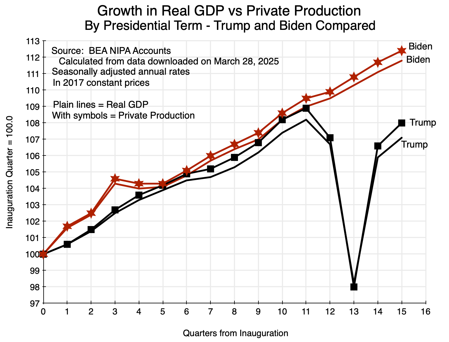
Chart 1

The plain lines show the levels of real GDP compared to what it was in the first quarter of each presidential term, while the lines of the same color but with symbols show what real growth was in private production (what the BEA labels Private Industries).  Private production was consistently somewhat higher, although not by much.  In terms of growth rates, real GDP grew at a 1.7% rate during Trump’s first term and at a rate of 2.8% during Biden’s.  Growth in 2020 was hurt, of course, due to the Covid crisis, and Trump’s mismanagement of the crisis made it worse than it would have been.  Private production grew at a faster rate for both presidents:  at a 1.9% rate under Trump and a substantially higher 3.0% rate under Biden.

One can draw a similar chart for Obama’s two terms in office:

Chart 2

The same pattern holds, with growth in private production faster than the growth in GDP as a whole.  The four-year growth rates were 1.8% and 2.25% for GDP in Obama’s two terms, and 2.1% and 2.5% for private production.

Since GDP is the sum of output of private industries and of government (both in value-added terms, as discussed in Section B above), the implication is that the growth in government value-added was slower than the growth in private value-added in each of these four presidential terms.  This is not surprising, as government growth has been kept constrained by tight budgets limiting what government was allowed to do.

Presidents – together with Congress – are responsible for government spending at the federal level.  Examining this, growth in federal government production (in value-added terms) was indeed flat or modest in each of the terms of Biden and Obama.  But it grew quickly under Trump:

Chart 3

Note that this federal production under Trump was already growing rapidly well before the start of the special programs passed by Congress in response to the Covid crisis.  Those special programs began only in the second quarter of 2020 – quarter #13 of his term in office.  They were also largely transfer programs, and hence separate from what would be counted in government value-added.  They do not explain the rapid growth in government during Trump’s first term in office, in contrast to the only modest growth, or even zero growth (in Obama’s second term), in federal programs when the Democrats were in office.

With this growth in federal production under Trump, why do we still see a substantially greater growth in private production than in overall GDP during Trump’s term (Chart 1 above)?  The reason is that government value-added as a component of GDP will include not only production by the federal government, but also production by state and local governments.  Furthermore, state and local level government production accounts for about two-thirds (68% in 2023) of overall government production (in value-added terms) in the US.  Federal programs account only for one-third.  And value-added in the state and local government sector fell at a 0.5% annual rate during Trump’s term in office, thus holding down overall government value-added despite the sharp rise in federal spending under Trump.

D.  Growth in Federal Worker Productivity Over Time

Musk and Lutnick also assert that government civil servants are unproductive whose contribution should not be counted in GDP.  It is, however, difficult to come up with a good measure of their contribution.  What metric would one use?

While it is difficult to come up with some absolute measure, one can conceive of a measure of the efficiency with which civil servants have, over time, managed their basic work.  Most of the work of federal civil servants is in the management and oversight of government-funded contracts or of federal transfer programs.  Examples of the first (discretionary government spending) include the management of contracts for medical research, or to buy tanks and planes for the military, or via state and local governments for the building of public infrastructure.  Examples of the second (mandatory government spending) include Social Security and Medicare.

There will be a dollar value associated with all such programs.  A crude measure of growth in federal government worker productivity would be how the dollar value of the contracts they have managed has changed over time – in real terms – per federal worker.  Relative to 1997 (the earliest year possible with a consistent series for all the data required), federal spending (in real terms) managed per federal worker has increased substantially:

Chart 4

Two curves are shown for federal government spending per federal worker (where only federal civilian workers are included; active duty military is excluded).  One counts discretionary government spending only, and excludes mandatory spending (for programs such as Social Security and Medicare) as well as interest on government debt and wages of the federal workers themselves.  This curve is shown here in blue.  While there have been substantial fluctuations, as of 2023 it was almost 50% higher than what it was in 1997.  And as of 2023, the increase was almost exactly the same as the increase in productivity for the economy as a whole, i.e. of real GDP per worker.

An alternative measure would include federal spending on mandatory programs in addition to spending on discretionary programs.  These are highly efficient programs, with administrative spending by government entities far below what is seen at private entities managing similar programs.  As was shown in an earlier post on this blog, the administrative cost of private health insurance is on average five times more expensive than the administrative cost for Medicare health insurance.  And administrative costs paid on an average 401(k) retirement accounts are more than an order of magnitude higher than the administrative costs of the Social Security system.  As discussed in another earlier post on this blog, the administrative costs of managing the Social Security system are only 0.5% of the benefits paid out each year.  In contrast, the annual cost of the fees paid out to private accounting and financial institutions on a 401(k) is generally between 2 and 3% of the outstanding balance in the 401(k) account.  The government designed programs are large, simple, and far more efficiently managed than private programs for similar matters.

Including these (and other) mandatory federal programs along with federal discretionary spending, the dollar values of the spending managed per federal worker doubled between 1997 and 2023 (see Chart 4).  This was far greater than the almost 50% increase in real GDP per worker in the economy as a whole.  It spiked even higher in 2020 and 2021 due to the massive Covid relief programs of those years.

This metric cannot assess how well federal workers are managing these programs in absolute terms.  But in terms of the effectiveness (in dollar costs per federal worker) with which they are being managed, federal worker productivity has grown substantially over the past quarter century.

E.  Concluding Comments – Similarities with the Material Product System of National Accounts of the USSR

While I am pretty sure Musk and Lutnick did not have it in mind when they asserted that “GDP” would be better measured by excluding the value of what government workers provide (or government spending in general), their proposal has parallels with the national accounts system developed by Gosplan in the 1930s in Stalin’s USSR.  That system – called the Material Product System (or also Material Balance Planning) – placed a value only on the production of material goods and not of certain services.  The concept for overall output in this system was not GDP but rather what the system defined as Net Material Product (NMP).  In contrast to GDP, NMP excluded the value of what it called “non-productive” services, which in that system included government services as well as health care, education, housing, passenger (but not freight) transport, financial services, and more.

Gosplan developed their system of national accounts based on the concept from Marx of productive and unproductive labor.  Only the production of material goods was viewed as productive, while labor used in the production of non-material goods was unproductive.  Thus whatever was provided by the latter should be excluded from their concept of overall output – i.e. excluded from their NMP.

I doubt that Musk and Lutnick were trying to follow some version of these Marxist concepts in their assertion that “GDP” should exclude the value of what government provides.  But the parallels are interesting.  The Material Product System of national accounts was used in the USSR and then in the post-war period in the Communist countries of Eastern Europe until 1990.  As we know, that did not end well.  One of the problems was that with their system of national accounts, they did not have a good view of what was in fact happening in their economies as conditions deteriorated over the decades.

There will be basic inconsistencies as well in trying to exclude one component of GDP in the integrated NIPA accounts, claiming that government does not contribute to GDP.  The three-way equality of GDP based on how production is used, the wage and profit income generated in production, and the value-added produced in all sectors of the economy, will then no longer hold.

A generous interpretation of Musk and Lutnick would be that they are calling for national income accounts that would count in GDP only the value of what is produced in private activities, i.e. excluding government.  One could do this, but it would no longer be GDP.  Rather, one would then have simply the sum of value-added across all private industries.  But if that is what they want, the BEA already provides it.

Not understanding national income accounting is, of course, minor in comparison to what Trump and his administration have done since taking office in January.  The disregard of basic laws and indeed the Constitution, the firing for no cause of thousands of civil servants and the closure of agencies established by Congress, and the vindictiveness of Trump’s attacks – and his willingness to use raw government power – on American media, universities, law firms, and individuals who have criticized him, are all of far greater consequence.

But the confident assertions of Musk and Lutnick on what should count in GDP is a further example of the self-confident arrogance of this administration.

The Impact on the Employment Numbers of the August 21 Announcement of the Bureau of Labor Statistics

A.  Introduction

The Bureau of Labor Statistics (BLS) issued an announcement on August 21 that said it had made a preliminary estimate that its figure for total employment as of March 2024 will be revised downwards by 818,000.  Some news media articles treated the announcement as if it were something to be alarmed by, and Trump issued a blast on the social media site he owns.  Trump asserted:  “MASSIVE SCANDAL!  The Harris-Biden Administration has been caught fraudulently manipulating Job Statistics to hide the true extent of the Economic Ruin they have inflicted upon America.  New Data from the Bureau of Labor Statistics shows that the Administration PADDED THE NUMBERS with an extra 818,000 Jobs that DO NOT EXIST, AND NEVER DID.  The real Numbers are much worse …” (sic, and capitalization as in the original).

None of this is true, but we know that accuracy has never been a strong point for Trump.  And such derogatory comments about the professionals at the Bureau of Labor Statistics just doing their jobs are also appalling.  There was nothing scandalous in their work.  A few basic points:

a)  Such a “preliminary benchmark revision” is issued every August, as part of an annual process by which the monthly employment estimates of the BLS are updated and anchored to (benchmarked to) more comprehensive estimates of employment.  This is done on a regular and routine basis every year.

b)  The date of the announcement is certainly not a secret, but rather is set well beforehand.  One will find it, for example, highlighted in a box on page 4 of the July jobs report that was released on August 2.  There was no attempt at a cover-up nor a leak.

c)  The 818,000 jobs figure is not some sort of monthly job number that people normally associate with the monthly jobs reports, but rather reflects an estimate of the change in the total number of people employed in March 2024.  The monthly employment estimates are then anchored to this benchmark, which will be updated again next year to an estimate for March 2025.  Employment still grew – and grew strongly – over the period from March 2023 (the previous benchmark) to March 2024 (which, when finalized, will become the new benchmark), but not by as much as was estimated before.  The previous estimate was of job growth of 2.9 million over this March to March period.  The new estimate (if the preliminary benchmark estimate holds – but bear in mind that it is preliminary and may well change) is of job growth of about 2.1 million.  That is still strong job growth.

d)  Many of the news articles highlighted that the 818,000 revision in estimated overall employment is high.  But one should keep in mind that it is equal only to about 0.5% of total employment.  That is, the revised figure (if the preliminary benchmark figure holds) will be 99.5% of what had been estimated earlier.  The 0.5% revision is also certainly not unprecedented.  Such revisions are part of a regular annual process, and figures the BLS provides going back to 1979 show that there have been revisions of 0.7% twice (in 1994 and 2009), 0.6% twice (1991 and 2006), and 0.5% four times (1979, 1986, 1995, and now in 2024).  That is, there have been such revisions to estimated overall employment by 0.5% or more a total of 8 times in 46 years, or 17% of the time.  A 0.5% change is large compared to what the figures normally are, but it is certainly not unprecedented, and in several years the revisions have been greater.

There is no scandal here.  There is no indication of manipulation.  And if there was some kind of politically motivated manipulation possible, doesn’t Trump realize that it would have made much more sense to manipulate the employment figures to be higher rather than lower?  Did he give even a few seconds of thought to his accusations?  The BLS is just doing the professional job it always has.

With all the publicity that has surrounded the BLS announcement, some may find of interest a description of how this annual updating process of the employment estimates works.  We will review that in the next section below.  The section following will then look at the figure itself – the 818,000 change in estimated overall employment – and what it may imply.  While still preliminary, the final estimate is likely to be close.  And the main message is that the basic story on employment growth during the Biden presidency has not changed.  Employment growth under Biden has been, and continues to be, exceptionally strong.

The chart at the top of this post updates a chart I provided in an article on this blog that was posted on August 21 – the day the BLS announcement came out.  I saw that announcement and the reports on it just after I posted that article.  One focus of that post was on the employment record under Biden and how it compared to the record under Trump.  The chart above replicates one in that August 21 post, but with the addition of what the path of estimated employment may now look like once the new benchmark is taken into account for the recent employment estimates.  That revised path is shown in orange.  It is a very rough estimate as the BLS has not yet worked out and released what the monthly employment figures will be with the new benchmark.  They are working on that now, and will release it – as they always do – in early February as part of the January monthly jobs report.

The path in orange is below the original one in red, but follows the same basic course.  It is still rising at a strong pace, and the basic message remains the same.  Job growth under Biden has been far stronger than what it was under Trump.

B.  The Annual Process of the BLS to Update Its Monthly Employment Estimates

The discussion in this section is based on material the BLS provides on its website on the process it follows in updating its monthly employment estimates to tie them (anchor them) to comprehensive employment estimates arrived at once a year from census-like figures.  The summary description provided here is based primarily on the BLS posts here and here.

The monthly jobs report of the BLS (more formally: “The Employment Situation” report) is eagerly awaited by many.  It provides estimates for what happened to the number of “jobs created” during the past month (more accurately, the change in the estimated number of nonfarm employees between the current month and the month before), as well as the unemployment rate along with numerous other measures of the labor market.

The report is produced on a very tight schedule.  The employment statistics come from a sample of establishments (both public and private, and called the Current Employment Statistics, or CES, survey), where the employing entities report to the BLS the number of employees on their payroll in the week of the month which includes the 12th day of the month.  The BLS jobs report is then issued at 8:30am on the Friday three weeks later, which is usually the first Friday of the following month.

(There are also figures in the monthly Employment Situation report on unemployment, the number in the labor force, and other figures that are obtained through the much smaller Current Population Survey (CPS) of households.  Most of what we will discuss here will be for the CES survey of business establishments, but similar modeling issues arise with the CPS survey, where there is also an annual process to update the model parameters.)

The survey of establishments is a rather comprehensive one, where the reporting entities account for about one-third of all nonfarm payroll jobs.  But it is still a sample survey, and the BLS needs to estimate from this survey the overall number of employees in the country (and hence what the change was from the previous month – the growth in the number employed).

For this, what is mainly needed is a large set of weights that the BLS can use to aggregate the reports it receives from firms of various types.  That is, to estimate the overall totals the BLS will need to know what weight to give to what is found in the survey reports for a particular type of firm (such as of a given size), operating in a particular sector, and perhaps categorized in other ways as well.

For example, small firms with up to 99 employees accounted for (in March 2023) 40.0% of all private employment in the country.  But while 70.4% of the number of private firms sampled by the BLS for the CES were in this category of up to 99 employees, those in the CES survey sample accounted for only 4.6% of total private employment.  Those firms are all small.  In contrast, large firms with employment of 1,000 or more were 6.2% of the number of private firms sampled by the BLS.  But those firms accounted for 68.4% of total private employment in the sample (and 28.8% of the total private employment in the country).

The BLS thus needs to know what weights to assign to each of these categories of firms to determine the overall totals.  The annual benchmarking exercise provides this.  A comprehensive census-type of exercise is needed, and for this the BLS uses primarily the March report of the Quarterly Census of Employment and Wages (QCEW) – which the BLS is also responsible for.  The QCEW is a comprehensive accounting of essentially all workers in the US based on the filings (and unemployment insurance tax payments) all firms are required to provide for the unemployment insurance program.

About 97% of the workers counted in the CES reports will be covered by regular unemployment insurance and hence included in the QCEW reports.  About 3% of workers are not, and the BLS uses various methods to arrive at a count for them.  Such “noncovered employment” (as the BLS labels it) includes, for example, certain workers at nonprofits and religious organizations, certain state and local government workers, railroad workers (where unemployment insurance is covered under the Railroad Retirement Board), paid interns and apprentices, and a range of others.

Keep in mind also that “employment” as reported in the monthly jobs report is for the nonfarm payroll, and thus excludes the self-employed as well as those working on farms (whether as self-employed owners or as employees).  But based on CPS data (the survey of households), those employed on farms (whether as employees or self-employed) only account for 1.4% of total employment.  That is so small that changes in on-farm employment do not have a significant impact on overall employment growth.  More potentially significant are the self-employed, who equal 6.1% of total employment according to the CPS data.  Unemployment insurance does not cover the self-employed, but those who are self-employed are also not employees and hence are not included in the CES definition of the nonfarm payroll.

The BLS then uses the detailed census counts from the March QCEW each year (supplemented by various sources of information for the remaining 3% of employees) to work out the weights to use to aggregate to the global estimates.  The March QCEW figures (as supplemented for the remaining 3%) then serve as an anchor on the employment totals.  It is updated on a routine basis annually on a calendar schedule that is set well ahead of time.  The monthly employment estimates are then worked out over the course of the year relative to the annual anchors of every March.

In addition to working out the weights to use to go from the monthly survey results to the overall totals, the BLS must also estimate the changes over time in the number of firms in each category.  That is, it needs to have an estimate for the number of new firms in each category that have begun operations each month (births), plus the number of firms that have ceased operations (deaths).  The QCEW census data will, by its nature, have nothing on the births and only outdated and now wrong information on the deaths.  The BLS updates its model of firm births and deaths each year as well, as part of its annual process of updating the benchmarks.

There has been speculation that the relatively large estimated reduction in estimated total employment of 818,000 in March 2024 may have been due in part to issues in the estimates of firm births and deaths.  There was an especially large jump in the number of new business establishments that opened in 2021 – a jump of 33% over what it was in 2020 or an increase of 37% over what it was in 2019 – to 1.4 million new firms in that year.  And the number of new firms was again at this record high of 1.4 million in 2022.  But small new firms typically struggle after a year or two, and many close even in the best of times.  It is possible that the BLS model for firm births and deaths did not capture well that this large jump in new business creation in 2021 and again in 2022 was followed by a relatively high number then closing in 2023 and 2024.

The BLS work begins once the March QCEW data become available, and each August it announces its preliminary benchmark revision for total employment in the prior March.  This is what the BLS announced on August 21, that Trump attacked.  The BLS will now work out the month-by-month implications of the new benchmark, adjusting the monthly employment figures that it had earlier estimated to reflect the new benchmark.  These revised monthly figures will be announced as part of the release of the January 2025 jobs report on Friday, February 7, 2025.  It does this in every January jobs report each year.

The benchmark figures on total employment are not seasonally adjusted numbers.  The anchors are the figures for each March, and hence the anchors in the upcoming revision will be for March 2023 (which is unchanged from what was determined before) and March 2024 (the new one).  The non-seasonally adjusted employment numbers will then be revised for the 21 months from April 2023 through to December 2024.  From April 2023 to the new March 2024 benchmark, the monthly employment figures will be adjusted in a simple linear fashion based on what the overall change in employment was between the March 2023 and March 2024 anchors.  If the final estimate turns out to be 818,000 (the same as the preliminary estimate), then that means the April 2023 non-seasonally adjusted employment estimate will be reduced by 68,167 (equal to one-twelfth of 818,000), the May 2023 estimate will be reduced by 136,333 (two-twelfths of 818,000), the June 2023 estimate by 204,500, and so on until the March 2024 employment estimate is reduced by 818,000.

The April 2024 to December 2024 figures for non-seasonally adjusted employment will then be re-estimated based on the models the BLS has updated based on the new March 2024 anchor estimates.  Keep in mind that by the time the January 2025 employment estimates are ready to be released (in early February 2025), the BLS will already have issued estimates for the April to December 2024 figures.  The revised estimates for all of the 2024 estimates are then provided in the Employment Situation report along with the employment figures for January.

The seasonally adjusted employment figures are then also updated.  Seasonally adjusted figures are calculated based on a statistical analysis of the regular annual patterns seen in the non-seasonally adjusted figures, using standard statistical programs.  The model parameters for this are re-estimated once the new non-seasonally adjusted employment figures are determined, and the BLS then goes back and revises the seasonally adjusted monthly employment estimates for a full five years.  Hence, once the January jobs report is released (on February 7 next year), one will find that the seasonally adjusted employment figures for the most recent five years (available online) will have also changed.

The January jobs report also has a section, in the interest of full transparency, showing what the new seasonally adjusted employment estimates are for each month of the past year, what the BLS had previously published, the difference, and the month-to-month employment changes (number of “new jobs”) as revised, as published before, and the difference.  All of this is routine.

The process is well-established and has been followed for at least 46 years (I have not looked farther back).  While the methods constantly evolve and are improved over time, there is no basis for Trump’s attack on the integrity of the BLS.

C.  How Much of an Impact?

The BLS was clear in its announcement that the new benchmark estimate for total employment in March 2024 is preliminary.  It is making this initial estimate available to the public in the interest of transparency, even though it has yet to work out the implications for the month-to-month employment figures.

But while preliminary with month-to-month specifics yet to be estimated, it is possible to get a sense of how significant a change this will likely entail to the pattern of employment growth under Biden.  And the answer is not much.  Furthermore, the change is in the direction one should have expected.  As discussed in my recent post on the economic record of Trump compared to that of Biden and Obama, employment growth during Biden’s term has been extremely fast.  This growth (whether based on the prior estimates or the preliminary revised estimates) has continued at a pace over the last year that is well in excess of separate estimates of growth in the labor force.  Over time, and at a constant unemployment rate, employment can only grow as fast as the labor force does.  In the past year the labor force participation rate rose slightly (from 62.6% of the adult population to 62.7%), which led to somewhat faster growth in the labor force than would be the case with a constant participation rate.  But the longer-term trend has been for the participation rate to drift downwards, as an aging population is leading to a higher share of adults in the usual retirement years.

The current estimate for the period of March 2023 to March 2024 – prior to any benchmark change – has been that total employment grew by 2.90 million.  This is based on the seasonally adjusted figures.  Growth over this period in the non-seasonally adjusted figures was a similar 2.96 million.  The preliminary benchmark change in total employment in March 2024 is 818,000, and formally this is the change in the non-seasonally adjusted figure for employment.  But it makes little difference whether one uses this to adjust the seasonally adjusted figures on employment or the non-seasonally adjusted figures.  With either, one ends up with a new figure for total employment in March 2024 of 2.1 million within round-off.

The month-by-month changes in the total employment estimates have yet to be worked out by the BLS, as noted before, but one can make a very rough estimate of what those might be.  The aim here is simply to give a sense of what the magnitudes are so that one can see – as in the chart at the top of this post – what the path of employment under Biden might then look like in comparison to the paths under Trump and Obama.

A number of assumptions are needed.  First, while the 818,000 adjustment in the benchmark employment total is formally a non-seasonally adjusted figure, I will assume the seasonally adjusted estimate will be similar.  The chart at the top of this post uses seasonally adjusted figures throughout, and the adjusted path for employment growth under Biden will be as well.

Second, for the period from April 2023 to March 2024 I adjusted the month-by-month employment estimates linearly, as the BLS does (although the BLS does this with the non-seasonally adjusted figures for the monthly employment estimates; I am assuming the changes in the seasonally adjusted figures will be similar).  That is, the April 2023 employment total was reduced by 68,167 (one-twelfth of 818,000), the May 2023 total by 136,333 (two-twelfths), and so on to March 2024.

Third, adjusting the figures going forward from March 2024 is more difficult as the BLS will use its updated models to make the revisions to the estimates from April.  Note that while the revised BLS estimates – when they are released as part of the January Employment Situation report – will cover the months through to December, all that we need now are estimates for the months of April, May, June, and July.

While very rough, for this I assumed the revisions for these four months will follow a pattern similar to what was found in the 2019 revision.  This was relatively recent but also pre-Covid (with all of the disruptions of patterns associated with that), and in that year the benchmark employment estimate was reduced by 0.3%.  While less than the 0.5% preliminary revision in the 2024 benchmark estimate, it was a still major revision downward (and during the Trump administration, although I do not recall ever seeing a reference by Trump to that reduction in the job totals).  I then used the month-by-month revisions in the seasonally adjusted employment estimates in 2019 for April through July, rescaled the percentage changes of each by the ratio of 0.5%/0.3% (in fact using the more precise figures of 0.517%/0.341%) and then applied those adjusted percentage changes to the current estimates of total employment in those four months.

The new path for total employment for the period of March 2023 to July 2024 is then shown as the orange line in the chart at the top of this post.  While below the current employment estimates (the line in red), the difference is not large.

The basic story remains the same.  Employment growth has been exceptionally strong under Biden, and has continued.  A downward revision in the benchmark total for March 2024 of 818,000 does not change this.

Trump’s Claims on the Economy and the Reality: A Comparison of Trump to Biden and Obama

“We had the greatest economy in the history of the world.  We had never done anything like it. … Nobody had seen anything like it.”

Donald Trump, Republican National Convention, Milwaukee, July 18, 2024

A.  Introduction

Donald Trump is fond of asserting that the US “had the greatest economy in the history of the world” while he was president.  He claimed this when he accepted the nomination at the Republican National Convention (as quoted above); he claimed it when he debated President Biden in June; and it is a standard line repeated at his campaign rallies.  He also asserts that this is all in sharp contrast to the economy he inherited from Obama and to where it is now under Biden.  In a June 22 speech, for example, Trump said “Under Biden, the economy is in ruins.”

These assertions of Trump are not new.  He was already repeatedly making this claim in 2018 – in the second year of his administration – asserting that the US was then enjoying “the greatest economy that we’ve had in our history” (or with similar wording).  And he repeated it.  The Washington Post Fact Checker recorded in their database that Trump made this claim in public fora at least 493 different times (from what they were able to find and verify) by the end of his term in January 2021.

Repetition does not make something true.  And numerous fact-checkers have shown that the assertion is certainly not true (see, for example, here, here, and here, and for the 2018 statements here).  But readers of this blog may nonetheless find a review of the actual data to be of interest, and in charts so that the extent to which Trump is simply making this up is clear.

The post will focus on Trump’s record compared to that of Obama’s second presidential term (immediately before Trump) and Biden’s presidential term (immediately after).  The post will also show that even if you just focus on the first three years of his presidential term – thus excluding the economic collapse in his fourth year during the Covid crisis – Trump’s record is nothing special.  The collapse in that fourth year was certainly severe, and with that included Trump’s record would have been one of the worst in US history.  But Covid would have been difficult to manage even by the most capable of administrations.  Trump’s was far from that, and that mismanagement had economic consequences, but Trump’s record is not exceptional even if you leave that fourth year out.

This post complements and basically updates a longer post on this blog from September 2020.  That post compared Trump’s economic record not only to that of Obama but also to that of American presidents going back to Nixon/Ford.  I will not repeat those comparisons here as they would not have changed.  I will focus this post on just a few of the key comparisons, adding in the record of Biden.

B.  The Record on Growth

The two charts at the top of this post show how Trump’s record compares to that of Obama and Biden in the two measures most commonly taken as indicators of economic performance – growth in national output (real GDP) and growth in total employment (jobs).  This section will focus on Trump’s not-so-special record on growth, while the section following will focus on employment.

Trump has repeatedly asserted that economic growth while he was president surpassed that of any in history.  This is not remotely true in comparison to growth under a number of post-World War II presidents.  (Quarterly GDP statistics only began in 1947 so older comparisons are more difficult, but there were certainly many other cases further back as well.)  Giving Trump the benefit of excluding the economic collapse in 2020 during the Covid crisis, real GDP grew at an annual rate of 2.8% over the first three years of Trump’s presidential term.  But real GDP grew at an annual rate of 5.3% during the eight years of the Kennedy/Johnson presidency; at a rate of 3.7% during the Clinton presidency; 3.4% during Reagan; and 3.4% as well during the Carter presidency.  The 2.8% during the first three years of Trump is not so historic.  Carter’s economic record is often disparaged (inappropriately), but Carter’s record on GDP growth is significantly better than that of Trump – even when one leaves out the collapse in the fourth year of Trump’s presidency.

Nor is the Trump record on growth anything special compared to that of Biden or Obama.  As seen in the chart at the top of this post, growth under Biden over the first three years of his presidency matched what Trump bragged about for that period (it was in fact very slightly higher for Biden).  GDP growth then remained strong in the fourth year of Biden’s presidency instead of collapsing.  Growth in the Obama presidential term immediately preceding Trump was also similar:  sometimes a bit above and sometimes a bit below, and with no collapse in the fourth year.  It was also similar in Obama’s first term once he had turned around the economy from the economic and financial collapse he inherited from the last year of the Bush presidency.

Trump’s repeated assertion that “we had the greatest economy in the history of the world” was a result – he claimed – of the tax cuts that Republicans rammed through Congress (with debate blocked) in December 2017.  While the law did cut individual income tax rates to an extent (heavily weighted to benefit higher income groups), the centerpiece was a cut in the tax rate on corporate profits from 35% to just 21%.  The argument made was that this dramatic slashing of taxes on corporate profits would lead the companies to invest more, and that this spur to investment would lead to faster growth in GDP benefiting everyone.

That did not happen.  As we have already seen, real GDP did not grow faster under Trump than it had before (nor since under Biden).  Nor, as one can see in the chart at the top of this post, was there any acceleration in the pace of GDP growth starting in 2018 when the new tax law went into effect in the second year of his presidential term (i.e. starting in Quarter 5 in the charts).

The promised acceleration in growth was supposed to be a consequence of a sustained spur to greater private investment from the far lower taxes on corporate profits.  There is no evidence of that either:

The measure here is of fixed investment (i.e. excluding inventories), by the private sector (not government), in real terms (not nominal), and nonresidential (not in housing but rather in factories, machinery and equipment, office structures, and similar investments in support of production by private firms).

This private investment grew as fast or often faster under Obama (when the tax rate on corporate profits was 35%) as under Trump (when the tax rate was cut to just 21%).  Growth under Biden has also been similar, even though the tax rate on corporate profits remains at 21%.  This similar growth is, in fact, somewhat of a surprise, as the Fed raised interest rates sharply starting in March 2022 with the aim of slowing private investment and hence the economy in order to bring down inflation.

With the far lower corporate profit tax rates going into effect in the first quarter of 2018 and the Fed raising interest rates starting in the first quarter of 2022 – both cases in the fifth quarter of the Trump and Biden presidential terms respectively – a natural question is what happened to private investment in the periods following those changes?  Rebasing real private non-residential fixed investment to 100 in the fourth quarter of the presidential terms, one has:

The paths followed by private investment under Biden (facing the higher interest rates of the Fed) and under Trump (following corporate profit taxes being slashed) were largely the same – with the path under Biden often a bit higher.  They diverged only in the 12th quarter of each administration (the fourth quarter of 2019 for Trump, and the fourth quarter of 2023 for Biden).  Under Trump, private investment fell in that quarter – well before Covid appeared – and then collapsed once Covid did appear.  Under Biden, in contrast, it kept rising up until the most recent period for which we have data.

It is also worth noting that private investment during the similar period in Obama’s second term rose by even more than under Trump (and for a period faster than under Biden, although later it rose by more under Biden).  This was despite a tax rate on corporate profits that was still at 35% when Obama was in office.  There is no evidence the tax rate mattered.  And although not shown in the chart here, private investment rose by far more in the similar period during Obama’s first term (although from a low base following the 2008 economic collapse).

With similar growth in such investment in all three presidential terms (leaving out the collapse in 2020), the conclusion one can draw is that taxes at such rates on corporate profits simply do not have a meaningful impact on investment decisions.  Decisions on how much to invest and on what depend on other factors, with a tax rate on profits of 21% or of 35% not being central.  Nor did the Fed’s higher interest rates matter all that much to investment during Biden’s term.  With a strong economy under Biden, firms recognized that there were investment opportunities to exploit, and they did.

The far lower tax rate of 21% on corporate profits did, however, lead to a windfall gain for those who owned these companies.  Far less was paid in such taxes.  That is, the tax cuts did have distributional consequences.  But they did not spur private investment nor overall growth.  They did not lead to “the greatest economy in the history of the world”.

C.  The Record on Employment

As seen in the chart at the top of this post, growth in total employment was higher under Obama than it was under Trump, and has been far higher under Biden – even if you restrict the comparison to the first three years of the respective presidential terms.  In the face of this clear evidence in favor of Biden’s record, Trump has now started to assert that the growth in jobs under Biden was due to a “bounce back” in jobs following the collapse in the last year of his administration, or that they all went to new immigrants.  But neither is true.

First, as one can see in the chart there has been strong growth in the number employed not only early in Biden’s administration but on a sustained basis throughout.  And second, nor was the growth only in the employment of immigrants.  The Bureau of Labor Statistics provides figures from its Current Population Survey (CPS) of households on the employment of those who were born in the US (the native-born) and those born abroad (the foreign-born).  Leaving out the collapse in 2020, employment growth over the first three years of Trump’s presidential term of the native-born averaged 1.3% per year.  During the first three years of the Biden presidential term, employment growth of the native-born averaged 1.8% per year.  The growth in employment of the native-born was not zero under Biden – as Trump claims – but rather was faster under Biden than under Trump.  While there is a good deal of noise in the CPS figures (which will be discussed below), these numbers do not provide support for Trump’s assertion.

There has also been concern expressed in the media with what was interpreted as a “disappointing” growth in employment in July.  The BLS “Employment Situation” report for July, released on August 2, indicated that employment rose by an estimated 114,000 in the month.  This is a good deal below the average in the 12 months leading up to July of 209,300 per month.  But an increase of 114,000 net new jobs in the month is substantial.  While there will often be large month-to-month fluctuations, one should not expect more on average going forward.

With the economy basically at full employment (the recent uptick in the unemployment rate – to a still low 4.3% – will be discussed below), the number employed cannot grow on a sustained basis faster than the labor force does.  And the labor force will grow at a monthly pace dictated by growth in the adult civilian population (i.e. age 16 and over) and what share of that adult population chooses to participate in the labor force.  The labor force participation rate in July was 62.7% and has been trending downward over the past several decades.  While a number of factors are behind this, the primary one has been the aging of the population structure with the Baby Boom generation moving into their normal retirement years.

The BLS report (using figures obtained from the Census Bureau) indicates that the adult civilian population rose by an average of 136,800 per month in the 12 months leading up to July.  At a labor force participation rate of 62.7%, the labor force would thus have increased by 85,800 per month.  Without an increase in the labor force participation rate, employment cannot grow faster than this on a sustained basis going forward.

In the past 12 months, however, the BLS report for July indicates that the labor force in fact grew at an average pace of 109,700 per month.  How was this possible?  The reason is that although the labor force participation rate is on a long-term downward trend due to the aging population, there can be and have been fluctuations around this trend.  And a small fluctuation can have a significant effect.  The labor force participation rate one year ago in July 2023 was 62.6%, and thus the rate in fact rose by 0.1% from July 2023 to July 2024.  If the labor force participation rate in July 2023 had in fact been 62.7%, then the labor force in July 2023 would have been 167,410,000 rather than the actual 167,113,000, and the increase over the 12 months leading to July 2024 would have averaged 84,900.  Within round-off, this is the same as the 85,800 figure calculated in the preceding paragraph for a constant 62.7% labor force participation rate,  (With more significant digits, the labor force participation rates were 62.589% and 62.696% respectively, and a constant 62.696% participation rate would have yielded the 85,800 figure for labor force growth.)

We should therefore not expect, going forward, that monthly employment will increase on a sustained basis by more than about 90,000 or so, or even less.  It could be higher if the labor force participation rate increases (and a small change can have a major effect), but the trend over the past couple of decades has been downward – as noted already – due to the aging of the population.  How then, was it possible for employment to have gone up by an average of 209,300 per month over the past year?  And this was also a period where the estimated unemployment rate rose from 3.5% in July 2023 to 4.3% in July 2024, which “absorbed” a share of the increase in the labor force as well.

The reason for these not fully consistent numbers is that employment estimates come from the Current Employment Statistics (CES) survey of establishments where people are employed, while the labor force and unemployment estimates come from the different Current Population Survey (CPS) – a survey of households.  The CES is a survey of nonfarm employers in both the private and public sectors, and covers 119,000 different establishments at 629,000 different worksites each month.  The “sample” (if it can be called that) covers an estimated one-third of all employees.

The CPS, in contrast, is a survey of about 60,000 households each month.  There will only generally be one or two members of the labor force in each household, so the share of the labor force covered will be far less than in the CES.  If each household had two members in the labor force, for example, the total of 120,000 would be only 0.07% of the labor force –  a sharp contrast to the one-third covered in the CES.  There is therefore much more statistical noise in the CPS data.  There are also definitional differences:  The CPS will include not only those employed on farms but also the self-employed and those employed in households.  Also, a person with two or more jobs will be counted as one person “employed” in the CPS.  The CES, in contrast, counts the employees of a firm, and the employers will not know if the individual may be working at a second job as well.  Thus a person working two jobs at two different firms will be counted as two “employees” in the CES.

These definitional differences are not major, however, and in part offset each other.  An earlier post on this blog looked at these differences in detail, and how, in an earlier period (2018/2019) there was a substantial deviation in the employment growth figures between the estimates in the CES and the CPS.  This was the case even with the figures adjusted (to the extent possible) to the same definition of “employment” in each.  There is a similar deviation between the employment estimates in the CES and in the CPS currently, with this accounting for a strong growth in employment as estimated by the CES (of 209,300 net new jobs each month over the past year) even though the labor force has grown -according to the CPS – by a more modest 109,700 per month over this period.

The labor market remains tight, however, even with the rise in the estimated unemployment rate to 4.3% in July:

The unemployment rate fell rapidly under Biden, following the chaos of 2020.  It was at a rate of 3.9% or less for over two years (27 months), despite the efforts by the Fed to slow the economy by raising interest rates.  The unemployment rate was also 3.9% or less for a period under Trump (for 20 months).  But as one sees in the chart, during the first three years of Trump’s term it basically followed the same downward path as it had under Obama.  It then shot up in March 2020 when the nation was caught unprepared for Covid.  As with the other key economic indicators (the growth in GDP, in employment, and in private investment), the paths followed by the economy during the first three years of Trump’s term were basically the same as – although usually not quite as good as – the paths set during Obama’s presidency.  They all then collapsed in Trump’s fourth year.

Any unemployment rate near 4%, and indeed near 5%, is traditionally seen as low.  Economists have defined the concept of the “Non-Accelerating Inflation Rate of Unemployment” (NAIRU) as the rate of unemployment that can be sustained without being so low that inflation will start to rise.  While one can question how robust this concept is (as will be discussed below), the NAIRU rate of unemployment has generally been estimated (for example by the staff at the Federal Reserve Board) to be between 5 and 6%.  An unemployment rate of 4.3% is well below this.  While the unemployment rate has gone up some in recent months, it is still extremely low.

D.  The Record on Real Living Standards

Ultimately, what matters is not the growth in overall output (GDP) or in employment, but rather in real living standards.  Many have asserted that because of recent inflation, living standards have gone down during Biden’s presidential term.  This is not true, as we will see below.  But first we will look at inflation.

Inflation rose significantly early in Biden’s presidential term.  The pace moderated in mid-2022, but until recently prices continued to rise:

Inflation was less during Trump’s term in office but was even lower under Obama.  Indeed, consumer price inflation has been low since around 1997, during Clinton’s presidency, until the jump in 2021.  Why did that happen?

The rise in 2021 can be attributed to both demand and supply factors.  On the demand side, both Trump and Biden supported and signed into law a series of genuinely huge fiscal packages to provide relief and support during the Covid crisis.  The packages were popular – especially the checks sent to most Americans (up to a relatively high income ceiling) that between the various packages totaled $3,200 per person.  But the overall cost for all the various programs supported was $5.7 trillion.  That is huge.  The funds were spent mostly over the two years of 2020 (under Trump) and 2021 (under Biden), and $5.7 trillion was the equivalent of 12.8% of GDP over those two years.  Or, as another comparison, the total paid in individual income taxes in the US in the single year of FY2023 was “only” $2.2 trillion.

While there was this very substantial income support provided through the series of Covid relief packages, households were limited in how much they could spend – out of both these income transfers and their regular incomes – in 2020 due to the Covid pandemic.  One went out only when necessary, and kept only to shopping that was necessary.  This carried over into early 2021.  But people could become more active as the Biden administration rolled out the massive vaccination campaign in the first half of 2021.  People then had a backlog of items to buy as well as the means to do so from what had been saved in 2020 and early 2021.  Demand rose sharply, and indeed Personal Consumption Expenditures in the GDP accounts rose by more in 2021 (by 8.4%) than in any year since 1946 (when it rose by 12.4%, and for similar reasons).

But at the same time, supply was constrained.  Supply chains had been sharply disrupted in 2020 worldwide due to Covid, and took some time to return to normal.  There was then the additional shock from the Russian invasion of Ukraine in February 2022, leading oil and many other commodity prices to spike.

Supply chains did, however, return more or less to normal early in the summer of 2022.  And as they did, one saw a sudden and sharp reduction in pressures on prices, in particular on the prices of goods that can be traded:

This chart shows the annualized inflation rates for 6-month rolling periods (ending on the dates shown) for the overall CPI, for the shelter component of the CPI, and for the CPI excluding shelter.  The overall inflation rate rose from an annualized rate of 3.2% in the six months ending in January 2021 (the end of Trump’s term) to a peak of 10.4% in the six months ending in June 2022.  It then fell remarkably fast, to an annualized rate of just 2.6% in the six months ending in December 2022.

This sudden drop in the inflation rate is seen even more clearly in the CPI index of prices for everything but shelter:  The annualized rate fell from 12.4% in the first half of 2022 (the six months ending in June) to a negative 0.2% rate in the second half of 2022 (the six months ending in December).  Why?  There was not a sudden collapse in consumer or other demand.  Rather, supply chains finally normalized in the summer of 2022, and this shifted pricing behavior.  When markets are supply constrained (as they were with the supply chain problems), firms can and will raise prices as competitors cannot step in and supply what the purchaser wants – they are all supply constrained.  But as the supply chains normalized, pricing returned to its normal condition where higher demand can be met by higher production – whether by the firm itself or, if it is unwilling, by its competitors.  It is similar to a phase change in conditions.

Shelter is different.  It covers all living accommodations (whether owned or rented), and as has been discussed in earlier posts on this blog (see here and here), the cost of shelter is special in the way it is estimated for the CPI.  It is also important, with a weight of 36% in the overall CPI index (and 45% in the core CPI index, where the core index excludes food and energy).  The data for the shelter component of the CPI comes from changes observed in the rents paid by those who rent their accommodation, and rental contracts are normally set for a year.  Hence, rental rates (and therefore the prices of the shelter component of the CPI) respond only with a lag.  One can see that in the chart above, with the peak in the inflation rate for shelter well after the peak in the inflation rate for the rest of the CPI.

Since mid-2022, the rate of inflation as measured by the overall CPI has generally been in the range of 3 to 4% annualized.  Increases in the cost of shelter have kept it relatively high and above the Fed’s target of about 2% per annum.  But as seen in the chart, it has recently come down – falling to an annualized rate of 2.5% in the six months ending in July.  For everything but shelter, the rate in the six months ending in July was only 1.4%.

One question that some might raise is whether the very tight labor markets – with an unemployment rate that was 4% or less until two months ago – might have led to the inflation observed.  The answer is no.  As noted above, inflation in all but shelter fell suddenly in mid-2022, falling from a rate of 12.4% in the first half of the year to a negative 0.2% in the second half, even though the unemployment rate was extremely low at 4% or less throughout (and only 3.5 or 3.6% in all of the second half of 2022).  Unemployment has remained low since while inflation has come down.  If the cause was tight labor markets, then the rate of inflation would have gone up rather than down.

Similarly, inflation as measured by the CPI was not high in 2018 nor in 2019 when labor markets were almost as tight during Trump’s presidency – with overall inflation then between 2 and 3% on an annual basis.  Nor did inflation go up during the similarly tight labor market of 1999 and 2000 during the Clinton presidency:  CPI inflation was generally in the 1 1/2 to 3 1/2 % range during that period.  All this calls into question the NAIRU concept, with its estimate that an unemployment rate below somewhere in the 5 to 6% range will lead to pressures that will raise the rate of inflation.

Managing inflation coming out of the chaos of 2020 was certainly difficult.  Inflation spiked in most countries of the world following the Covid crisis, reaching a peak in 2022.  But the rate of inflation has since come down as supply conditions normalized.  That does not mean that the absolute level of prices came down, only that they were no longer increasing at some high rate.  Wages and other sources of income will then adjust to the new price levels, and what matters in the end is whether real levels of consumption improve or not.  And they have:

The chart shows the paths followed for per capita real levels of personal consumption expenditures, as measured in the GDP accounts, during the presidential terms of Trump, Biden, and the second term of Obama.  The path followed under Trump was basically the same as that followed under Obama – until the collapse in the last year of Trump’s term.  The path followed under Biden has been substantially higher than either.  It was boosted in his first year as the successful vaccination campaign allowed people to return to their normal lives.  They could then purchase items with not only their then current incomes, but also with the savings they had built up in 2020.  But even if one excludes that first year, the growth under Biden has been similar to that under Obama and under Trump up to the collapse in Trump’s fourth year.

Once again, there is no basis for Trump’s claim of the “greatest economy”.

E.  Summary and Conclusion

The economy during Trump’s presidency was certainly not “the greatest in the history of the world”.  Nor was it even if you leave out the disastrous fourth year of his presidency.  Covid would have been difficult to manage even by the most capable of administrations, and Trump’s was far from that.  Instead of preparing for the shock this highly contagious disease would bring, Trump’s response was to insist – repeatedly – “it’s going to go away”.

Trump’s economic record was certainly nothing special.  Real GDP grew as fast or faster under Obama and Biden as it had under Trump.  Trump insisted that growth would be – and was – spurred by the tax cuts that he signed into law in late 2017 that slashed the tax on corporate profits.  But there is no indication of this in the data.  Nor is there even any indication that private investment rose as a result of the lower taxes.

Employment has grown far faster under Biden than it had under Trump, and also grew faster in Obama’s second term – even leaving out Trump’s disastrous fourth year.  Unemployment fell during the first three years of Trump’s term in office (before sky-rocketing in his fourth year), but here it just followed a very similar path to that under Obama.  For this, as with GDP and employment growth, perhaps the biggest accomplishment of Trump’s first three years in office was that he did not mess up the path that had been set under Obama.  And unemployment has been even lower under Biden.

Inflation was certainly higher in 2021 as the US came out of the Covid crisis.  Supply chains were still snarled, but there was pent-up demand from consumers who had had to avoid shopping in 2020 due to Covid and who also benefited from a truly huge set of Covid relief packages passed under both Trump and Biden.  Supply chains then normalized in mid-2022, sharply reducing pricing pressures for goods other than shelter.  Due in part to lags in how rental rates for housing are set (as they are normally fixed for a year) and then estimated by the BLS, the cost of the shelter component of the CPI came down more slowly than the cost of the rest of the CPI.  This kept inflation as measured higher than what the Fed aims for, although recently (in the last half year) it has come down again.  Most anticipate that the Fed will soon start to cut interest rates from their current high levels.  The inflationary episode resulting from the Covid crisis appears to be coming to an end.

There is thus no justification for the claim by Trump that “we had the greatest economy in the history of the world”.  Yet he has repeatedly asserted it, both now and when he was president.  Why?  Stephanie Grisham, who served in the Trump administration as press secretary and in other senior positions, and who had been – by her own description – personally close to Trump, explained it well in a speech she made on August 20 to the Democratic National Convention.  She noted that Trump used to tell her:  “It doesn’t matter what you say, Stephanie.  Say it enough, and people will believe you.”

Many do appear to believe that the economy was exceptionally strong when Trump was president:  that it was “the greatest in history”.  But that is certainly not true.  Facts matter; reality matters; and a president needs to know that they matter.