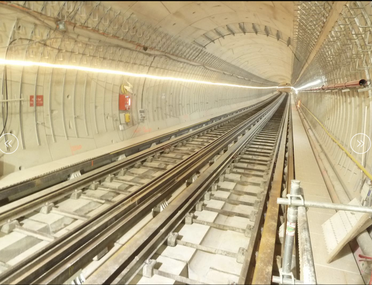
Paris Metro Line 14 Tunnel:
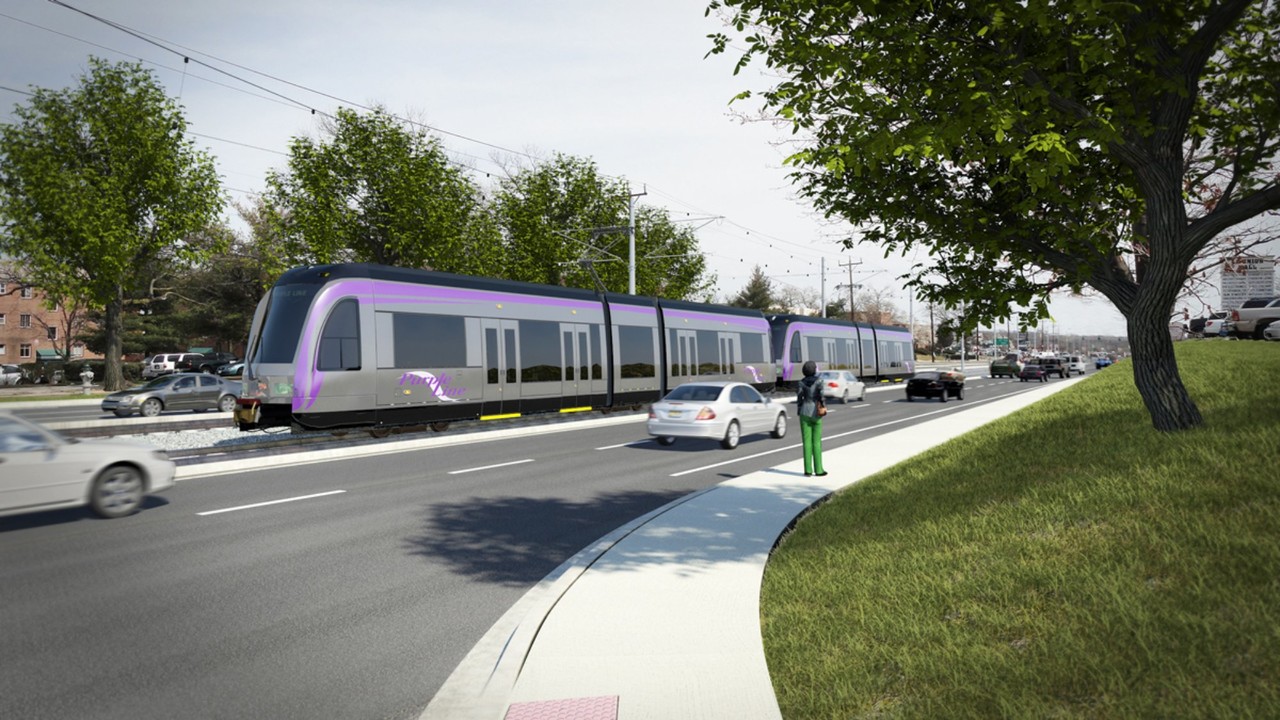
Maryland Purple Line Light Rail – Route adjacent to roadway:
A. Introduction
Few dispute that the management of the Purple Line project has been a fiasco. Construction costs that are now well more than double what they were in the original contract and a forecast ten years (at least) for construction rather than the originally planned five, are just two of the more obvious problems with what has been a poorly planned and managed project. As the governor of Maryland at the time, Larry Hogan signed the contracts that launched the project (and then the contracts that re-launched the project when the initial contractor walked away), and must bear responsibility for the consequences.
The Purple Line is a 16.2 mile light rail line that will arc north and east outside of Washington, DC, through the Maryland suburbs from Bethesda on the west to New Carrollton on the east. It was supposed to be built at a fixed price in what was called an “innovative” PPP (Public-Private-Partnership) contract, where the risk of any cost overruns was to be the responsibility of the private concessionaire. That has not been the case.
The cost – even the original cost – is also high for what the State of Maryland is getting. The Purple Line is a relatively simple and straightforward light rail line of two parallel tracks built mostly at ground level, along existing roadways or over what had previously been public parks. Yet, as we will see below, its cost per mile is comparable to that of a heavy rail line recently completed in Paris. That rail line – a major extension of Line 14 of the Paris Metro – is entirely in tunnels and has a capacity to handle more than 14 times the number of passengers the Purple Line is being built to carry. The photos at the top of this post show a portion of Paris’s new Line 14 in comparison to the simple tracks along the side of the road of the Purple Line.
The high cost of the Purple Line is, however, only one aspect of a terribly mismanaged program. Despite years, indeed decades, to prepare, there have been repeated delays by the Maryland Transit Authority (MTA, part of the Maryland Department of Transportation – MDOT) in fulfilling its design and other responsibilities. This increased what were already high costs. The MTA has been responsible for the supervision of the contract, the basic design work, as well as the acquisition of the required land parcels along the right-of-way and arranging for the movement of utility lines along that right-of-way. It has repeatedly failed to complete this on a timely basis, leading to delays in the work the construction contractor could do and consequent higher costs.
This led the original contractor responsible for the work to walk away, where a poorly designed PPP contract made that easy for them to do as they had little equity invested in the project. The total now being paid by the State of Maryland for the construction phase of the project is $4.5 billion – an increase of $2.5 billion over the originally contracted cost of $2.0 billion. And that is assuming there will be no further increases in the cost, which has happened multiple times already. The time required to build what should have been a relatively straightforward project is also now expected to be ten years – if it is completed under the current schedule in late 2027 – rather than the originally scheduled five.
Then Governor Hogan sought to blame a citizen lawsuit opposed to the project for these delays and higher costs. But that is nonsense. The lawsuit argued that the project had not been adequately prepared, and the judge agreed, putting a hold on the start of construction for the project while calling for the State of Maryland to undertake further work on the justification for the project. The judicial order was issued in August 2016, construction had been scheduled to start in October 2016, and then started instead in August 2017 after the appeals court decided that deference should be given to the State of Maryland on this matter. The construction contractor, in their formal letter stating they would withdraw from the project, said this delayed the start of construction by 266 calendar days: less than nine months. That cannot account for an extra five years (i.e. ten years rather than five) to build the project from when construction began in 2017.
Indeed, if anything the extra nine months provided to the MTA to prepare the project should have reduced – rather than lengthened – the time required to build the project. The MTA continued to work on the design of the project, as well as on the land acquisition and utility work needed, during the nine months when construction was on hold. Yet despite that extra nine months to prepare, the MTA was still not able to keep up with the schedule. The letter of May 2020 formally notifying the MTA that the original construction firm intended to withdraw stated:
“MTA was late in providing nearly every ROW [right-of-way] parcel out of the original 600+ parcels it was required to acquire … by more than two years in some cases”.
Construction obviously cannot begin on some portion of the line until they have the land to do it on, yet the MTA was consistently late in providing this despite the extra 9 months they had due to the judicial order.
And those MTA delays have continued. Under the revised contract for the new construction firm, compensation is paid for any further delays resulting from the MTA not fulfilling its responsibilities. Payments from the State of Maryland have been made twice under that provision – in July 2023 and in March 2024 – totaling $563 million thus far. That is equal to 29% of what was supposed to be the original cost of building the entire rail line.
The problems have not been just with the construction. There were major problems also with the assessments that were done to determine whether the project was the best use of scarce funds to serve the transit needs of these communities. Issues in two key areas illustrate this. One was with the forecasts made of what the ridership on the Purple Line might be (where expected ridership is fundamental to any decision on how best to serve transit needs, what the capacity of that service should be, and whether the expected ridership can justify the costs). The second was the assessment of the economic impacts to be expected from the project.
But a close examination of the work done on those two key issues often shows absurd results that are simply impossible – mathematically impossible in some cases. I have looked at this in prior posts on this blog (see here and here), and will only summarize below some of the key findings from those analyses. The official assessments of whether the Purple Line was warranted were simply not serious. A moderately competent but neutral professional could have pointed out the errors. But none was evidently consulted.
As the governor at the time, Larry Hogan was responsible for the decision to proceed with the project. While there is no expectation that he should have undertaken any kind of technical review himself of whether the project could be justified, he should have insisted that such assessments be made and that they be honest. And he should have listened to neutral professionals on the adequacy of the assessments.
Rather, it appears Maryland state staff were expected to approach the issue not to determine whether the Purple Line was justified, but instead to find a way to justify a decision that had already been made and then to get it built.
Staff were especially praised by then Governor Hogan in 2022 when the contract was re-negotiated with a new construction firm (at a far higher cost than the original contract – see below). As recorded in the transcript of the meeting of the Maryland Board of Public Works in January 2022 at which the new contract with the concessionaire was approved, Governor Hogan said:
“So I’m very proud of the team that in spite of incredible — it’s a huge project and it has incredible obstacles. But they have kept pushing, you know, moving the ball forward no matter how many times there was a setback from outside. It’s not the fault of anyone in any of these positions. They kept moving.”
Indeed, the more costly the project became, and thus the less justifiable it was as a use of scarce public funds, the more the staff were praised for their skill in nonetheless being able to keep pushing it forward.
To be fair, Governor Hogan was not the first Maryland governor to favor building the Purple Line. Governor O’Malley, his predecessor and a Democrat, favored it as well. But Governor Hogan made the final decision to proceed when the high cost was clear. He signed the PPP contract and he is ultimately responsible.
Hogan is now running to represent Maryland in the US Senate as a Republican. Should he win, he could very well represent the key vote to give Republicans control over what is expected to be a closely divided Senate. While Hogan has stated he will not personally vote for Donald Trump to be president, that is not the vote of Hogan that will matter. Rather, a Republican-controlled US Senate – possibly as a consequence of Hogan’s vote for a Republican as the Leader – could allow Trump, should he become president, to carry through his radical program with his openly stated aim of revenge. Senate approval of Trump’s judicial and other appointees could also then be easily granted. And if Harris should win the presidency, a Republican-controlled Senate could block much of what she would seek to achieve.
The experience with the Purple Line provides a good basis for assessing Hogan’s judgment. It merits a review. We will examine below first what the Purple Line is costing to build, starting with the original 2016 contract and through to now. The line is not yet finished so the costs may rise even further, but we will examine the contracted costs as they stand now.
The section following will then compare those costs to the cost per mile of building a major extension to the Paris Metro Line 14 heavy rail subway line. That extension was recently opened (in June 2024, just prior to the Paris Olympics this past summer), so we have good figures on what the cost was. It was built entirely as a tunnel – which would be expected to be far more expensive than laying rails at ground level – and has a capacity to carry more than 14 times the number of passengers the Purple Line has been designed for. But its cost per mile is only about a third more. The cost per unit of capacity is more than ten times higher for the Purple Line than for the new Paris Metro line.
Sections will then briefly review the problems in the analyses of forecast Purple Line ridership and of its economic impacts. These have been covered in previous posts on this blog, so only the highlights will be summarized here. Finally, issues with the design of the PPP contract and the incentives it created will be briefly reviewed, along with Maryland governance issues.
B. The Purple Line’s Construction Cost
1) Cost
The cost of the Purple Line PPP contract first to build and then to operate this light rail line is summarized in the following table, with figures both for the original contract (signed in 2016) and for the contract as it stands now (most recently amended in March 2024):
| Purple Line Cost |
|
|
|
|
| in $ millions |
|
|
|
|
|
Original Contract
|
New Contract
|
$ Increase
|
% Increase
|
| A. Construction Costs |
$1,971.9 |
$4,467.8 |
$2,495.9 |
126.6% |
| Design-Build Contract |
$1,971.9 |
$3,435.8 |
$1,463.9 |
|
| Settlement |
|
$250.0 |
$250.0 |
|
| MTA supervised work |
|
$218.7 |
$218.7 |
|
| Compensation for MTA Delays: July 2023 * |
|
$148.3 |
$148.3 |
|
| Compensation for MTA Delays: March 2024 * |
|
$415.0 |
$415.0 |
|
|
|
|
|
|
| B. Operational Period |
$2,306.0 |
$2,613.7 |
$307.7 |
13.3% |
| Operations & Maintenance |
$1,744.3 |
$1,977.2 |
$232.9 |
|
| Insurance |
$272.6 |
$340.6 |
$68.0 |
|
| Capital Renewal |
$289.1 |
$295.9 |
$6.8 |
|
|
|
|
|
|
| C. Financing Costs (as of Feb 2022) |
$1,312.0 |
$2,765.8 |
$1,453.8 |
110.8% |
|
|
|
|
|
| Overall Total Cost (as of March 2024) |
$5,589.9 |
$9,847.3 |
$4,257.4 |
76.2% |
* Includes an unspecified amount for financing costs.
Sources: MDOT Briefing prepared for Maryland Legislature, February 2022, and Board of Public Works Agenda, March 13, 2024
These figures do not include all the costs of the Purple Line, but rather just the costs covered under the PPP contract with the private concessionaire. Thus the figures here exclude associated projects, such as the cost to connect the Purple Line station in Bethesda to the nearby Metro station (at a cost currently estimated to be $130.4 million), and the cost to restore what had been a tunnel for walkers and bikers at what will now be the Purple Line Bethesda station (at a cost currently estimated to be $82.5 million, although there is a good chance this promised restoration will be canceled).
More significantly although difficult to estimate, there have also been the direct costs incurred by MTA for both its staff and the consulting firms it contracted as the Purple Line project was designed, assessed, and now supervised. The then Maryland Secretary of Transportation Pete Rahn had indicated in a court filing in 2017 that those costs over the years were already at that time at least $200 million. They would be significantly higher now. There have also been the costs covered directly by both the state and county governments and by other entities for some share of the road and utility work necessitated by the placement of the Purple Line.
And while less easy to estimate in dollar value, they should also have recognized that there has been the cost of taking over what had previously been parkland for use now as a rail line. No compensation was paid for that parkland. Had this been a World Bank funded project, the entities responsible for the project would have been required to acquire a similar acreage of land of a similar nature and relatively close by as an offset to the parkland lost to the project. It does not appear there was ever any consideration given to acquiring such an offset, possibly because it would have been expensive. But this loss of parkland for the rail line should still be recognized as a cost.
The overall costs of the Purple Line are therefore substantially higher than just the costs reflected in the PPP contract with the concessionaire. But we will focus only on the costs of that contract.
The original PPP contract was approved and signed in the Spring of 2016. The table above shows the costs of what would be covered under that contract broken down for both the construction period and then the subsequent 30 years of operation. But it was just one unified contract for all of those costs. While there would be certain payments made during the period of construction as various milestones were reached, the bulk of the payments would be made by the State of Maryland on a monthly basis once the line was operational. These are called “availability payments” as the State of Maryland is obliged to make those payments as long as the Purple Line is available to be operated. And those payments will be the same regardless of ridership; they must be made in the set amounts even if no riders show up.
The original construction firms responsible for the actual building of the Purple Line (primarily Fluor Enterprises – a large Texas construction firm – with two smaller partners) decided in 2020 that, due primarily to the frequent delays and other issues that arose after construction began in 2017, they would abandon the project unless compensated for the resulting costs. As noted above, they explained that MTA was late (and as much as two years late – with this at a point where construction had been underway for only two and a half years) in delivering almost all of the more than 600 land parcels they needed to build the line.
They filed a claim for $800 million in additional payments from Maryland for the extra costs they had incurred, but Maryland refused and decided instead to seek a new construction firm to complete the project. A negotiated settlement was eventually reached where the State of Maryland agreed to pay $250 million to the original construction firms for their additional costs, with the firms then leaving the project.
In early 2022 Maryland reached an agreement with the concessionaire on a new construction firm (with Dragagdos, of Spain, as the lead contractor), at a new cost of $3.4 billion for the rail line. See the table above. To this one needs to add $250 million for the settlement payment to Fluor and its partners, plus $219 million for construction work by the numerous sub-contractors that had been working on the project in 2020 when Fluor left, and which the MTA then supervised directly in order for the work to continue.
The State of Maryland has since agreed to provide the Purple Line concessionaire two additional payments – of $148 million approved in July 2023 and of $415 million approved in March 2024 – as compensation for the extra costs the concessionaire incurred as a consequence of continued delays in the MTA fulfilling its responsibilities under the project. Such MTA delays was the issue that frustrated Fluor. It appears that Dragados was careful in the new, 2022, contract to ensure there was a clear formula for what it would be compensated for the costs arising from such delays.
Taken together, the overall cost of construction is now at $4.5 billion instead of the $2.0 billion in the original contract – an increase of $2.5 billion or 127%. MTA staff were praised by Governor Hogan for their negotiation of this new contract, and there is no doubt they worked hard at it. But one should question the wisdom of the decision to start over with a new contract when the original contractor (Fluor) had indicated it would continue if it were fairly compensated for the costs it incurred as a consequence of the MTA delays – primarily delays in receiving the cleared land parcels it needed before it could begin its work. It asked for an additional $800 million (which could probably have been negotiated down by some amount), but even at the full $800 million, the total cost would have been $2.8 billion to complete the line. Under the new contract, the cost will be $3.9 billion for this same work (i.e. the $4.5 billion cost less the later payments of $148 million and $415 million).
It is hard to see how the new contract at $3.9 billion represented a better deal for Maryland taxpayers when the original contractor would have continued if paid $2.8 billion. It is $1.1 billion more. Yet Governor Hogan praised MTA staff for their skill at arriving at what he praised as a well-negotiated new contract.
Section B of the table above shows the costs associated with the operating stage of the concession (the 30 years following the completion of construction). They increased by a total of $308 million in the new contract. This part of the original contract would not have changed had Maryland agreed to compensate the original construction contractors the extra $800 million requested (or some lower negotiated amount). The actual cost of the new contract is therefore not just the $1.1 billion for the construction, but rather $1.4 billion when one takes into account the higher cost of what will be paid for the operation of the line.
Section C then provides a figure for what the total financing costs will sum to over the life of the concession. These financing costs are the sum of the interest and other fees associated with the funds borrowed by the concessionaire for the project, as well as a return on its equity investment. It is of interest to the State of Maryland as it will be paying these financing costs via the availability payments, in addition to the repayment of the principal on the loans (where that principal is already reflected in what is shown for the construction costs and should not be double-counted).
[Side note: The additional payments of $148 million agreed in July 2023 and $415 million in March 2024 are primarily for additional construction costs, and have been included in that section of the cost table above. But some unspecified share of each appears to include additional financing costs to cover the interest on what will be borrowed and then repaid only over the 30-year concession period via consequent higher availability payments. However, a breakdown of those payments to show the financing portion was not provided by MTA staff at the Board of Public Works meetings (see here and here) that approved the additional spending commitments, and thus could not be shown here.]
The financing costs (as of the February 2022 contract) more than doubled between the old and the new contracts: from $1.3 billion to $2.8 billion, or an increase of $1.5 billion. This was not due to higher interest rates when the new contract was signed in early 2022 compared to what they were when the original contract was signed in 2016 (or finalized in 2017). Interest rates were in fact similar in those two periods. They had declined in 2019 and especially 2020 during the Covid crisis, and in early 2022 were roughly where they were in 2016 / 2017.
Rather, one needs to examine the funding structure.
2) Funding
The original funding structure and that as of the February 2022 new contract were:
| Purple Line Funding |
|
|
|
|
| in $ millions |
|
|
|
|
|
Original Contract
|
Shares
|
New Contract
|
Shares
|
| A. Federal Government |
$1,775.0 |
79.7% |
$2,706.0 |
67.7% |
| Grant – New Starts Program |
$900.0 |
40.4% |
$1,006.0 |
25.2% |
| Loan – TIFIA |
$875.0 |
39.3% |
$1,700.0 |
42.5% |
| B. Tax-exempt Private Activity Bond |
$313.0 |
14.1% |
$1,013.0 |
25.3% |
| C. Private Equity |
$138.0 |
6.2% |
$280.0 |
7.0% |
|
|
|
|
|
| Total (incl. for working capital) |
$2,226.0 |
100.0% |
$3,999.0 |
100.0% |
|
|
|
|
|
| Sub-Total: Borrowed funds only |
$1,326.0 |
59.6% |
$2,993.0 |
74.8% |
Sources: MDOT Presentation of April 2019, and MDOT Briefing of February 2022
Even though the Purple Line PPP was proclaimed to be a “privately-funded” project, the federal government in fact covered 80% of the original costs. Half of this was as a straight grant, and half as a low interest loan under the federal TIFIA (Transportation Infrastructure Finance and Innovation Act) program, which lends funds for such projects at an interest rate set equal to the funding costs of the federal government. That is, funds under the TIFIA program basically pay the low US Treasury rate.
Under the revised contract signed in early 2022, there will only be a relatively minor increase in federal grant support: an additional $106 million that Maryland would have been able to use for a range of transportation projects but chose to give to the Purple Line. Rather, the major increase in funding will be borrowed funds under the TIFIA program, with an increase to $1.7 billion from the prior $875 million.
More is also being borrowed through tax-exempt Private Activity Bonds, which enable the borrower for such projects to issue bonds that are exempt from Maryland state income taxes. While Private Activity Bonds are granted exemption from Maryland income taxes because the investments are deemed to be in the public interest, the Maryland tax exemption is certainly appropriate here. These are in essence State of Maryland borrowing obligations as Maryland will be repaying these bonds through the monthly availability payments to the concessionaire. As of February 2022, MDOT stated that “new” Private Activity Bonds of $700 million would be issued. While it is not fully clear from the MDOT presentation, it appears these new bonds are being counted in terms of the net increase in such bonds relative to those originally issued (as the originally issued bonds would be retired and replaced under the new contract). The equity stake was also increased to $280 million from the prior $138 million.
With the far higher construction costs ($3.9 billion as of February 2022) and the federal grant funding only modestly increased, there had to be far greater borrowing to cover the cost of the project. That was the cause of the 111% increase in the financing costs, not (as some have asserted) higher interest rates in early 2022. Indeed, the total funds borrowed for the project (including via equity) rose from $1,326 million in the original funding structure to $2,993 million in the new one – an increase of 126%. This is even a bit more than the 111% increase in financing costs.
3) Lack of Justification to Continue When the Higher Costs Became Clear
A critical question that should have been addressed when the far higher costs of the new concession contract became clear was whether there was a justification to continue with the project. A project is an investment, and whether any investment is worthwhile depends on the relationship of its cost to its benefits. At a low enough cost or high enough benefits, it may be a good use of funds. But if the costs turn out to be substantially higher, or the benefits substantially lower, that may no longer be the case. The issue therefore needs to be re-examined when there has been a substantial increase in costs. But it does not appear it was ever seriously considered for the Purple Line.
Two questions should have been addressed by MTA staff and then considered by Governor Hogan in deciding whether to proceed. One was whether at the new cost (which turned out to be $3.9 billion once the new bids became known, although with the possibility – and later the reality – that there could be further cost increases later), the rail line could be justified. The second was whether given what had already been spent by that time on the project ($1.1 billion), was the further spending justified? Treating the $1.1 billion as a sunk cost already lost, was it worth spending a further $2.8 billion on the project to cover the $3.9 billion cost of construction (minimum – assuming no further increases)? One should also have taken into account that operating the line for the 30 years of the concession period would now also cost the state $300 million more, but I will set that aside for the purposes here.
It is clear that the answer to both of these questions is no. The project was at best highly marginal when it was approved. As was discussed in an earlier post on this blog, at the time the light rail line alternative was chosen as the “preferred alternative” by the State of Maryland (in 2008), a measure of its cost relative to its benefits placed it just barely in a “medium” cost category where it might be considered for federal support. But with a cost only a tiny 0.7% higher (or benefits from expected ridership of just 0.7% less), it would have been in the “medium-low” category and unlikely to receive federal financial support. And at costs 27% higher (or benefits 27% lower) it would have been in the “low” category and federal financial support would have been impossible.
Adjusting for inflation, the construction cost expected in 2008 ($1.2 billion) would have come to $1.6 billion as of late 2021 when decisions were being made on whether to proceed with the new contract. The $3.9 billion construction cost being considered at that time was 144% higher than this, and the $2.8 cost excluding the $1.1 expense already incurred was 75% higher. Even leaving the expected benefits the same (where we will see below that they will likely be far less than forecast), any of these costs are far above the 27% higher cost that would have placed the project in a category where it never would have been considered for approval.
The criteria for federal approval used in 2008 were later revised during the Obama administration to ones where qualitative judgment factors entered in addition to the cost factors. A multi-level, weighted, point scoring system was then used to arrive at an overall rating. But even at the original costs – costs that were known in early 2022 to be far too low – the project only obtained a minimally adequate rating in 2016 because of a system where the weighted averages of the point scores were rounded up at each level. Without such rounding – i.e. with each of the specific weighted scores kept rather than rounded up – the Purple Line would not have obtained a minimally adequate rating for federal approval.
But there is no evidence that there was any consideration in early 2022 of whether the project could be justified at the then known costs (and minimum costs, as they could – and did – go even higher). Rather, it appears MTA staff were directed to find a way to have it built regardless of the costs, as long as those costs would not appear in the current Maryland state budget. Those costs would instead be paid for by future Maryland budgets when Governor Hogan would already have left office. And that is what they did, with the increased costs loaded into higher availability payments that would begin when the rail line was completed.
C. A Comparison to the Cost of the Extension of Line 14 of the Paris Metro
A major extension of Paris Metro Line 14 has recently been completed, and good figures are available on what that cost. It extends Line 14 south by 14 kilometers (8.7 miles) to Orly Airport, and was opened in June 2024, in time for the Paris Olympics. There was also a more minor extension of the line north, but by only 1.1 kilometers (0.7 miles) to a new station. The cost and other figures here will, however, only be for the extension south to Orly.
The cost figures can be found in a report published in April 2024 by the “Cour des Comptes” of France – the supreme audit institution in France, under the control of the courts and hence independent of the executive and legislative branches. It audits major government programs. The extension of Line 14 is the first part of a major (indeed huge) program expanding the Paris Metro system, which will add 200 kilometers of lines (almost all underground) and where in addition to the extension of Line 14 there will be four new lines (15, 16, 17, and 18) circling Paris. The new lines are scheduled to open in phases between late 2025 and 2030, although it would not be a surprise if there are delays. Figures on the costs so far (and what is expected to be the costs for the new lines when they are completed) can be found in Annex 11 of the Cour des Comptes report, while Annex 10 provides figures on the costs of the new trains that will run in these lines (including Line 14).
Comparing the new Paris Line 14 South extension with the Purple Line:
|
Paris Line 14 South |
Purple Line |
Ratio |
| Length |
14 km = 8.7 miles |
16.2 miles |
|
| Type of line |
Heavy rail |
Light rail |
|
| Tunnel |
100% |
one of 1,020 feet |
|
| Depth |
100 feet below ground |
Mostly at grade |
|
| Stations |
7, o/w 6 new, all underground |
21, mostly at surface |
|
| Stations per mile |
0.8 |
1.3 |
|
| Length of train |
394 ft |
142 ft |
|
| Driver required? |
Fully automated |
Driver required |
|
| Average speed incl. stops |
37.3 mph on new section |
15.5 mph |
|
| Cost per mile |
$365.9 million |
$275.8 million |
1.34 times |
| Daily passenger capacity |
1 million |
70,000 |
14.3 times |
| Cost per unit of capacity |
$365.9
|
$3,940.0 |
10.8 times (inverse) |
The length of both lines is substantial: 8.7 miles for the Line 14 extension and 16.2 miles for the Purple Line. Line 14 passes through the center of Paris, and now has a full length of 16.8 miles. This extension south is thus more than doubling the length of the line. It is a heavy rail line while the Purple Line is only light rail, and is designed to carry far more passengers. In contrast to the Purple Line, which is mostly being built at ground level (with just a few bridges and elevated sections, and one tunnel of just 1,020 feet), 100% of Line 14 is built as a tunnel deep underground – on average about 30 meters (about 100 feet) underground. Tunneling is far more expensive than a rail line that is simply built mostly at ground level alongside existing roads or over what had previously been public parks.
Six new stations have been built on the Line 14 extension, and it was connected at a seventh to the existing Line 14. This comes to 0.8 stations per mile on average. Such stations are major projects in themselves, as they have to be built to bring the passengers down to 100 feet underground (the height of a 10-story building) to where the rail line is. The Purple Line will have 21 stations – or 1.3 per mile on average – but these should be far less expensive. Most will be not much more than simple platforms with something to cover them.
To carry the passengers, each Line 14 train will consist of eight rail cars and will be 120 meters (394 feet) long. The Purple Line trains are just 142 feet long. The Line 14 trains are also fully automated, with no need to employ a driver on each train. The Purple Line trains, in contrast, will require drivers. This is necessary for safety as the Purple Line trains will be at ground level and will cross many roads at intersections. While this will reduce the upfront capital costs (as there is then no need to spend the money needed to make the trains fully automated), the need for drivers on the Purple Line will increase operating expenses.
Paris’s Line 14 trains will also be far faster. For the newly completed southern extension, they will average 37.3 miles per hour while the Purple Line will average just 15.5 miles per hour.
The Line 14 South Extension has cost Euro 2.71 billion according to the Cour des Comptes report. Using an exchange rate of 1.085 Dollars per Euro (the current exchange rate as I write this), this comes to $2.94 billion. This includes the cost of the six new stations (and the connection to a seventh). To this, one should add the cost of the train cars for comparability as that cost is included in the Purple Line construction cost contract. They have purchased new trains for the entire Line 14 route (the old train cars on the line will be used elsewhere in the Paris Metro system), at a total cost of Euro 431 million. Prorating this based on distance for the South Extension vs. the entire Line 14 route (51.9%), and with the 1.085 Dollars per Euro exchange rate, the cost for the train cars for the South Extension is $243 million. Adding this to the $2.94 billion construction cost and dividing the total cost by the 8.7 mile length leads to an overall cost per mile of $365.9 million.
The Purple Line total construction cost, as noted above, will now be $4,467.8 million (assuming no further cost increases). Over 16.2 miles, this comes to $275.8 million per mile.
The cost per mile of Line 14 is thus 34% higher than for the Purple Line, but Line 14 is a heavy rail line, built entirely as a tunnel rather than mostly at grade, with stations that will bring passengers to 100 feet below ground level, operating at a far higher speed. One would expect that such a heavy rail line would cost many times the cost of a light rail line built mostly at grade. But it is just 34% more.
And Line 14 will have a far greater passenger capacity. The new line has been built to be able to carry 1 million passengers per day. While the 1 million passengers would be for the entire Line 14 – including the existing section – the extensions will have the same capacity as the same trains at the same frequency will pass through them. One might also note that the length of the full Line 14 – at 27 kilometers or 16.8 miles – is also similar to the length of the Purple Line.
The Purple Line, in contrast, is being built to be able to handle daily ridership that has been forecast to total 69,300 in 2040. It is being built to handle a peak load that is forecast to be on the segment between Silver Spring and Bethesda. I have rounded this up to 70,000 for the purposes here. While “capacity” on such a system is not always easy to define (what degree of crowding should one assume, for example), the reader is welcome to substitute a higher figure for the calculations should they wish. The story is fundamentally the same for any reasonable capacity figure that might be assumed.
The capacity to carry 1 million passengers per day on the Line 14 extension is more than 14 times the capacity to carry 70,000 passengers per day on the Purple Line. But the cost is not 14 times higher; it is only 34% higher. Or in terms of the cost per unit of capacity, the Purple Line is 10.8 times as expensive as the Paris Line 14 South Extension. That is huge.
Prior to his decision to proceed with the Purple Line, Governor Hogan asked his Secretary of Transportation to find ways to reduce its cost. There were some cuts, but primarily by removing some “nice-to-haves” by cutting what would be spent on artwork, on the visible surfaces at the stations, and on the promise that the area between the rails would be planted with grasses and other natural vegetation instead of covered with something harsher such as gravel. These were all removed, or reduced in scale. But this had only a modest effect on the costs, and the costs remained high, as discussed above.
What Governor Hogan should have asked was why were the basic costs simply so high. Even at the original cost of the PPP contract (and thus excluding all the other costs associated with the project), $1,971.9 million for 16.2 miles works out to over $23,000 for each linear foot. It is hard to understand why it should cost so much to lay down two parallel rail lines, mostly at ground level, with some concrete and other materials (and some pro-rated share of the costs of the trains and other equipment). At the current cost of $4,467.8 million, the cost is $52,200 per linear foot. That is over a half million dollars for every ten feet of the line!
Governor Hogan could also have asked why such lines cost so much less in a country such as France. Wages of construction workers are not less in France than in the US; unions are certainly more powerful in France than in the US; and safety, environmental, and other regulations are certainly stricter in France than in the US. Yet in terms of the cost per unit of capacity, the Purple Line is costing more than ten times what the Paris Metro Line 14 South Extension has cost.
But such questions were evidently never asked.
D. Mismanagement Prior to Construction
The mismanagement of the Purple Line has not been limited only to the implementation of the construction phase of the project. Prior to that, there were also major issues in the process that was followed to assess the project, determine what alternative would best serve the very real transit needs of the neighborhoods in the most cost-effective way, the approach taken in structuring the concession contract (including whether it should indeed be structured as a concession), and the role of the Maryland state legislature in approving or not the financial commitments the State of Maryland has made.
These issues have been reviewed in some detail in prior posts on this blog. See the posts here, here, here, and here. I will only summarize in this post some of the key issues and the more blatant mistakes. These mistakes illustrate that the process followed simply was not serious; it was not professional. Rather, it appears the aim of the process was not to assess how best to provide public transit services to meet the needs of these neighborhoods, but rather to provide a justification for a decision that had already been made and then to work out a way to get that particular approach done, regardless of the cost.
1) The Ridership Forecasts
To start, a central issue is what ridership should be expected if the rail line is built. A figure for expected ridership (for a specific project design) is needed to determine whether the project is being sized appropriately in terms of capacity, what the economic benefits might be should it be built, and whether those benefits justify the costs.
Ridership forecasts are inherently difficult to do, even with the best of intentions. At this point – with the project not yet completed – we cannot say for sure what the ridership will be. But with a rail line, it is too late once the line is built to change the design or choose a different option to provide transit services. The money has already been spent, and a rail line does not have the flexibility to adapt should ridership turn out to be different than was forecast. This is in contrast to expanded bus service, for example, where one can easily add to or reduce capacity depending on what the ridership turns out to be. Also, in the specific case of the Purple Line, the concession contract has been structured so not only will the money for the construction have been spent, but the State of Maryland will also be committed to pay the concessionaire to operate the system for 30 years and in the same amount regardless of how many people choose to ride.
The ridership forecasts for the Purple Line are therefore especially important to taxpayers in the State of Maryland. They do not matter to the concessionaire, as they will be paid the same regardless of how many riders show up. Indeed, they would prefer fewer riders rather than more, as their costs will then be lower (less wear and tear on equipment due to use, for example, and less to clean up each day).
This was an important flaw in how the concession contract was designed, and will be discussed below. But first on the ridership forecasts themselves.
The earlier post on this blog on ridership pointed out that there are numerous – and often obvious – errors in the ridership forecasts. Some involved forecast figures that were simply mathematically impossible. Among the more important (as well as obvious) mistakes:
a) Mathematically Impossible Ridership Forecasts: More than half of the figures for the forecast ridership between groups of Purple Line stations are mathematically impossible. Briefly (see the earlier blog post for more detail) ridership forecasts are produced in a multi-level process by first dividing up the metro area (in this case the Washington, DC, metro area) into basically a large “checkerboard” (although with uneven borders and areas, not squares), with each defined area a “traffic analysis zone”. A forecast for some future year (2040 in the case of the Purple Line forecasts) is produced via a model for the number of daily trips that will be taken from each zone to each other zone by all modes of transportation. The number of trips is modeled based on the population of each zone, the number of jobs in each zone that workers will travel to, distances between the zones, and other factors such as income levels.
They then model what share of those trips will be taken by private vehicles (cars mainly) and what share by public transit, based on factors such as relative costs and travel times by each mode. At the level below, they then model the share of the trips by public transit that will be taken between each zone by bus, by the Washington Metrorail system, by commuter rail, or by – in the scenario where the Purple Line is built – by the Purple Line. Again, the shares are modeled based on factors such as the relative costs and travel times of each.
For the Purple Line, the objective is to forecast how many people will choose to travel each day between the Purple Line stations. While there will be 21 Purple Line stations, they combined the stations into 7 adjacent groups based on the traffic analysis zones, with anywhere from one station in the zone (in the case of Bethesda) to several. There would therefore be 7 x 7 = 49 different combinations of trips that are being modeled – from one traffic zone along the Purple Line route to another, in both directions.
In such a multi-level process, the number of trips that would be taken on the Purple Line alone cannot be more than the number of trips that will be taken by all forms of public transit, i.e. by bus, or the Metrorail, or commuter rail, or the Purple Line. Yet, if one compares the forecast number of daily trips provided in the Travel Forecasts chapter of the Final Environmental Impact Statement (FEIS, Volume III, available here and with the relevant table reproduced in my blog post), one finds this not always to be the case. For the figures on the number of trips from each zone to each other zone (in what is called the “Production/Attraction format” – see my post for more on that if interested), the forecast ridership on the Purple Line is higher than the forecast ridership on all forms of public transit in 29 of the 49 possible cases.
This is mathematically impossible and indeed simply nonsense. The consultants responsible for this analysis (Parsons Brinckerhoff) made some kind of mistake. Indeed, with 29 of the 49 possible cases, it is conceivable that the figures are simply random. One would expect half to be higher and half lower if these are random figures, and 29 of 49 is not far from that.
b) The Forecast Capacity Requirement: There is another impossibility as well, although here the cause of the error is clear. The number of daily riders that the Travel Forecasts chapter estimates will be exiting the Bethesda station each day is 19,800. But they state that only 10,210 will be going from Bethesda to elsewhere on the Purple Line each day. (See Figure 10 in the Travel Forecasts chapter, reproduced in my blog post.) This is obviously silly; Bethesda will not be gaining a population of close to 10,000 each day.
The cause of this error is clear, however. The analysts responsible for this work used ridership figures from the “Production/Attraction” format tables. But that format does not present the total ridership that will be entering or leaving a station each day. Rather, it is one step in the modeling process, and is an estimate of how many of the daily trips will start in a given zone (based mainly on how many people live there – this is the “Production”) and how many daily trips will have this as the destination (where the jobs are – this is the “Attraction”). Bethesda is a relatively significant jobs center on the line, and hence “Attracts” a higher number of riders than it “Produces”.
The final step is to convert the figures to an “Origin/ Destination” format to show the number of daily trips that will originate at a given station and will end at a given destination. The figures in origin/destination format will be close to the average for the figures in the production/attraction framework. Thus the daily number of entries and exits at Bethesda would be roughly 15,000: the average of the 19,800 and 10,210 figures. And the Travel Forecasts chapter presents the origin/destination figures in its Tables 24 and 25, although in one they provide a figure of 15.010 and 14,990 in the other, with similar small differences for all of the stations as well in the overall daily ridership forecasts (69,330 in Table 24 and 69,300 in Table 25). The cause of these small differences was never explained and suggests sloppiness.
But due to this error, the report indicates in its Figure 10 and in the associated text that the number of Purple Line riders going into Bethesda each day will be 19,800, and that the peak ridership (and hence the capacity that will be necessary) will be in the segment from the Woodside/16th Street station to Lyttonsville (a portion of the line between Silver Spring and Bethesda), where there would be 21,400 travelers each day in the westbound direction. This is wrong, and a misinterpretation of the forecasts due to confusion between figures in a production/attraction format and ones in origin/destination.
c) Time Savings: The forecast time that would be saved by travelers choosing to take the Purple Line is central both to the forecast of how many would take the Purple Line (instead of some other mode of public transit) as well as for the estimate of the social benefits from the construction of the Purple Line (which is based on how much time would be saved by travelers).
But there were also major problems here. Table 23 of the Travel Forecasts chapter of the FEIS provides the estimates they used for the average number of minutes that would be saved by travelers per trip (from each traffic zone to each other) if they have the Purple Line as a choice. But some of the figures are obviously absurd. They indicate an average time savings for travelers from the Bethesda traffic zone (Bethesda station) to the New Carrollton zone at the other end of the line of 691 minutes. That is 11.5 hours! That is 1.4 miles per hour for the 16.2 mile route of the Purple Line; one could walk faster! Similarly, the time savings from Bethesda to the traffic zone just before New Carrollton (Riverdale Park) is 582 minutes, or 9.7 hours. This is also absurd. My guess is that they misentered the data, with a decimal point in the wrong place.
But there are more general and much more significant problems. One is that in the data they entered on alternative travel options in the absence of the Purple Line, they failed to include use of the existing Washington Metrorail system as such an option. And some of the trips would require less time on the Metro than they would if one rode on the Purple Line. For example, the Travel Forecasts report itself indicated that traveling from Bethesda to New Carrollton via Metro currently takes only 55 minutes (Table 6 in the report). On the Purple Line, the same trip would require 62.6 minutes (Table 11). There would not be any time savings, but rather a time cost. And obviously not 691 minutes of time savings.
More generally, the time savings per trip across the 7×7 zones being forecast (Table 21) appear to be far too high on average. The summary at the bottom of the table indicates an average savings of 30 minutes per trip for trips in the metropolitan region as a whole. Yet in the three detailed examples they provided for how such calculations are made, they calculated an average time savings of a much more plausible 7.3 minutes per trip. The sample is small, but a savings of 10 minutes per trip is probably a better estimate than 30 minutes. This is especially the case if one allows (as one should) the option of taking the existing Metrorail system between several of the stations – often for a faster trip than the Purple Line will provide.
An average time savings of 10 minutes per trip rather than 30 reduces the benefits of the Purple Line by a far from insignificant two-thirds even assuming the number of trips would remain the same as forecast. But it would also significantly reduce the number of Purple Line trips in the forecast, as that forecast number depends primarily on the assumed time savings. If linear, it would imply that the number of trips should also be reduced by two-thirds, and the overall benefits (the number of trips times the time savings per trip) would fall by eight-ninths. That is far from a minor adjustment in the forecast benefits.
A reduction in the forecast ridership on the Purple Line by two-thirds would also be more in line with the ridership seen on other light rail lines in the US. As I noted in my earlier blog post:
A study from 2015 found that the forecast ridership on the Purple Line would be three times as high as the ridership actually observed in 2012 on 31 light rail lines built in the US over the last three decades. Furthermore, the forecast Purple Line ridership would be 58% higher than ridership actually observed on the highest line among those 31. And with the Purple Line route passing through suburban areas of generally medium to low density, in contrast to routes to and from major downtown areas for most of those 31, many have concluded the Purple Line forecasts are simply not credible.
d) Uncertainty and the Lack of Resilience in a Rail System: Finally, one should always keep in mind that there will be uncertainties with any such forecasts. The Purple Line ridership forecasts are not plausible, but a more fundamental issue is that future ridership can never be known with certainty. The experience with ridership on Washington’s Metrorail system over the past decade and a half illustrates well the uncertainties, and also has a direct bearing on the Purple Line forecasts.
The Purple Line will intersect with four Metrorail lines, and a major share of the forecast Purple Line ridership is of riders who would use the Purple Line for part of their journeys to connect to a regular Metro line or to return home from a trip on the Metro. The ridership forecasts for the Purple Line were first developed around 2008 and then refined later, and assumed that ridership on Metrorail as a whole would grow steadily over time. But it turned out that Metrorail ridership peaked in 2008 and then fell steadily. This was indeed a major issue raised by Judge Richard Leon in his August 2016 ruling, where he indicated the State of Maryland should review whether, in light of the steady decline in Metrorail ridership in the years leading up to 2016, the Purple Line would still be justified. By 2016, Metrorail ridership was already 14% below where it had been in 2008, and by even more, of course, relative to where it would have been had it kept to the pre-2008 trend (a rising trend the ridership forecasts assumed would continue). The response by Maryland was that they expected Metrorail ridership would soon recover fully to its pre-2008 trend path, and then continue at that trend growth rate in the future.
Metrorail ridership did not. It continued to fall and then collapsed in 2020 due to the Covid crisis. Average daily ridership on the Metrorail system in 2020 was 72% below what it was in 2019, and in 2021 was 78% below 2019. There has since been some recovery, but in 2024 (up to October 11 – the most recent data as I write this) it is still 38% below what it was in 2019. Given the shift to working from home for many office workers, there is the question of whether Metrorail ridership will ever recover to where it was in 2008, much less to the trend growth path that was assumed for the Purple Line ridership forecasts.
Defenders of the Purple Line might say that it was impossible to predict the Covid crisis and the shift to working from home. That is true, and is precisely the point! The future is uncertain, and major surprises are always possible. It is for this reason that one should favor resilient and flexible systems that can respond as the future unfolds. A light rail line such as the Purple Line is not flexible. Once the rail lines have been laid, they cannot be moved. And with the train sets purchased and other equipment installed, the capacity is basically fixed. This is in direct contrast to bus systems, where routes can be changed based on how development proceeds and capacity on any given route can easily be adjusted by running more or fewer buses.
Bus options existed for serving the neighborhoods through which the Purple Line is being run. Bus routes could have been adjusted, capacity on those routes could have been adjusted, and express routes could have been added (such as between Silver Spring and Bethesda – if there is indeed a demand). And while less flexible, they could also have built – at a far lower cost than the Purple Line – bus-only lanes in key locations (such as into and through Bethesda), or they could have extended planned Bus Rapid Transit routes to include segments the Purple Line will be covering (such as between Silver Spring and Bethesda).
2) The Economic Impact
A key question for a project such as the Purple Line is what economic impact can be expected, and will that impact justify the costs. Studies are commissioned for this, and the key one for the Purple Line was prepared by the consulting firm TEMS (for Transportation Economics and Management Systems, Inc.). Its March 2015 report was an update of one it had prepared in 2010, and will be the focus here.
The release of the TEMS report on April 20, 2015, was highly orchestrated, with a press conference, an article in the Washington Post, an editorial that same day in the Washington Post extolling the reported benefits, as well as letters to Governor Hogan from local political figures citing the report. Presumably, the TEMS report was circulated before this date for review by selected entities (including the Washington Post) but embargoed until the press conference on that day.
It does not appear, however, that any of these entities undertook a serious review of the report prior to citing it as proof that the Purple Line would have highly beneficial economic impacts on the communities and the state and region more generally. It is a report that could be highly technical in areas, and it would not have been reasonable to assume that members of the Editorial Board at the Washington Post would have fully understood what was being done. However, before jumping to the conclusion that the report’s conclusions were soundly based, the Editorial Board (as well as others) could have requested a review by a neutral professional or scholar to advise on whether the report was sound. But they did not. There are major problems with the report, and indeed obvious problems that any professional would have quickly seen.
a) The “Statistical” Analysis: To start with a simple but obvious issue, and one that any professional in the field would have seen immediately just by glancing at the report, the TEMS study provided what it said were the results of a statistical regression analysis of travel demand between different zones of the Washington metro area. The report said it used a database constructed of travel patterns in the region between each of the defined traffic zones, the cost of travel between the zones, and socioeconomic variables such as population, employment, and average household incomes. The results are presented in Exhibit 4.2 on page 25.
They state that the statistical results they found were very good. If properly done, such results would not only have been good, but far too good. Indeed impossibly good. For example, and most blatantly, they claimed to have obtained a statistical measure of goodness of fit (called a t-statistic) in one of the regressions of 250 for one of the parameters estimated and over 200 for each of two others. The higher the t-statistic, the better (the tighter) the statistical fit. For most such regressions, analysts are happy with a t-statistic of 2.0. At 2.0, there is a 95% likelihood that a statistically meaningful correlation is being found, and only one chance in 20 that it is not. At a t-statistic of 3, it is one chance in 370, at a t-statistic of 4 it is one in almost 16,000, at a t-statistic of 5 it is one in 1.7 million, at a t-statistic of 6 it is one in half a billion and at a t-statistic of 7 it is one in almost 400 billion. As you can see, it diminishes rapidly. It is impossible to imagine what it would be at a t-statistic of 250. Something is clearly wrong here. No statistical analysis of real-world data produces such results.
This would have been obvious to any professional with just a glance at the report. But there were other issues as well.
b) Correlation is Not Causation: The TEMS report states that it estimates that annual household incomes in the region will increase by $2.2 billion each year as a return on the $1.9 billion investment in the building of the Purple Line (where $1.9 billion was the estimated cost at the time the study was done). This would be a rate of return of 116% ($2.2 billion per year for a one-time investment of $1.9 billion). Any professional would immediately see that this is certainly wrong. Transportation investments – especially passenger rail investments – do not generate anything close to such returns.
How did they arrive at this figure? Going through the report’s presentation, one sees that the estimate of the impact on household incomes is based on another statistical regression analysis. That one looked at the relationship between existing household incomes in a particular geographic zone and a figure for average transportation costs for those living in that zone (along with other variables for that zone).
The problem was that they confused correlation with causation. As any introductory statistical course in college will teach, a regression equation provides estimates of correlations, and one should not assume these necessarily imply causation. There may be neighborhoods (Georgetown in Washington, DC, would be an example) where travel costs to work might be relatively low on average (Georgetown is close to jobs in downtown DC) and incomes are relatively high. But it is a mistake then to jump to the conclusion that the reason rich people in Georgetown became rich was that their commuting costs were relatively low.
The TEMS study made this simple mistake. Correlation is not causation.
c) Errors in the Analysis of Construction Impacts: In addition to their (mistaken) estimates of the economic benefits to households and others in the region once the Purple Line is running, the TEMS report also provided what it claimed to be estimates of benefits accruing from what will be spent for the construction of the line. There were also fundamental problems here.
First, and most basic, the TEMS analysis is based on the presumption that the more that is spent on the construction, the greater the benefit. That is, if the construction costs doubled to $4 billion, say, from the initial estimate of $2 billion, then the “benefits” would be twice as much. And if the costs blew up to $20 billion, say, the benefits would be ten times as much.
This is, of course, not just perverse but also silly. Cost overruns are not benefits. While they are claiming that jobs would be “created” for those working on the construction (and hence twice as many jobs if twice as much is spent), the mistake they make is assuming the alternative is that such funds for public transit would not be spent at all. But that is not the alternative. There are huge needs for public transit – and for transportation projects more generally – and the alternative that should have been examined is not to do nothing, but rather to make use of the funds for one or more of the high-priority needs. That is, instead of covering cost overruns on a poorly managed project, those funds could have been used to meet the very real transit needs of these communities. The number of jobs “created” (if that is the objective) would have been similar.
It gets worse. The TEMS study used what is called an “input-output” analysis to estimate what it said would be the impacts on the various sectors of the economy in the region from the expenditures for items that would be needed for the construction. They excluded (properly) the $0.2 billion in expenditures on the rail cars for the Purple Line (as they have been built elsewhere), leaving $1.7 billion for the “construction” cost from their $1.9 billion overall cost estimate. But they then assumed – completely improperly – that all of the $1.7 billion would be spent locally. This is obviously not true. While a portion would be spent for local construction labor, a far greater portion would be for the materials and equipment needed for the rail line. But the steel rails being laid down, for example, would not be an expenditure on a locally produced item. There are no steel mills in the DC metro area. And that would be the case for most of the items purchased for the project. Yet the TEMS input-output analysis assumed all of the construction expenditure would be for locally produced products.
And then it gets even worse. The TEMS study calculated such direct and feedback effects separately for Montgomery County and for Prince George’s County (the two Maryland counties of the 16.2 mile Purple Line route), and then also for Washington, DC (where the Purple Line will not run at all). But one look at the detailed estimates of the purported economic impacts (Tables 7.10, 7.11, and 7.12, in the TEMS report for Montgomery, PG County, and DC, respectively). They show that they assigned the full $1.7 billion of construction costs as if it were spent entirely in Montgomery County, spent entirely again in Prince George’s County, and spent entirely again in Washington, DC.
That is, they triple-counted those construction expenditures! Even if one accepts the problematic methodology of TEMS, the implementation is replete with errors.
This was not a competent analysis. Before extolling the purported “findings” of a report of the tremendous impact building the Purple Line would have on the region, the Washington Post editorial board, as well as others, should have first asked a neutral professional or academic to review it and indicate whether it was sound.
3) The Structuring of the PPP Contract, Maryland Debt, and the Role of the State Legislature
There are also major issues with the process followed. Only three will be addressed here: the structuring of the PPP contract, the impact on State of Maryland debt, and the role of the state legislature in voting approval for (or, in this case, not voting) on what will be a major public expenditure commitment lasting over 35 years.
a) How the PPP Contract Was Structured: The Purple Line project is the first project of the State of Maryland that has gone forward under legislation passed in 2013 for PPP contracts. It has important lessons on what not to do.
A PPP (Public-Private Partnership) contract divides responsibilities between state and private parties on investments where there is a direct public interest. It can be a broad concept, covering a variety of contract structures, but the aim normally is to encourage the party best able to manage a particular type of risk to take responsibility for that risk and have an incentive to manage it well.
The Purple Line PPP does not do that. Indeed, it is not much different from Maryland using a standard fixed-price procurement contract for the work to be done. The private consortium that won the contract committed to building the Purple Line in accordance with the basic design provided by the state, and then to operate the line for 30 years following its opening in compliance with agreed service standards (such as for the hours and frequency of the train operations). They were supposed to do this for a fixed cost that, as noted in Section B above, was to total $5.6 billion in payments over the planned 35 years (5 years for construction and then 30 years for operation). The cost of the PPP contract will now be at least $9,8 billion over the full period.
This could have been structured as a standard fixed-price procurement contract. Indeed, a standard procurement contract could have been written with greater flexibility by not combining the building of the rail line with its later operation. Different types of firms have expertise in each. There could have been a fixed-price contract to build it, and then separate fixed-price contracts for operating it for a given period as a concession. And the operating concessions need not be for a very long, 30-year, period, but perhaps 5 years at a time after which it could be adjusted to reflect what ridership actually turned out to be and then re-bid.
It is certainly true that public procurement contracts that are supposed to be for a “fixed price” often end up with major cost increases. But this would not differ from how the Purple Line contract turned out. Its cost (over the full concession period) is now $4.3 billion higher than the original “fixed price” of $5.6 billion.
Private firms do not appear to be very good at managing the risk that costs may turn out to be substantially higher than initially agreed in such major public sector infrastructure projects. It was a mistake to assume – as the structure of the Purple Line PPP assumed – that costs would not rise. In the case of the Purple Line, the public sector (MTA) has been responsible for delivering on time the parcels of land required to build the rail line, as well as for ensuring utility lines and pipes are moved as required and for the basic design of the rail system. But MTA has been repeatedly late in fulfilling those obligations (even with the lawsuit, that provided the MTA an extra 9 months to get a headstart on this work). The most recent payment of compensation for the higher construction costs arising from the continued MTA delays was approved just last March – six and a half years after construction began.
In contrast, private firms can be good at assessing “market risk” – in this case assessing what ridership demand might be. The Purple Line PPP contract was not, however, structured so that the private concessionaire would care whether ridership turns out to be anywhere close to the forecasts that were made. The concessionaire will be paid the same regardless. Whatever is collected in fares will be passed directly to the State of Maryland.
A better structure of the PPP contract would have been for the concessionaire to receive the fares. This would have been much like how many private toll road PPP contracts are structured. A significant difference is that while tolls on toll roads can usually suffice to cover the costs of building and then operating the road, fares on rail lines rarely cover their costs – and they certainly will not in the case of the Purple Line. However, this could be addressed by basing the bidding criterion on the level of state subsidy the concessionaire would receive each month, say, during the concession period. There would be a competitive bidding process, and the pre-qualified private consortium submitting the lowest bid for the subsidy required would win the contract.
Note that in the existing structure that was used for the PPP for the Purple Line, the State of Maryland is paying the concessionaire a similar “subsidy” for building and then operating the concession, with the subsidy then paid out monthly through the availability payments. But the critical difference would be that the fares would instead go to the concessionaire rather than the state. Instead of bidding an amount for which they would build and then operate the project (as in the current PPP contract), those competing for this contract would instead submit a bid that was reduced from that amount based on what they expected to receive in fares.
The structure would still be one where the private concessionaire would build the project and then operate it for a period such as 30 years. The receipts – fares plus the fixed subsidies – over those 30 years would cover what it cost to build the rail line plus the operating and maintenance costs. While this might appear to be close to the PPP structure used for the Purple Line, there is an important difference. In this new structure, the concessionaire would have an incentive to build and operate a rail line that is attractive to riders, with a service that will maximize the number of riders and hence the fares. The concessionaire would be receiving the fares. Under the current structure, the concessionaire will be paid the same regardless of riders, would prefer fewer to more riders, and will need to be supervised closely to ensure they are not cutting corners to save money. In the current PPP structure, they do not care whether fewer riders would choose the system (and indeed would prefer fewer).
In this new PPP structure, the potential bidders will pay close attention to the ridership forecasts, as they will lose directly should those forecasts turn out to be overly optimistic. One can therefore be sure that they would be more carefully done than those – discussed above (with their numerous errors) – used by the State of Maryland to establish what they considered to be a justification for building the line.
However, there would be a major drawback to such a PPP structure, as neither the private concessionaires nor the politicians and others pushing for the project would have been happy. Such a PPP structure would have made clear upfront that building the Purple Line was simply not warranted. There would have been more carefully worked out estimates of the ridership (providing a more realistic estimate of what ridership to expect) as well as greater clarity on the state subsidies that would then have been required for the Purple Line to be built. The political figures seeking a justification for building the rail line would not have wanted this. Nor would the vested interests that are benefiting privately from it while others are paying.
The private consortia bidding on the line would also not favor such an approach. They of course favor a structure where, as in the present one, they do not bear the risk of ridership not materializing. They certainly prefer the State of Maryland to take on this risk.
There was an additional flaw in the structuring of the PPP contract. Section B above noted that in the original financial structure agreed to in 2016, the equity investment of the Purple Line concessionaire was only $138 million – equal to just 6.2% of the overall cost to build the line. This was small, and gave the concessionaire the credible threat to walk away should problems develop leading to higher costs. Furthermore, the primary construction contractor – Fluor – held only a 15% share in the consortium responsible for the project, and hence would have put up only 15% of $138 million in equity, or $20.7 million.
Fluor walked away from the contract in 2020 when the persistent delays and other issues that raised their costs led them to demand $800 million in compensation in order to continue. They eventually settled for $250 million, but both of these figures are far in excess of the $20.7 million they had invested in the project in equity. The State of Maryland had claimed that the PPP contract would ensure that the private consortium responsible for the project would be responsible for any cost overruns, with Maryland protected. This proved not to be the case, and the very low share of equity in the project gave the private consortium strong negotiating leverage when costs turned out to be higher.
b) The Impact on Maryland’s Public Debt Commitments
The availability payments that Maryland will be obliged to pay on the Purple Line are essentially the same as debt commitments. Maryland will be obliged to pay them in the amounts set in the contract, with the sole condition that the rail line is available for operations. The availability payments due will not be reduced should ridership turn out to be less than forecast – even far less than forecast. Nor will they be reduced should there be, for example, an economic downturn so that public funds are especially tight. They will have to be maintained at the level agreed in the PPP contract.
The payments are thus basically like payments on a state bond obligation. But unlike bonds, the payment obligations under the Purple Line PPP are to be for 35 years (5 years for the anticipated construction period, and then 30 years for operations). In contrast, the maximum term of a State of Maryland public bond is set by law to be no more than 15 years – a maximum term that was presumably set for prudential borrowing reasons.
But Maryland is not counting these availability payment obligations as part of the state’s debt obligations. If they had, then the Purple Line payment obligations would be included in debt limits set by the state’s Capital Debt Affordability Committee – a committee of senior state officials chaired by the State Treasurer. The limits are for tax-supported state debt not to exceed 4% of personal (i.e. household) income in the state, nor for debt service obligations to exceed 8% of state revenues.
The state has been close to these limits, where according to the most recent report of the Capital Debt Affordability Committee (issued in December 2023 for FY2025 borrowing), Maryland state debt was 3.1% of state personal income in FY2023 and debt service on such debt was 6.5% of state revenues. Scaling these up as if the Purple Line debt (construction cost less federal grant) and estimated availability payments were owed and due, Maryland debt would have been 3.9% of personal income in the state (just below the 4% limit), and debt service would have been 7.4% (versus the 8% limit). Maryland was closer to the limits in FY2019 (as well as FY2020). Had the Purple Line obligations been due and recognized then, the borrowing limits would have been breached, with state debt at 4.3% of personal income in FY2019 (and 4.4% in FY2020) and debt service payments at 8.7% of state revenues in FY2019 (and 8.5% in FY2020).
These past fiscal year figures are just taken for illustration. The additional amounts that will be due on the Purple Line would be booked in a future year, and the base amounts for Maryland debt and debt service obligations in those future years are not now known. But the recent figures indicate that including the Purple Line debts could lead to a breach of the prudential borrowing limits the state has set. And even if not breached, the Purple Line obligations would reduce the headroom the state has for meeting its other needs.
The State of Maryland under then Governor Hogan decided, however, to exclude the Purple Line debt obligations and the 30-year commitment on the availability payments from Maryland state debt accounts. As was discussed in more detail in an earlier post on this blog, Maryland officials structured the payment obligations for the Purple Line as if they would be made through a newly created trust account. When the Purple Line is operational with the availability payments due, that trust account will receive whatever fare revenues are collected on the Purple Line plus then transfers of sufficient revenues from MARC (the state’s public commuter rail system) to suffice to cover the payments due.
Excluding the Purple Line debt and availability payments due would not be inappropriate if fare revenues from the Purple Line could be expected to cover what will be due. It would not then need to be covered by general state tax revenue. But the Purple Line fares will not come anywhere close to what is needed to cover the costs. The average annual availability payments required will be approximately $280 million. This is based on the $250 million figure provided in February 2022 by the MTA in a briefing to a legislative committee, accounting for the portion that will cover operations and maintenance ($87 million per year on average), and scaling up the debt repayment portion to reflect the additional compensation agreed in July 2023 ($148.3 million) and in March 2024 ($415.0 million).
The fares collected will be far less. The Travel Forecasts chapter of the FEIS estimates that the net increase in fares on all public transit services when the Purple Line is in operation will only be $9.6 million in 2040. This figure is especially low as it takes into account that much of the forecast ridership on the Purple Line will be riders who have shifted from other forms of public transit – primarily buses. Based just on the fares to be collected on the Purple Line itself, with a forecast ridership in 2040 of 69,300 per weekday (certainly highly optimistic, as discussed above) and a fare per trip of $2 (a figure MTA has provided), and using the standard rule of thumb that ridership on weekends is about half the rate of that per weekday, then the gross fares collected on the Purple Line would be $21.6 million per year.
Fare collection of even $21.6 million per year is far below the $280 million needed for the availability payments, and the net fare collection of $9.6 million is even less. And both figures are certainly overestimates due to the optimistic ridership forecasts. The difference in what is needed to cover the availability payments would then be covered by a notional transfer of MARC fare revenues. The argument made is that what is needed to cover the Purple Line payments will thus not come from the Maryland state budget and its regular tax revenues.
But this is not true. MARC, like most commuter rail systems, does not run a surplus, but rather needs regular budgetary transfers as a subsidy to its operations. Hence, whatever is transferred from the MARC accounts to cover the Purple Line availability payments will need to be matched dollar-for-dollar by an increase in budgetary transfers to MARC to cover its costs.
This is then just a shell game. The payment obligations for the Purple Line availability payments are the same – and are being covered by the general state budget – whether the budget transfers are made directly to a Purple Line account or are made indirectly first to a MARC account and then from MARC to a Purple Line account.
The main rating agencies – S&P, Moody’s, and Fitch – recognize that availability payment commitments as have been made for the Purple Line are a state financial commitment, and cannot be ignored when they arrive at their decisions on state bond ratings. They differ in the details of precisely how they account for what they call “debt-like obligations”, and when those obligations should be taken into account (e.g. as milestone payments are made during construction, or only when the project is operational) but they are unanimous in saying the obligations cannot be excluded in the debt and debt service ratios they examine.
Maryland has a AAA rating, which allows it to borrow on exceptionally good terms. The Purple Line obligations could have an impact on this.
c) The Role (or Non-Role) of the State Legislature in Setting the State Budget
The state legislature in Maryland, as in most states, approves major project commitments as well as the regular annual budget of the state. As was discussed in more detail in an earlier post on this blog, the procedures to be followed in a PPP process were set out in legislation passed in 2013. The Purple Line PPP was the first project to be managed under this new process, and the legislature gave its approval (also in 2013) for the state to begin the competitive bidding process to select a concessionaire for the project.
This approval by the legislature in 2013 to start the process could only be based, of course, on estimates of what the contract costs might be. As I noted in the earlier blog post, the state issued a Request for Qualifications in November 2013 to identify interested bidders and a Request for Proposals in July 2014, and then received proposals from four bidders in November and December 2015. Following a review and final negotiations, the state then announced the winning bidder on March 1, 2016.
The state legislature was then given 30 days to review the proposed contract (of close to 900 pages!), and was allowed within that 30-day window to vote non-approval, should it choose. If no vote was held, then the contract was deemed approved, and it was. That original contract, as noted in Section B above, provided for $1,971.9 million for construction and $5,589.9 million in total cost over the anticipated 35-year period: for construction, operations, as well as the financing costs (interest basically).
The cost is now far higher, at $4,467.8 million for the construction and $9,847.3 million overall (including the July 2023 and March 2024 additions of $153.8 million and $415.0 million respectively). Yet even though the total cost is $4,247.5 million higher – 76% more than was approved originally – the state legislature has never taken a vote on whether it approved of the additional payment obligations. It has played no role – at least no formal role – in approving major increased expenditure commitments that future governors (and legislators) will be obliged to abide by.
All that was required by Maryland’s process was approval by the state’s Board of Public Works. The Board is made up of three members – with one being the governor, one the State Treasurer, and one the State Comptroller – and only two votes are required for the expenditure commitments to pass. With the governor having one vote, he only needs one other vote when such PPP contracts are being amended to bind the state to a financial commitment that appears to be unlimited. It could be $4.3 billion and 76% higher than the original approval – as was the case here – or something ten times higher. It does not appear that there is any limit where legislative approval would be required. And the term of the obligation – 35 years here – could apparently also be extended to any number of years.
One would think that the state legislature should have a say in any such financial commitments. Governor Hogan created major new financial obligations that will bind future governors and state legislators for 35 years, with no vote by the legislature on whether this was warranted.
E. Conclusion
The Purple Line has been a fiasco. It has been terribly mismanaged, where the cost of building it is now well more than twice what the original fixed price was supposed to be. And its cost as of today (it could still go even higher) compared to what it cost to build a heavy rail line in Paris – all of it by underground tunnel – is more than ten times as much in terms of the capacity per mile provided.
The problems have not just been with the implementation of the PPP contract. There were also obvious, and telling, issues with the studies done to forecast what ridership to expect and what the economic impacts would be if the project is built. The PPP contract could also have been structured so that the potential concessionaires bidding on the contract would take seriously the ridership forecasts. However, this would then have made it clear that the published ridership forecasts should not have been believed.
In addition, booking the payments that will need to be made during the 35 years of the Purple Line concession contract through a special trust account to be filled by the transfer of fare revenues from MARC, and then for the state legislature to cover those transfers through the annual state budget for MARC, is just a shell game. The state budget will be covering the payments for the Purple Line. There should be transparency on this being a state commitment that will bind future Maryland governors and legislatures with a major budgetary expenditure for 35 years.
All this points to a process that simply was not serious. Expensive studies such as for the ridership forecasts and on the economic impact were not part of a process to determine whether a light rail line was the best use of scarce resources to serve the very real transit needs of these communities. Rather, one can only see the process as work aimed at trying to find a way to justify a decision that had already been made.
As costs rose and the difficulties with the project became more and more clear, MTA staff did not then consider whether continuing with the project remained warranted (if it ever was). Rather, they were praised by Governor Hogan for finding a way to push the project forward despite the far higher cost.
As the governor who made the decision in 2016 to have the Purple Line built, and then to sign the re-negotiated contract in 2022 at a far higher cost, Larry Hogan is in the end responsible for this. It is certainly true that there were other Maryland officials and state legislators – including prior governors – who also pushed for the line to be built. But Hogan is ultimately responsible for the key decision to proceed, and he should be held accountable.


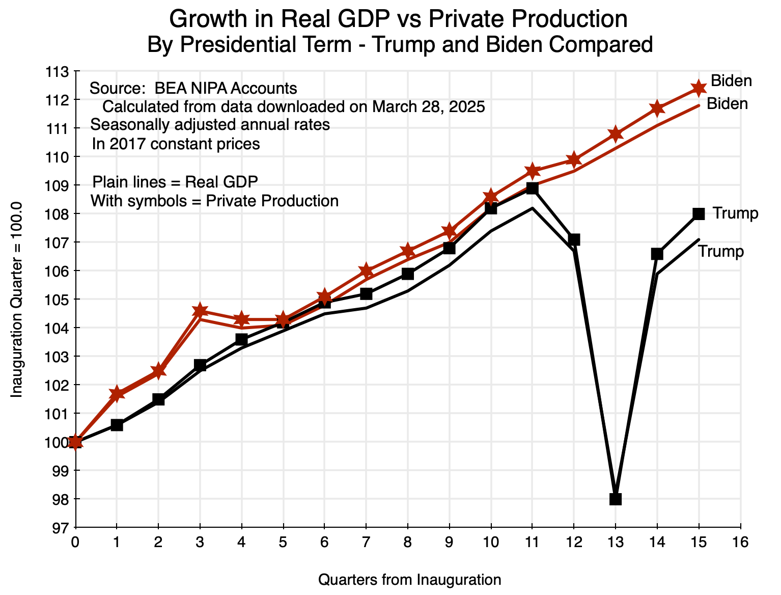


You must be logged in to post a comment.