
A. Introduction
Conservative media and conservative politicians in the US have looked down on France over the last decade (particularly after France refused to join the US in the Iraq war, and then turned out to be right), arguing that France is a stagnant, socialist state, with an economy being left behind by a dynamic US. They have pointed to faster overall growth in the US over the last several decades, and average incomes that were higher in the US to start and then became proportionately even higher as time went on.
GDP per capita has indeed grown faster in the US than it has in France over the last several decades. Over the period of 1980 to 2007 (the most recent cyclical peak, before the economic collapse in the last year of the Bush administration from which neither the US nor France has as yet fully recovered), GDP per capita grew at an annual average rate of 2.0% in the US and only 1.5% in France.
But GDP per capita reflects an average covering everyone. As has been discussed in this blog (see here and here), the distribution of income became markedly worse in the US since around 1980, when Reagan was elected and began to implement the “Reagan Revolution”. The rich in the US have done extremely well since 1980, while the not-so-rich have not. Thus while overall GDP per capita has grown by more in the US than in France, one does not know from just this whether that has also been the case for the bulk of the population.
In fact it turns out not to be the case. The bottom 90%, which includes everyone from the poor up through the middle classes to at least the bottom end of the upper middle classes, have done better in France than in the US.
B. Growth in GDP per Capita in France vs. the US: Overall and the Bottom 90%
The graph at the top of this post shows GDP per capita from 1980 to 2012 for both the US and France. The figures come from the Total Economy Database (TED database) of the Conference Board, and are expressed in terms of 2012 constant prices, in dollars, with the conversion from French currency to US dollars done in terms of Purchasing Power Parity (PPP) of 2005. PPP exchange rates provide conversions based on the prices in two respective countries of some basket of goods. They provide a measure of real living standards. Conversions based on market exchange rates can be misleading as those rates will vary moment to moment based on financial market conditions, and also do not take into account the prices of goods which are not traded internationally.
Real GDP per capita (for the entire population) rose for both the US and France over this period, and by proportionately somewhat more in the US than in France. These incomes are shown in the top two lines in the graph above, with the US in black and France in blue. GDP per capita in France was 83% of the US value in 1980, and fell to 72% of the US by 2012.
But the story is quite different if one instead focuses on the bottom 90%. The GDP per person of those in the bottom 90% of the US and in France are presented in the lower two lines of the graph above. The figures were calculated using the distribution data provided in the World Top Incomes Database, assembled by Thomas Piketty, Emmanuel Saez, and others, applied to the GDP and population figures from the TED database. The US distribution data extends to 2012, but the French data only reaches 2009 in what is available currently.
The Piketty – Saez distribution data is drawn from information provided in national income tax returns, and hence is based on incomes as defined for tax purposes in the respective countries. Thus they are not strictly comparable across countries. Nor is taxable income the same as GDP, even though GDP (sometimes referred to as National Income) reflects a broad concept of what constitutes income at a national level. But for the moment (the direction of some adjustments will be discussed below), distributing GDP according to income shares of taxable income is a good starting point.
Based on this, incomes (as measured as a share of GDP, and then per person in the group) of the bottom 90% in France were 88% of the US level in 1980. But this then grew to 98% of the US level by 2007, before backing off some in the downturn. That is, the real income of the bottom 90%, expressed purely in GDP per person, rose in France over this period from substantially less than that for the US in 1980, to very close to the average US income of that group by 2007. And since one is talking about 90% of the population, that is all those other than the well-off and rich, this is not an insignificant group.
C. Most of the US Income Growth Went to the Top 10%
Figures on the growth of the different groups, and their distributional shares, show what happened:
|
France |
US |
| GDP per Capita, Rate of Growth, 1980-2007 |
| Overall |
1.5% |
2.0% |
| Bottom 90% |
1.4% |
1.0% |
|
|
|
| Share of GDP, 1980 |
|
|
| Top 10% |
31% |
35% |
| Bottom 90% |
69% |
65% |
|
|
|
| Share of GDP, 2007 |
|
|
| Top 10% |
33% |
50% |
| Bottom 90% |
67% |
50% |
|
|
|
| Share of Increment of GDP Growth, 1980-2007 |
| Top 10% |
36% |
62% |
| Bottom 90% |
64% |
38% |
As noted before, overall GDP per capita grew at a faster average rate in the US than in France over this period: 2.0% annually in the US vs. 1.5% in France. But for the bottom 90%, GDP per capita (for the group) grew at a rate of only 1.0% in the US while in France it grew at a rate of 1.4% per year. The French rate for the bottom 90% was almost the same as the overall average rate for everyone there, while in the US the rate of income growth for the bottom 90% was only half as much as for the overall average.
Following from this, income shares did not vary much over the 1980 to 2007 period in France. That is, all groups shared similarly in growth in France. In contrast, the top 10% in the US enjoyed a disproportionate share of the income growth, leaving the bottom 90% behind.
In 1980 in France, the top 10% received 31% of the income generated in the economy and the bottom 90% received 69%. With perfect equality, the top 10% would have had 10% and the bottom 90% would have had 90%, but there is no perfect equality. The US distribution in 1980 was somewhat more unequal than in France, but not by much. In 1980, the top 10% received 35% of national income, while the bottom 90% received 65%.
This then changed markedly after 1980. Of the increment in GDP from growth over the 1980 to 2007 period, the top 10% received 36% in France (somewhat above their initial 31% share, but not by that much), while the bottom 90% received 64%. The pattern in the US was almost exactly the reverse: The top 10% in the US received fully 62% of the increment in GDP, while the bottom 90% received only 38%. As a result of this disproportionate share of income growth, the top 10% in the US increased their overall share of national income from 35% in 1980 to 50% in 2007. Distribution became far more unequal in the US over this period, while in France it did not.
The data continue to 2012 for the US, but the results are the same within roundoff. That is, the top 10% received 62% again of the increment of GDP between 1980 and 2012 while the bottom 90% only received 38%. For France the data continue to 2009, but again the results are the same as for 1980 to 2007, within roundoff.
With this deterioration in distribution, the bottom 90% in the US saw their income grow at only half the rate for the economy as a whole. The top 10% received most (62%) of the growth in GDP over this period. In France, in contrast, the bottom 90% received close to a proportionate share of the income growth. For those who make up the first 90%, economic performance and improvement in outcomes were better in France than in the US. Only the top 10% fared better in the US.
D. Other Factors Affecting Living Standards: Social Services and Leisure Time
In absolute terms, even with the faster growth of real incomes of the bottom 90% in France relative to the US over this period, the bottom 90% in France came close to but were still a bit below US income levels in 2007. They reached 98% of US income levels in that year, and then fell back some (in relative terms) with the start of the 2008 downturn.
But the calculations discussed above were based on applying distributional shares from tax return data to GDP figures. For income earning comparisons, this is reasonable. But living standards includes more than cash earnings. In particular, one should take into account the impact on living standards of social services and leisure time.
Social services include services provided by or through the government, which are distributed to the population either equally or with a higher share going to the poorer elements in society. An example of a service distributed equally would be health care services. In France government supported health care services (largely provided via private providers such as doctors and hospitals) are made available to the entire population. Since individual health care needs are largely similar for all, one would expect that the bottom 90% would receive approximately 90% of the benefit from such services, while the top 10% would receive about 10%. If anything, the poor might receive a higher share, as their health conditions will on average likely be worse (and might account for why they are poor). For other social services, such as housing allowances or unemployment compensation, more than 90% will likely accrue to the bottom 90%.
Taking such services into account, the bottom 90% in France will be receiving more than the 67% share of income (in 2007) seen in tax return data. How much more I cannot calculate as I do not have the data. The direction of change would be the same in the US. However, one would expect a much lower impact in the US than in France because social services provided by or through the government are much more limited in the US than in France. While Medicare provides similar health care as one finds in France, Medicare in the US is limited to those over 65, while government supported health care in France goes to the entire population. And the social safety net, focussed on the poor and middle classes, is much more limited in the US than in France.
In addition, economists recognize that GDP per capita is a only crude measure of living standards as it does not take into account how many hours each individual must work to obtain that income. Your living standard is higher if you can earn the same income but work fewer hours as someone else to receive that income, as the remaining time can be spent on leisure. And there is nothing irrational to choose to work 10% fewer hours a year, say, even though your annual income would then be 10% less. The work / leisure tradeoff is a choice to be made.
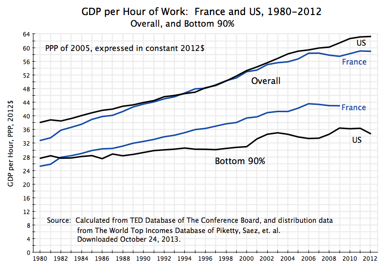
GDP per capita may often be the best measure available due to lack of data on working hours, but for the US and France such data are available (and are provided in the TED database referred to previously). One can then calculate GDP per hour of work instead of GDP per capita, both overall and (using the same distributional data as above) for the bottom 90%. The resulting graph for 1980 to 2012 is as follows:
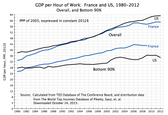
By this measure, overall GDP per hour of work in France was similar to that of the US in the 1990s, but somewhat less before and after. Overall GDP per capita was always higher in the US over this full period (the top graph in this post), and by a substantial 20% (in 1980) to 38% (in 2012). Yet GDP per hour worked never varied by so much, and indeed in some years was slightly higher in France than in the US.
But for the bottom 90%, income received per hour of work has been far better in France than in the US since 1983. By 2007, GDP per hour worked was 30% higher in France than in the US for the bottom 90%. This is not a small difference. French workers are productive, and take part of their higher productivity per hour in more annual leisure time than their US counterparts do.
E. Summary and Conclusions
The French economic record has been much criticized by conservative media and politicians in the US, with France seen as a stagnant, socialist, state. Overall GDP per capita has indeed grown faster in recent decades in the US than in France, averaging 2.0% per annum in the US vs. a rate of 1.5% in France. While such a difference in rates might appear to be small, it compounds over time.
But the picture is quite different if one focusses on the bottom 90%. This is not a small segment of the population, but rather everyone from the poor up to all but the quite well off. Growth in average real income of this group was substantially faster in France than in the US since 1980. While overall growth was faster in the US than in France, most of this income growth went to the top 10% in the US, while the gains were shared more equally in France.
Furthermore, when one takes into account social services, which are more equally distributed than taxable income and which are much more important in France than in the US, as well as leisure time, the real living standards of the bottom 90% have not only grown faster in France, but have substantially surpassed that of the US.
For those other than those fortunate enough to be in the top 10%, living standards are now higher, and have improved by more in recent decades, in France than in the US.




You must be logged in to post a comment.