The Impact of the Reagan and Bush Tax Cuts: Not a Boost to Employment, nor to Growth, nor to the Fiscal Accounts

Private Employment Following Tax Law Changes

A.  Introduction

The belief that tax cuts will spur growth and new jobs, and indeed even lead to an improvement in the fiscal accounts, remains a firm part of Republican dogma.  The tax plans released by the main Republican presidential candidates this year all presume, for example, that a spectacular jump in growth will keep fiscal deficits from increasing, despite sharp cuts in tax rates.  And conversely, Republican dogma also holds that tax increases will kill growth and thus then lead to a worsening in the fiscal accounts.  The “evidence” cited for these beliefs is the supposed strong recovery of the economy in the 1980s under Reagan.

But the facts do not back this up.  There have been four major rounds of changes in the tax code since Reagan, and one can look at what happened after each.  While it is overly simplistic to assign all of what followed solely to the changes in tax rates, looking at what actually happened will at least allow us to examine the assertion underlying these claims that the Reagan tax cuts led to spectacular growth.

The four major changes in the tax code were the following.  While each of the laws made numerous changes in the tax code, I will focus here on the changes made in the highest marginal rate of tax on income.  The so-called “supply-siders” treat the highest marginal rate to be of fundamental importance since, under their view, this will determine whether individuals will make the effort to work or not, and by how much.  The four episodes were:

a)  The Reagan tax cuts signed into law in August 1981, which took effect starting in 1982. The highest marginal income tax rate was reduced from 70% before to 50% from 1982 onwards.  There was an additional round of tax cuts under a separate law passed in 1986, which brought this rate down further to 38.5% in 1987 and to 28% from 1988 onwards. While this could have been treated as a separate tax change episode, I have left this here as part of the Reagan legacy.  Under the Republican dogma, this should have led to an additional stimulant to growth.  We will see if that was the case.  There was also a more minor change under George H.W. Bush as part of a 1990 budget compromise, which brought the top rate partially back from 28.0% to 31.0% effective in 1991.  While famous as it went against Bush’s “read my lips” pledge, the change was relatively small.

b)  The tax rate increases in the first year of the Clinton presidency.  This was signed into law in August 1993, with the tax rate increases applying in that year.  The top marginal income tax rate was raised to 39.6%.

c)  The tax cuts in the George W. Bush presidency that brought the top rate down from 39.6% to 38.6% in 2002 and to 35.0% in 2003.  The initial law was signed in June 2001, and then an additional act passed in 2003 made further tax cuts and brought forward in time tax cuts being phased in under the 2001 law.

d)  The tax rate increases for those with very high incomes signed into law in December 2012, just after Obama was re-elected, that brought the marginal rate for the highest income earners back to 39.6%.

We therefore have four episodes to look at:  two of tax cuts and two of tax increases.  For each, I will trace what happened from when the tax law changes were signed up to the end of the administration responsible (treating Reagan and Bush I as one).  The questions to address are whether the tax cut episodes led to exceptionally good job growth and GDP growth, while the the tax increases led to exceptionally poor job and GDP growth. We will then look at what happened to the fiscal accounts.

B.  Jobs and GDP Growth Following the Changes in Tax Law

The chart at the top of this post shows what happened to private employment, by calendar quarter relative to a base = 100 for the quarter when the new law was signed. The data is from the Bureau of Labor Statistics (downloaded, for convenience, from FRED).  A chart using total employment would look almost exactly the same (but one could argue that government employment should be excluded as it is driven by other factors).

As the chart shows, private job growth was best following the Clinton and Obama tax increases, was worse under Reagan-Bush I, and abysmal under Bush II.  There is absolutely no indication that big tax cuts, such as those under Reagan and then Bush II, are good for job growth.  I would emphasize that one should not then jump to the conclusion that tax increases are therefore good for job growth.  That would be overly simplistic.  But what the chart does show is that the oft-stated claim by Republican pundits that the Reagan tax cuts were wonderful for job growth simply has no basis in fact.

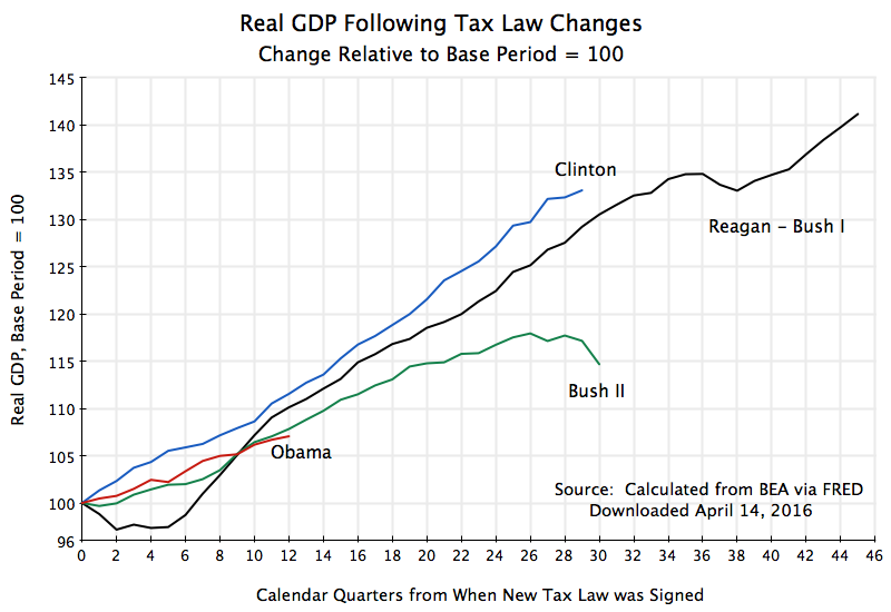
How about the possible impact on GDP growth?  A similar chart shows (based on BEA data on the GDP accounts):
Real GDP Following Tax Law Changes

Once again, growth was best following the Clinton tax increases.  Under Reagan, GDP growth first fell following the tax cuts being signed into law (as the economy moved down into a recession, which by NBER dating began almost exactly as the Reagan tax cut law was being signed), and then recovered.  But the path never catches up with that followed during the Clinton years.  Indeed after a partial catch-up over the initial three years (12 calendar quarters), the GDP path began to fall steadily behind the pace enjoyed under Clinton.  Higher taxes under Clinton were clearly not a hindrance to growth.

The Bush II and Obama paths are quite similar, even though growth during these Obama years has had to go up against the strong headwinds of fiscal drag from government spending cuts.  Federal government spending on goods and services (from the GDP accounts, with the figures in real, inflation-adjusted, terms) rose at a 4.4% per annum pace during the eight years of the Bush II administration, and rose at a 5.6% rate during Bush’s first term.  Federal government spending since the late 2012 tax increases were signed under Obama have fallen, in contrast, at a 2.8% per annum rate.

There is therefore also no evidence here that tax cuts are especially good for growth and tax increases especially bad for growth.  If anything, the data points the other way.

C.  The Impact on the Fiscal Accounts

The argument of those favoring tax cuts goes beyond the assertion that they will be good for growth in jobs and in GDP.  Some indeed go so far as to assert that the resulting stimulus to growth will be so strong that tax revenues will actually rise as a result, since while the tax rates will be lower, they will be applied against resulting higher incomes and hence “pay for themselves”.  This would be nice, if true.  Something for nothing. Unfortunately, it is a fairy tale.

What happened to federal income taxes following the changes in the tax rates?  Using CBO data on the historical fiscal accounts:

Real Federal Income Tax Revenues Following Tax Law Changes

Federal income tax revenues (in real terms) either fell or at best stagnated following the Reagan and then the Bush II tax cuts.  The revenues rose following the Clinton and Obama tax increases.  The impact is clear.

While one would think this should be obvious, the supply-siders who continue to dominate Republican thinking on these issues assert the opposite has been the case (and would be, going forward).  Indeed, in what must be one of the worst economic forecasts ever made in recent decades by economists (and there have been many bad forecasts), analysts at the Center for Data Analysis at the conservative Heritage Foundation concluded in 2001 that the Bush II tax cuts would lead government to “effectively pay off the publicly held federal debt by FY 2010”.  Publicly held federal debt would fall below 5% of GDP by FY2011 they said, and could not go any lower as some federal debt is needed for purposes such as monetary operations.  But actual publicly held federal debt reached 66% of GDP that year.  That is not a small difference.

Higher tax revenues help then make it possible to bring down the fiscal deficit.  While the deficit will also depend on public spending, a higher revenue base, all else being equal, will lead to a lower deficit.

So what happened to the fiscal deficit following these four episodes of major tax rate changes?  (Note to reader:  A reduction in the fiscal deficit is shown as a positive change in the figure.)

Change in Fiscal Deficit Relative to Base Year Following Tax Law Changes

The deficit as a share of GDP was sharply reduced under Clinton and even more so under Obama.  Indeed, under Clinton the fiscal accounts moved from a deficit of 4.5% of GDP in FY1992 to a surplus of 2.3% of GDP in FY2000, an improvement of close to 7% points of GDP.  And in the period since the tax increases under Obama, the deficit has been reduced by over 4% points of GDP, in just three years.  This has been a very rapid base, faster than that seen even during the Clinton years.  Indeed, the pace of fiscal deficit reduction has been too fast, a consequence of the federal government spending cuts discussed above.  This fiscal drag held back the pace of recovery from the downturn Obama inherited in 2009, but at least the economy has recovered.

In contrast, the fiscal deficit deteriorated sharply following the Reagan tax cuts, and got especially worse following the Bush II tax cuts.  The federal fiscal deficit was 2.5% of GDP in FY1981, when Reagan took office, went as high as 5.9% of GDP in FY1983, and was 4.5% of GDP in FY1992, the last year of Bush I (it was 2.5% of GDP in FY2015 under Obama).  Bush II inherited the Clinton surplus when he took office, but brought this down quickly (on a path initially similar to that seen under Reagan).  The deficit was then 3.1% of GDP in FY2008, the last full year when Bush II was in office, and hit 9.8% of GDP in FY2009 due largely to the collapsing economy (with Bush II in office for the first third of this fiscal year).

Republicans continue to complain of high fiscal deficits under the Democrats.  But the deficits were cut sharply under the Democrats, moving all the way to a substantial surplus under Clinton.  And the FY2015 deficit of 2.5% of GDP under Obama is not only far below the 9.8% deficit of FY2009, the year he took office, but is indeed lower than the deficit was in any year under Reagan and Bush I.  The tax increases signed into law by Clinton and Obama certainly helped this to be achieved.

D.  Conclusion

The still widespread belief among Republicans that tax cuts will spur growth in jobs and in GDP is simply not borne out be the facts.  Growth was better following the tax increases of recent decades than it was following the tax cuts.

I would not conclude from this, however, that tax increases are therefore necessarily good for growth.  The truth is that tax changes such as those examined here simply will not have much of an impact in one direction or the other on jobs and output, especially when a period of several years is considered.  Job and output growth largely depends on other factors.  Changes in marginal income tax rates simply will not matter much if at all. Economic performance was much better under the Clinton and Obama administrations not because they raised income taxes (even though they did), but because these administrations managed better a whole host of factors affecting the economy than was done under Reagan, Bush I, or Bush II.

Where the income tax rates do matter is in how much is collected in income taxes.  When tax rates are raised, more is collected, and when tax rates are cut, less is collected.  This, along with the management of other factors, then led to sharp reductions in the fiscal deficit under Clinton and Obama (and indeed to a significant surplus by the end of the Clinton administration), while fiscal deficits increased under Reagan, Bush I, and Bush II.

Higher tax collections when tax rates go up and lower collections when they go down should not be a surprising finding.  Indeed, it should be obvious.  Yet one still sees, for example in the tax plans issued by the Republican presidential candidates this year, reliance on the belief that a miraculous jump in growth will keep deficits from growing.

There is no evidence that such miracles happen.
Initial Claims for Unemployment Insurance Are at Record Lows

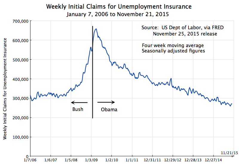
Weekly Initial Claims for Unemployment Insurance, January 7, 2006, to November 21, 2015

Weekly Initial Claims for Unemployment Insurance as a Ratio to Employment, January 1967 to October 2015


Initial claims for unemployment insurance are now at their lowest level, in terms of absolute numbers, in forty years, and the lowest ever when measured relative to employment (although the series goes back only to 1967).  There has been a steady improvement in the job market since soon after Barack Obama took office in January 2009, with (as discussed in a recent post on this blog) a steady increase in private sector jobs and an unemployment rate now at just 5.0%.  Yet the general discussion still fails to recognize this.  I will discuss some of the possible reasons for this perception later in this post.

Initial claims for unemployment insurance provides a good measure of the strength of the labor market, as it shows how many workers have been involuntarily laid off from a job and who are then thus eligible for unemployment insurance.  The US Department of Labor reports the figure weekly, where the numbers in the chart above are those updated through the release of November 25, 2015 (with data through November 21).  While there is a good deal of noise in the weekly figures due to various special factors (and hence most of the focus is on the four week moving average), it does provide a high frequency “yardstick” of the state of the labor market.  The charts above are for the four week moving averages.

The measure has been falling steadily (abstracting from the noise) since soon after President Obama took office.  News reports have noted that the weekly figures have been below 300,000 for some time now (close to a year).  This is a good number.  Even in the best year of the Bush administration (2006, at the height of the housing bubble), weekly initial claims for unemployment insurance averaged 312,000.  So far in 2015 (through November 21) it has averaged 279,000, and the lowest figure was just 259,250 for the week of October 24.  Initial claims for unemployment have not been so low in absolute numbers since December 1973.

But the population and labor force have grown over time.  When measured as a ratio to the number of those employed, initial claims for unemployment insurance have never been so low, although the series only begins in January 1967.  It is now well below the lowest points ever reached in the George W. Bush administration, in the Reagan administration, and even in the Clinton administration, under which the economy enjoyed the longest period of economic expansion ever recorded in the US (back to at least 1854, when the recession dating of the NBER begins).

Why then has the job market been seen by many as being especially weak under Obama? It should not be because of the unemployment rate, which has fallen steadily to 5.0% and is now well below where it was at a similar point during the Reagan administration.  Private job creation has also been steady and strong (although government jobs have been cut, for the first time in an economic downturn in at least a half century).  There has also been no increase in the share of part time employment, despite assertions from Republican politicians that Obamacare would have led to this.  And growth in GDP, while it would have been faster without the fiscal drag of government spending cuts seen 2010, has at least been steady.

What has hurt?  While no one can say for sure as the issue is some sense of the general perception of the economy, the steady criticism by Republican officials and pundits has probably been a factor.  The Obama administration has not been good at answering this.

But also important, and substantive, is that wages have remained stagnant.  While this stagnation in wages has been underway since about 1980, increased attention is being paid to it now (which is certainly a good thing).  In part due to this stagnation, the recovery that we have seen in the economy since the trough in mid-2009 has mostly been for the benefit of the very rich.  Professor Emmanuel Saez of UC Berkeley has calculated, based on US tax return data, that the top 1% have captured 58% of US income growth over the period 2009 to 2014.  The top 1% have seen their real incomes rise over this period by a total of 27% in real terms, while the bottom 99% have seen income growth over the period of only 4.3%.  Furthermore, most of this income growth for the bottom 99% only started in 2013.  For the period from 2009 through 2012, the top 1% captured 91% of the growth in national income.  The bottom 99% saw their real incomes rise by only 0.8% total over that period.

The issue then is not really one of jobs or overall growth.  Rather it is primarily a distribution problem.  The recovery has not felt like a recovery not because jobs or growth have been poor (although they would have been better without the fiscal drag), but rather because most of the gains of the growth have accrued to the top 1%.  It has not felt like a recovery for the other 99%, and for an understandable reason.

An Update on the Impact of the Austerity Programs in Europe and a Higher Tax on Consumption in Japan: Still No Growth


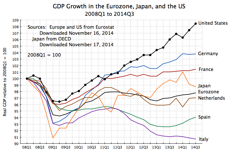
GDP Growth in Eurozone, Japan, and US, 2008Q1 to 2014Q3

A.  Introduction

With the release last Friday by Eurostat of the initial GDP growth estimates for most of Europe for the third quarter of 2014, and the release on Monday of the initial estimate for Japan, it is a good time to provide an update on how successful austerity strategies have been.

B.  Europe

As was discussed in earlier posts in this blog on Europe (here and here), Europe moved from expansionary fiscal policies in its initial response to the 2008 downturn, to austerity programs with fiscal cutbacks starting in 2010/11.  The initial expansionary policies did succeed in stopping the sharp downturn in output that followed the financial collapse of 2008/2009.  European economies began to grow again in mid-2009, and by late 2010 had recovered approximately two-thirds of the output that had been lost in the downturn.

But then a number of European leaders, and in particular the leaders of Germany (Chancellor Angela Merkel and others) plus the then-leader of the European Central Bank (Jean-Claude Trichet), called for fiscal cuts.  They expressed alarm over the fiscal deficits that had developed in the downturn, and argued that financial instability would result if they were not quickly addressed.  And they asserted that austerity policies would not be contractionary under those circumstances but rather expansionary.  Trichet, for example, said in a June 2010 interview with La Repubblica (the largest circulation newspaper in Italy):

Trichet:  … As regards the economy, the idea that austerity measures could trigger stagnation is incorrect.

La Republicca:  Incorrect?

Trichet:  Yes. In fact, in these circumstances, everything that helps to increase the confidence of households, firms and investors in the sustainability of public finances is good for the consolidation of growth and job creation.  I firmly believe that in the current circumstances confidence-inspiring policies will foster and not hamper economic recovery, because confidence is the key factor today.

So what has actually happened since the austerity programs were imposed in Europe?  The chart at the top of this post shows the path of real GDP for the larger Eurozone economies as well as for the Eurozone as a whole, plus Japan and the US for comparison.  The data for Europe (as well as the US) comes from Eurostat, with figures for 2014Q3 from the November 14 Eurostat press release, while the data for Japan came most conveniently from the OECD.  Real GDP is shown relative to where it was in the first quarter of 2008, which was the peak for most of Europe before the 2008/09 collapse.

In a word, the results in Europe have been terrible.  Real GDP in the Eurozone as a whole is basically the same as (in fact slightly less than) what it was in early 2011, three and a half years ago.  To be more precise, real GDP in the Eurozone fell by a bit more than 1% between early 2011 and early 2013, and since then rose by a bit over 1%, but it has basically been dead.  There has been no growth in the three and a half years since austerity programs took over.  And Eurozone output is still more than 2% below where it had been in early 2008, six and a half years ago.

Since early 2011, in contrast, the US economy grew by 8.6% in real terms.  Annualized, this comes to 2.4% a year.  While not great (fiscal drag has been a problem in the US as well), and not sufficient for a recovery from a downturn, the US result was at least far better than the zero growth in the Eurozone.

There was, not surprisingly, a good deal of variation across the European economies.  The chart shows the growth results for several of the larger economies in the Eurozone.  Germany has done best, but its growth flattened out as well since early 2011.  As was discussed in an earlier post, Germany (despite its rhetoric) in fact followed fairly expansionary fiscal policies in 2009, with further increases in 2010 and 2011 (when others, including the US, started to cut back).  And as the chart above shows, the recovery in Germany was fairly solid in 2009 and 2010, with this continuing into 2011.  But it then slowed.  Growth since early 2011 has averaged only 0.9% a year.

Other countries have done worse.  There has been very little growth in France since early 2011, and declines in the Netherlands, Spain, and Italy.  Spain was forced (as a condition of European aid) to implement a very tight austerity program following the collapse of its banking system in 2008/09 as a consequence of its own housing bubble, but has loosened this in the last year.  Only in France is real GDP higher now than where it was in early 2008, and only by 1.4% total over those six and a half years.  But France has also seen almost no growth (just 0.4% a year) since early 2011.

C.  Japan

The new figures for Japan were also bad, and many would say horrible.  After falling at a 7.3% annualized rate in the second quarter of this year, real GDP is estimated to have fallen by a further 1.6% rate in the third quarter.  The primary cause for these falls was the decision to go ahead with a planned increase in the consumption tax rate on April 1 (the start of the second quarter) from the previous 5% to a new 8% rate, an increase of 60%.

The Japanese consumption tax is often referred to in the US as a sales tax, but it is actually more like a value added tax (such as is common in Europe).  It is a tax on sales of goods and services to final consumers such as households, with offsets being provided for such taxes paid at earlier stages in production (which makes it more like a value-added tax).  As a tax on consumption, it is the worst possible tax Japan could have chosen to increase at this time, when the economy remains weak.  There is insufficient demand, and this is a straight tax on consumption demand.  It is also regressive, as poor and middle class households will pay a higher share of their incomes on such a tax, than will a richer household.  With its still weak economy, Japan should not now be increasing any such taxes, and increasing the tax on consumption is the worst one they could have chosen.

With recessions conventionally defined as declines in real GDP in two consecutive quarters, Japan is now suffering its fourth recessionary contraction (a “quadruple-dip” recession) since 2008.  This may be unprecedented.  Japan’s output is still a bit better, relative to early 2008, than it is for the Eurozone as a whole, but it has been much more volatile.

Prime Minister Shinzo Abe was elected in December 2012 and almost immediately announced a bold program to end deflation and get the economy growing again.  It was quickly dubbed “Abenomics”, and was built on three pillars (or “arrows” as Abe described it).  The first was a much more aggressive monetary policy by the Central Bank, with use of “quantitative easing” (such as the US had followed) where central bank funds are used to purchase long term bonds, and hence increase liquidity in the market.  The second arrow was further short-term fiscal stimulus.  And the third arrow was structural reforms.

In practice, however, the impacts have been mixed.  Expansionary monetary policy has been perhaps most seriously implemented, and it has succeeded in devaluing the exchange rate from what had been extremely appreciated levels.  This helped exporters, and the stock market also boomed for a period.  The Nikkei stock market average is now almost double where it was in early November 2012 (when it was already clear to most that Abe would win in a landslide, which he then did).  But the impact of such monetary policy on output can only be limited when interest rates are already close to zero, as they have been in Japan for some time.

The second “arrow” of fiscal stimulus centered on a package of measures announced and then approved by the Japanese Diet in January 2013.  But when looked at more closely, it was more limited than the headline figures suggest.  In gross terms, the headline expenditure figure amounted to a bit less than 2% of one year’s GDP, but the spending would be spread over more than one year.  It also included expenditures which were already planned.  It therefore needs to be looked at in the context of overall fiscal measures, including the then planned and ultimately implemented decision to raise the consumption tax rate on April 1, 2014.  The IMF, in its October 2013 World Economic Outlook, estimated that the net impact of all the fiscal measures (including not only the announced stimulus programs, but also the tax hike and all other fiscal measures) would be a neutral fiscal stance in 2013 (neither tightening nor loosening) and a tightening in the fiscal stance of 2.5% of GDP in 2014.  The fall in GDP this year should therefore not be a surprise.

Finally, very little has been done on Abe’s third “arrow” of structural reforms.

On balance, Abe’s program supported reasonably good growth of 2.4% for real GDP in 2013 (see the chart above).  There was then a spike up in the first quarter of 2014.  However, this was largely due to consumers pulling forward into the first quarter significant purchases (such as of cars) from the second quarter, due to the planned April 1 consumption tax hike.  Some fall in the second quarter was then not seen as a surprise, but the fall turned out to be a good deal sharper than anticipated.  And the further fall in the third quarter was a shock.

As a result of these developments, Abe has announced that he will dissolve the Diet, hold new elections in mid-December with the aim of renewing his mandate (he is expected to win easily, due to disorder in the opposition), and will postpone the planned next increase in the consumption tax (from its current 8% to a 10% rate) from the scheduled October 2015 date to April 2017.  Whether the economy will be strong enough to take this further increase in a tax on consumption by that date remains to be seen.  The government has no announced plans to reverse the increase of 5% to 8% last April.

Japan’s public debt is high, at 243% of GDP in gross terms as of the end of 2013.  Net debt is a good deal lower at 134% (debt figures from IMF WEO, October 2014), but still high.  The comparable net debt figure for the US was 80% at the end of 2013 (using the IMF definitions for comparability; note this covers all levels of government, not just federal).  Japan will eventually need to raise taxes.  But when it does, with an economy just then emerging from a recession due to inadequate demand, one should not raise a tax on consumption.  A hike in income tax rates, particularly on those of higher income, would be far less of a drag on the economy.