
A. Introduction
Donald Trump has repeatedly asserted that he built “the greatest economy in history”. A recent example is in his acceptance speech for the Republican nomination to run for a second term. And it is not a surprise that Trump would want to claim this. It would be nice, if true. But what is surprising is that a number of election surveys have found that Trump polls well on economic issues, with voters rating Trump substantially above Biden on who would manage the economy better.
Yet any examination of Trump’s actual record, not just now following the unprecedented economic collapse this year resulting from the Covid-19 crisis, but also before, shows Trump’s repeated assertion to be plainly false.
The best that can be said is that Trump did not derail, in his first three years in office, the economic expansion that began with the turnaround Obama engineered within a half year of his taking office in 2009 (when Obama had inherited an economy that was, indeed, collapsing). But the expansion that began under Obama has now been fully and spectacularly undone in Trump’s fourth year in office, with real GDP in the second quarter of 2020 plummeting at an annualized rate of 32% – to a level that is now even well below what it was when Trump took office. The 32% rate of decline is by far the fastest decline recorded for the US since quarterly data on GDP began to be recorded in 1947 (the previous record was 10%, under Eisenhower, and the next worst was an 8.4% rate of decline in the last quarter of 2008 at the very end of the Bush administration.
This post will look at Trump’s record in comparison to that not just of Obama but also of all US presidents of the last almost 48 years (since the Nixon/Ford term). For his first three years in office, that Trump record is nothing special. It is certainly and obviously not the best in history. And now in his fourth year in office, it is spectacularly bad.
The examination will be via a series of charts. The discussion of each will be kept limited, but the interested reader may wish to study them more closely – there is a lot to the story of how the economy developed during each presidential administration. But the primary objective of these “spaghetti” charts is to show how Trump’s record in his first three years in office fits squarely in the middle of what the presidents of the last half-century have achieved. It was not the best nor the worst over those first three years – Trump inherited from Obama an expanding and stable economy. But then in Trump’s fourth year, it has turned catastrophic.
Also, while there is a lot more that could be covered, the post will be limited to examination of the outcomes for growth in overall output (GDP), for the fiscal accounts (government spending, the fiscal deficit, and the resulting public debt), the labor market (employment, unemployment, productivity, and real wages), and the basic trade accounts (imports, exports, and the trade balance).
The figures for the charts were calculated based on data from a number of official US government sources. Summarizing them all here for convenience (with their links):
a) BEA: Bureau of Economic Analysis of the US Department of Commerce, and in particular the National Income and Product Accounts (NIPA, also commonly referred to as the GDP accounts).
b) BLS: Bureau of Labor Statistics of the US Department of Labor.
c) OMB Historical Tables: Office of Management and Budget, of the White House.
d) Census Bureau – Foreign Trade Data: Of the US Department of Commerce.
It was generally most convenient to access the data via FRED, the Federal Reserve Economic Database of the St. Louis Fed.
B. Real GDP
Trump likes to assert that he inherited an economy that was in terrible shape. Larry Kudlow, the director of the National Economic Council and Trump’s principal economic advisor recently asserted, for example in his speech to the Republican National Convention, that the Trump administration inherited from Obama “a stagnant economy that was on the front end of a recession”. While it is not fully clear what a “front end” of a recession is (it is not an economic term), the economy certainly was not stagnant and there was no indication whatsoever of a recession on the horizon.
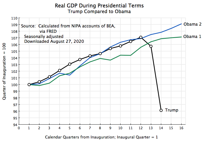
The chart at the top of this post shows the path followed by real GDP during the course of Obama’s first and second terms in office, along with that of Trump’s term in office thus far. Both are indexed to 100 in the first calendar quarter of their presidential terms. Obama inherited from Bush an economy that was rapidly collapsing (with a banking system in ruin) and succeeded in turning it around within a half year of taking office. Subsequent growth during the remainder of Obama’s first term was then similar to what it was in his second term (with the curve parallel but shifted down in the first term due to the initial downturn).
Growth in the first three years of Trump’s presidency was then almost exactly the same as during Obama’s second term. There is a bit of a dip at the start of the second year in Obama’s second term (linked to cuts in government spending in the first year of Obama’s second term – see below), but then a full recovery back to the previous path. At the three-year mark (the 12th quarter) they are almost exactly the same. To term this stagnation under Obama and then a boom under Trump, as Kudlow asserted, is nonsensical – they are the same to that point. But the economy has now clearly collapsed under Trump, while it continued on the same path as before under Obama.
Does Trump look better when examined in a broader context, using the record of presidents going back to the Nixon/Ford term that began almost 48 years ago? No: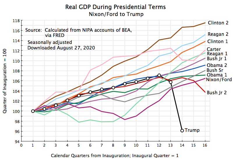
The best that can be said is that the growth of real GDP under Trump in his first three years in office is roughly in the middle of the pack. Growth was worse in a few administrations – primarily those where the economy went into a recession not long after they took office (such as in the first Reagan term, the first Bush Jr. term, and the Nixon/Ford term). But growth in most of the presidential terms was either similar or distinctly better than what we had under Trump in his first three years.
And now real GDP has collapsed in Trump’s fourth year to the absolute worst, and by a very significant margin.
One can speculate on what will happen to real GDP in the final two quarters of Trump’s presidency. Far quicker than in earlier economic downturns, Congress responded in March and April with a series of relief bills to address the costs of the Covid-19 crisis, that in total amount to be spent far surpass anything that has ever been done before. The Congressional Budget Office (CBO) estimates that the resulting spending increases, tax cuts, and new loan facilities of measures already approved will cost a total of $3.1 trillion. This total approved would, by itself, come to 15% of GDP (where one should note that not all will be spent or used in tax cuts in the current fiscal year – some will carry over into future years). Such spending can be compared to the $1.2 trillion, or 8.5% of the then GDP, approved in 2008/09 in response to that downturn (with most of the spending and tax cuts spread over three years). Of this $1.2 trillion, $444 billion was spent under the TARP program approved under Bush and $787 billion for the Recovery Act under Obama).
And debate is currently underway on additional relief measures, where the Democratic-controlled Congress approved in May a further $3 trillion for relief, while leaders in the Republican-controlled Senate have discussed a possible $1 trillion measure. What will happen now is not clear. Some compromise in the middle may be possible, or nothing may be passed.
But the spending already approved will have a major stimulative effect. With such a massive program supporting demand, plus the peculiar nature of the downturn (where many businesses and other centers of employment had to be temporarily closed as the measures taken by the Trump administration to limit the spread of the coronavirus proved to be far from adequate), the current expectation is that there will be a significant bounceback in GDP in the third quarter. As I write this, the GDPNow model of the Atlanta Fed forecasts that real GDP in the quarter may grow at an annualized rate of 29.6%. Keep in mind, however, that to make up for a fall of 32% one needs, by simple arithmetic, an increase of 47% from the now lower base. (Remember that to make up for a fall of 50%, output would need to double – grow by 100% – to return to where one was before.)
Taking into account where the economy is now (where there was already a 5% annualized rate of decline in real GDP in the first quarter of this year), what would growth need to be to keep Trump’s record from being the worst of any president of at least the last half-century? Assuming that growth in the third quarter does come to 29.6%, one can calculate that GDP would then need to grow by 5.0% (annualized) in the fourth quarter to match the currently worst record – of Bush Jr. in his second term. And it would need to grow by 19% to get it back to where GDP was at the end of 2019.
C. The Fiscal Accounts
Growth depends on many factors, only some of which are controlled by a president together with congress. One such factor is government spending. Cuts in government spending, particularly when unemployment is significant and businesses cannot sell all that they could and would produce due to a lack of overall demand, can lead to slower growth. Do cuts in government spending perhaps explain the middling rate of growth observed in the first three years of Trump’s term in office? Or did big increases in government spending spur growth under Obama?
Actually, quite the opposite:
Federal government spending on goods and services did rise in the first year and a half of Obama’s first term in office, with this critical in reversing the collapsing economy that Obama inherited. But the Republican Congress elected in 2010 then forced through cuts in spending, with further cuts continuing until well into Obama’s second term (after which spending remained largely flat). While the economy continued to expand at a modest pace, the cuts slowed the economy during a period when unemployment was still high. (There is also government spending on transfers, where the two largest such programs are Social Security and Medicare, but spending on such programs depends on eligibility, not on annual appropriations.)
Under Trump, in contrast, government spending has grown, and consistently so. And indeed government spending grew under Trump at a faster pace than it had almost any other president of the last half-century (with even faster growth only under Reagan and Bush, Jr., two presidents that spoke of themselves, as Trump has, as “small government conservatives”):
The acceleration in government spending growth under Trump did succeed, in his first three years in office, in applying additional pressure on the economy in a standard Keynesian fashion, which brought down unemployment (see below). But this extra government spending did not lead to an acceleration in growth – it just kept it growing (in the first three years of Trump’s term) at the same pace as it had before, as was seen above. That is, the economy required additional demand pressure to offset measures the Trump administration was taking which themselves would have reduced growth (such as his trade wars, or favoritism for industries such as steel and aluminum, which harmed the purchasers of steel and aluminum such as car companies and appliance makers).
Trump has also claimed credit for a major tax cut bill (as have Reagan and Bush, Jr.). They all claimed this would spur growth (none did – see above and a more detailed analysis in this blog post), and indeed such sufficiently faster growth, they predicted, that tax revenue would increase despite the reductions in the tax rates. Hence fiscal deficits would be reduced. They weren’t: 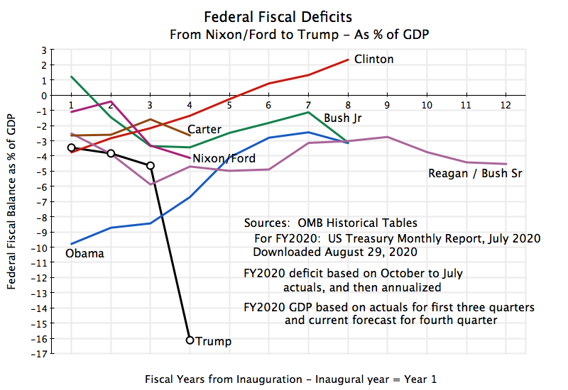
Fiscal deficits were large and sustained throughout the Reagan/Bush Sr. years. They then moved to a fiscal surplus under Clinton, following the major tax increase passed in 1993 and the subsequent years of steady and strong growth. The surplus was then turned back again into a deficit under Bush Jr., with his major tax cuts of 2001 and 2003 coupled with his poor record for economic growth. Obama then inherited a high fiscal deficit, which grew higher due to the economic downturn he faced on taking office and the measures that were necessary to address it. But with the economic recovery, the deficit under Obama was then reduced (although at too fast a pace – this held back the economy, especially in the early years of the recovery when unemployment was still high).
Under Trump, in contrast, the fiscal deficit rose in his first three years in office, at a time when unemployment was low. This was the time when the US should have been strengthening rather than weakening the fiscal accounts. As President Kennedy said in his 1962 State of the Union Address: “The time to repair the roof is when the sun is shining.” Under Trump, in contrast, the fiscal deficit was reaching 5% of GDP even before the Covid-19 crisis. The US has never before had such a high fiscal deficit when unemployment was low, with the sole exception of during World War II.
This left the fiscal accounts in a weak condition when government spending needed to increase with the onset of the Covid-19 crisis. The result is that the fiscal deficit is expected to reach an unprecedented 16% of GDP this fiscal year, the highest it has ever been (other than during World War II) since at least 1930, when such records began to be kept.
The consequence is a public debt that is now shooting upwards: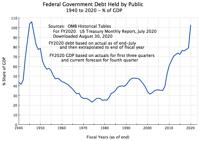
As a share of GDP, federal government debt (held by the public) is expected to reach 100% of GDP by September 30 (the end of the fiscal year), based on a simple extrapolation of fiscal account and debt data currently available through July (see the US Treasury Monthly Statement for July, released August 12, 2020). And with its momentum (as such fiscal deficits do not turn into surpluses in any short period of time), Trump will have left for coming generations a government debt that is the highest (as a share of GDP) it has ever been in US history, exceeding even what it was at the end of World War II.
When Trump campaigned for the presidency in 2016, he asserted he would balance the federal government fiscal accounts “fairly quickly”. Instead the US will face this year, in the fourth year of his term in office, a fiscal deficit that is higher as a share of GDP than it ever was other than during World War II. Trump also claimed that he would have the entire federal debt repaid within eight years. This was always nonsense and reflected a basic lack of understanding. But at least the federal debt to GDP ratio might have been put on a downward trajectory during years when unemployment was relatively low. Instead, federal debt is on a trajectory that will soon bring it to the highest it has ever been.
D. The Labor Market
Trump also likes to assert that he can be credited with the strongest growth in jobs in history. That is simply not true:
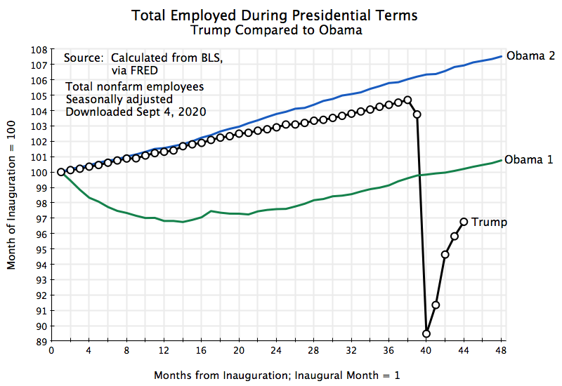 Employment growth was higher in Obama’s second term than it ever was during Trump’s term in office. The paths were broadly similar over the first three years of Trump’s term, but Trump was simply – and consistently – slower. In Obama’s first term, employment was falling rapidly (by 800,000 jobs a month) when Obama took his oath of office, but once this was turned around the path showed a similar steady rise.
Employment then plummeted in Trump’s fourth year, and by a level that was unprecedented (at least since such statistics began to be gathered in 1947). In part due to the truly gigantic relief bills passed by Congress in March and April (described above), there has now been a substantial bounceback. But employment is still (as of August 2020) well below what it was when Trump took office in January 2017.
Even setting aside the collapse in employment this year, Trump’s record in his first three years does not compare favorably to that of other presidents:
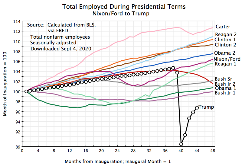 A few presidents have done worse, primarily those who faced an economy going into a downturn as they took office (Obama) or where the economy was pushed into a downturn soon after they took office (Bush Jr., Reagan) or later in their term (Bush Sr., Nixon/Ford). But the record of other presidents was significantly better, with the best (which some might find surprising) that of Carter.
Trump also claims credit for pushing unemployment down to record low levels. The unemployment rate did, indeed, come down (although not to record low rates – the unemployment rate was lower in the early 1950s under Truman and then Eisenhower, and again in the late 1960s). But one cannot see any significant change in the path on the day Trump was inaugurated compared to what it had been under Obama since 2010: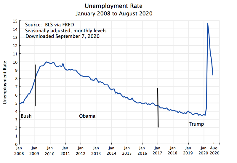
And of course now in 2020, unemployment has shot upwards to a record level (since at least 1948, when these records began to be kept systematically). It has now come down with the bounceback of the economy, but remains high (8.4% as of August).
Over the long term, nothing is more important in raising living standards than higher productivity. And this was the argument Trump and the Republicans in Congress made to rationalize their sharp cuts in corporate tax rates in the December 2017 tax bill. The argument was that companies would then invest more in the capital assets that raise productivity (basically structures and equipment). But this did not happen. Even before the collapse this year, private non-residential investment in structures and equipment was no higher, and indeed a bit lower, as a share of GDP than what it was before the 2017 tax bill passed.
And it certainly has not led to a jump in productivity: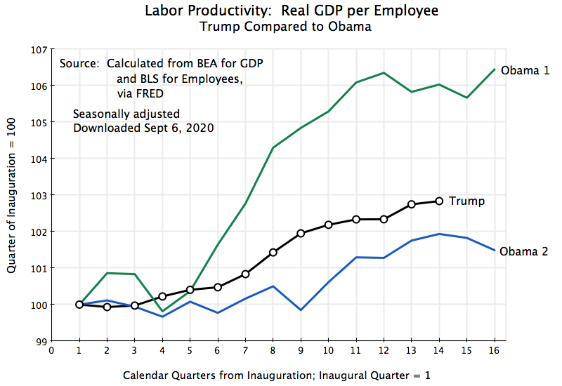
Productivity growth during Trump’s term in office has been substantially lower (by 3%) than what it was during Obama’s first term, although somewhat better than during Obama’s second term (by a cumulative 1% point at the same calendar quarter in their respective terms).
And compared to that of other presidents, Trump’s record on productivity gains is nothing special: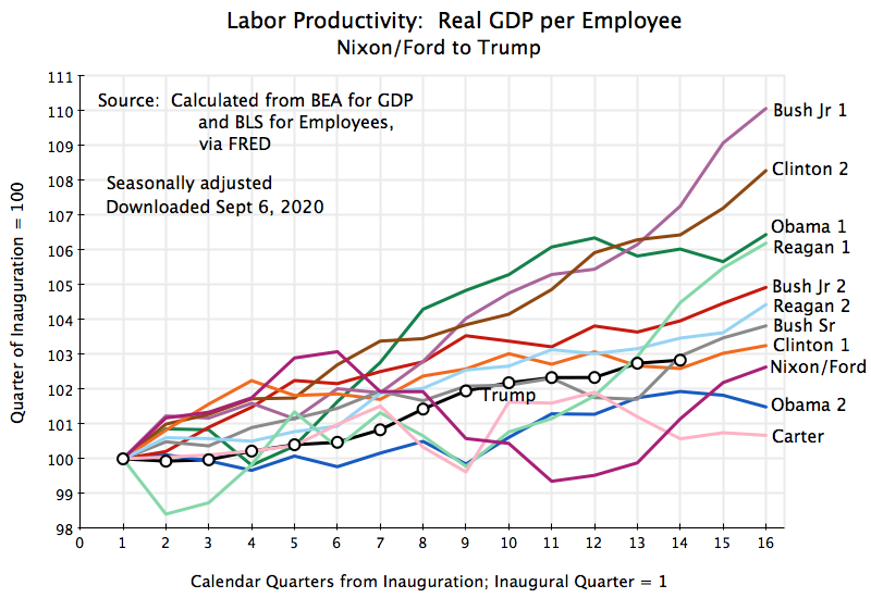
Finally, what happened to real wages? While higher productivity growth is necessary in the long term for higher wages (workers cannot ultimately be paid more than what is produced), in the short term a number of other factors (such as relative bargaining strength) will dominate. When unemployment is high, wage gains will typically be low as firms can hire others if a worker demands a higher wage. And when unemployment is low, workers will typically be in a better bargaining position to demand higher wages.
How, then, does Trump’s record compare to that of Obama?: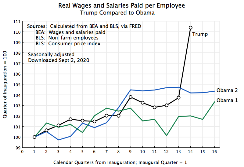
During the first three years of Trump’s tenure in office, real wage gains were basically right in the middle of what they were over the similar periods in Obama’s two terms. But then it looks like real wages shot upwards at precisely the time when the Covid-19 crisis hit. How could this be?
One needs to look at what lies behind the numbers. With the onset of the Covid-19 crisis, unemployment shot up to the highest it has been since the Great Depression. But two issues were then important. One is that when workers are laid off, it is usually the least senior, least experienced, workers who are laid off first. And such workers will in general have a lower wage. If a high share of lower-wage workers become unemployed, then the average wage of the workers who remain employed will go up. This is a compositional effect. No individual worker may have seen an increase in his or her wage, but the overall average will go up if fewer lower-wage workers remain employed.
Second, this downturn was different from others in that a high share of the jobs lost were precisely in low-wage jobs – workers in restaurants, cafeterias, and hotels, or in retail shops, or janitors for office buildings, and so on. As the economy shut down, these particular businesses had to close. Many, if not most, office workers could work from home, but not these, commonly low-wage, workers. They were laid off.
The sharp jump in average real wages in the second quarter of 2020 (Trump’s 14th quarter in office) is therefore not something to be pleased about. As the lower-wage workers who have lost their jobs return to being employed, one should expect this overall average wage to fall back towards where it was before.
But the path of real wages in the first three years of Trump’s presidency, when the economy continued to expand as it had under Obama, does provide a record that can be compared. How does it look relative to that of other presidents of the last half-century?:
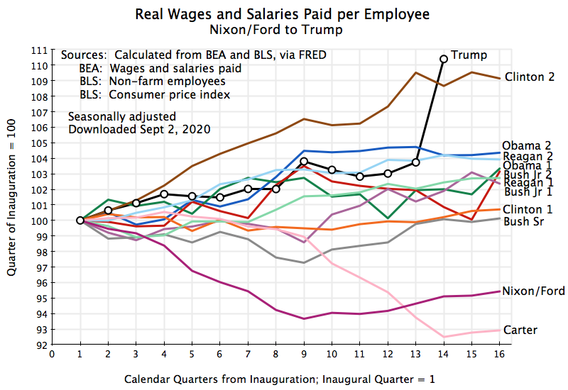
Again, Trump’s record over this period is in the middle of the range found for other presidents. It was fairly good (unemployment was low, which as noted above would be expected to help), but real wages in the second terms of Clinton and Obama rose by more, and performance was similar in Reagan’s second term.
E. International Trade Accounts
Finally, how does Trump’s record on international trade compare to that of other presidents? Trump claimed he would slash the US trade deficit, seeing it in a mercantilistic way as if a trade deficit is a “loss” to the country. At a 2018 press conference (following a G-7 summit in Canada), he said, for example, “Last year,… [the US] lost … $817 billion on trade. That’s ridiculous and it’s unacceptable.” And “We’re like the piggybank that everybody is robbing.”
This view on the trade balance reflects a fundamental lack of understanding of basic economics. Equally worrisome is Trump’s view that launching trade wars targeting specific goods (such as steel and aluminum) or specific countries (such as China) will lead to a reduction in the trade deficit. As was discussed in an earlier post on this blog, the trade balance ultimately depends on the overall balance between domestic savings and domestic investment in an economy. Trade wars may lead to reductions in imports, but then there will also be a reduction in exports. If the trade wars do not lead to higher savings or lower investment, such trade interventions (with tariffs or quotas imposed by fiat) will simply shift the trade to other goods or other nations, leaving the overall balance where it would have been based on the savings/investment balance.
But we now have three and a half years of the Trump administration, and can see what his trade wars have led to. In terms of imports and exports: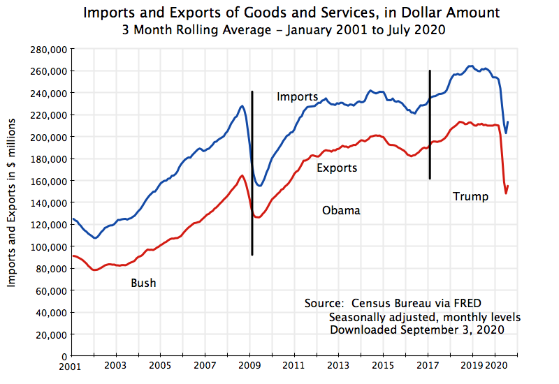
Imports did not go down under Trump – they rose until collapsing in the worldwide downturn of 2020. Exports also at first rose, but more slowly than imports, and then leveled off before imports did. They then also collapsed in 2020. Going back a bit, both imports and exports had gone up sharply during the Bush administration. Then, after the disruption surrounding the economic collapse of 2008/9 (with a fall then a recovery), they roughly stabilized at high levels during the last five years of the Obama administration.
In terms of the overall trade balance: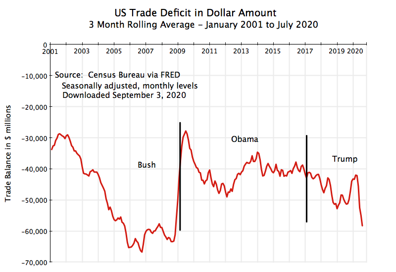
The trade deficit more than doubled during Bush’s term in office. While both imports and exports rose (as was seen above), imports rose by more. The cause of this was the housing credit bubble of the period, which allowed households to borrow against home equity (which in turn drove house prices even higher) and spend that borrowing (leading to higher consumption as a share of current income, which means lower savings). This ended, and ended abruptly, with the 2008/9 collapse, and the trade deficit was cut in half. After some fluctuation, it then stabilized in Obama’s second term.
Under Trump, in contrast, the trade deficit grew compared to where it was under Obama. It did not diminish, as Trump insisted his trade wars would achieve, but the opposite. And with the growing fiscal deficit (as discussed above) due to the December 2017 tax cuts and the more rapid growth in government spending (where a government deficit is dis-saving that has to be funded by borrowing), this deterioration in the trade balance should not be a surprise. And I also suspect that Trump does not have a clue as to why this has happened (nor an economic advisor willing to explain it to him).
F. Conclusion
There is much more to Trump’s economic policies that could have been covered. It is also not yet clear how much damage has been done to the economic structure from the crisis following the mismanagement of Covid-19 (with the early testing failures, the lack of serious contact tracing and isolation of those who may be sick, and importantly, Trump’s politicizing the wearing of simple masks). Unemployment rose to record levels, and this can have a negative impact (both immediate and longer-term) on the productivity of those workers and on their subsequent earnings. There has also been a jump in bankruptcies, which reduces competition. And bankrupt firms, as well as stressed firms more generally, will not be able to repay their loans in full. The consequent weakening of bank balance sheets will constrain how much banks will be able to lend to others, which will slow the pace of any recovery.
But these impacts are still uncertain. The focus of this post has been on what we already know of Trump’s economic record. It is not a good one. The best that can be said is that during his first three years in office he did not derail the expansion that had begun under Obama. Growth continued (in GDP, employment, productivity, wages), at rates similar to what they were before. Compared to paths followed in other presidencies of the last half-century, they were not special.
But this growth during Trump’s tenure in office was only achieved with rapid growth in federal government spending. Together with the December 2017 tax cuts, this led to a growing, not a diminishing, fiscal deficit. The deficit grew to close to 5% of GDP, which was indeed special: Never before in US history has the fiscal deficit been so high in an economy at or close to full employment, with the sole exception of during World War II.
The result was a growing public debt as a share of GDP, when prudent fiscal policy would have been the reverse. Times of low unemployment are when the country should be reducing its fiscal deficit so that the public debt to GDP ratio will fall. Reducing public dis-saving would also lead to a reduction in the trade deficit (other things being equal). But instead the trade deficit has grown.
As a consequence, when a crisis hits (as it did in 2020) and government needs to spend substantial sums for relief (as it had to this year), the public debt to GDP ratio will shoot upwards from already high levels. Republicans in Congress asserted in 2011 that a public debt of 70% of GDP was excessive and needed to be brought down rapidly. Thus they forced through spending cuts, which slowed the recovery at a time when unemployment was still high.
But now public debt under Trump will soon be over 100% of GDP. Part of the legacy of Trump’s term in office, for whoever takes office this coming January 20, will therefore be a public debt that will soon be at a record high level, exceeding even that at the end of World War II.
This has certainly not been “the greatest economy in history”.



 An Economic Sense
You must be logged in to post a comment.